Office Parks and Suburban Housing in San Mateo County, California - Aerial

Bay Area Real Estate Market Report - August 2025

Select a Market Report to Read:

The Local Lowdown

Quick Take:

  • Median sale prices show mixed performance across the Bay Area, with Silicon Valley maintaining strength while the East Bay experiences six consecutive months of declines.
  • Inventory dynamics vary dramatically by region - San Francisco faces severe shortages while most other areas see rising inventory levels.
  • Despite varying inventory conditions, listings are spending significantly more time on the market across nearly all Bay Area markets.
  • Market conditions range from highly competitive sellers' markets in core Silicon Valley to more balanced or buyer-friendly conditions in outlying areas.

Note: You can find the charts/graphs for the Local Lowdown at the end of this section.

*National Association of REALTORS® data is released two months behind, so we estimate the most recent month's data when possible and appropriate.

Regional price performance reveals a tale of two markets

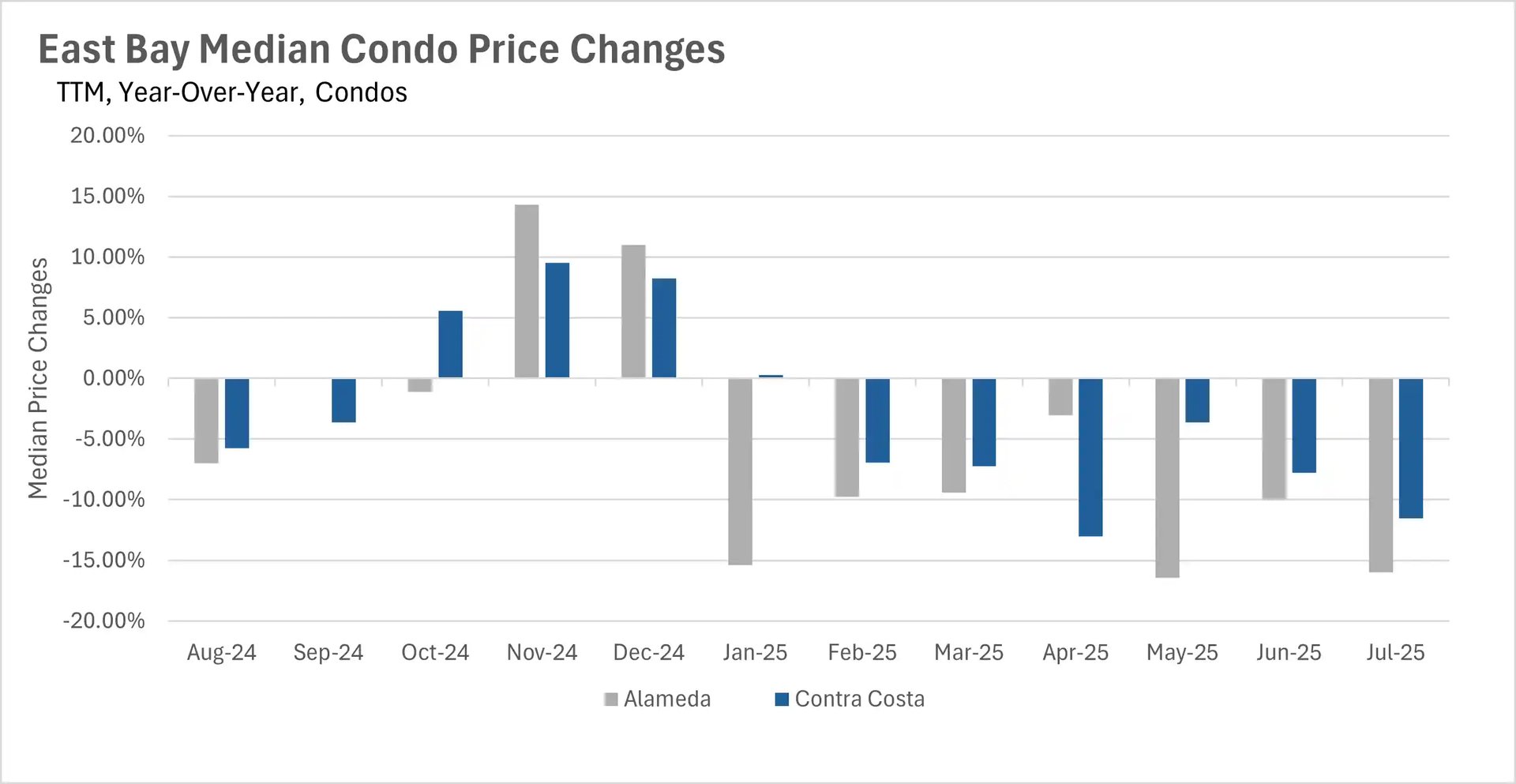
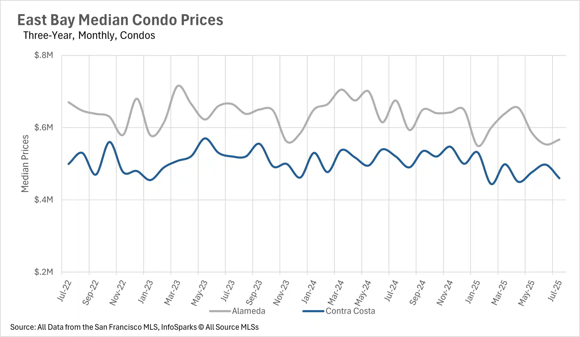
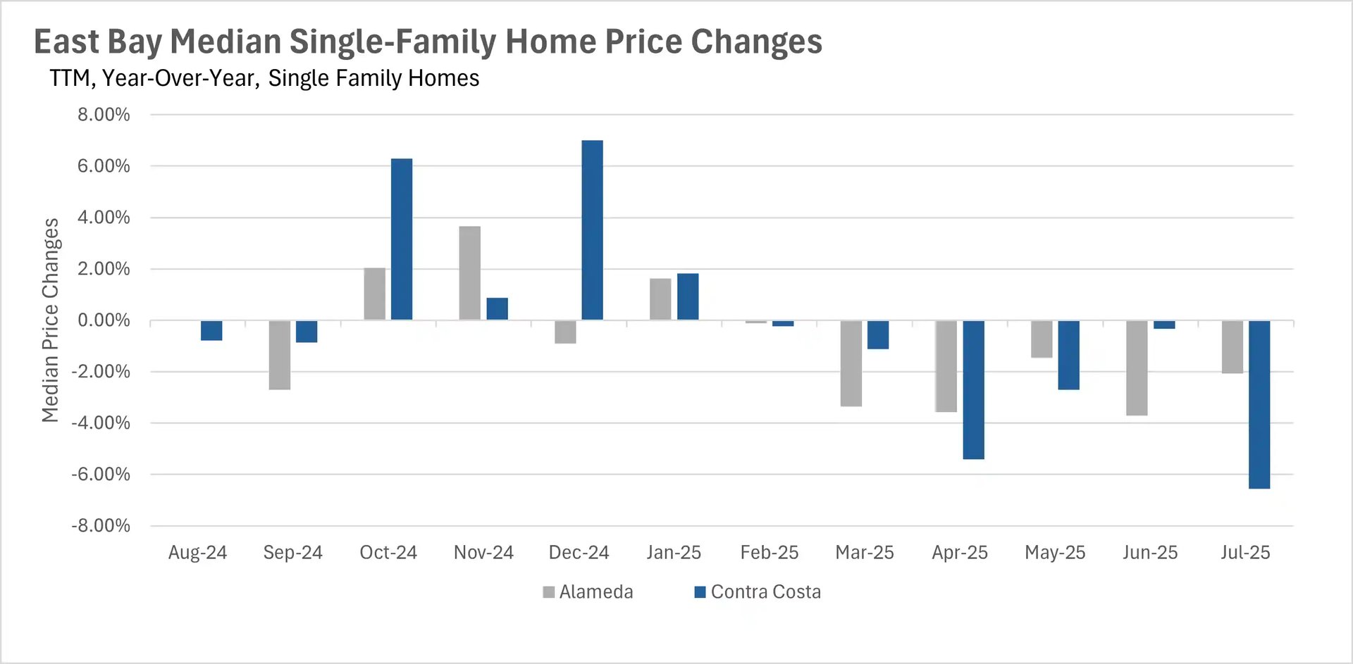
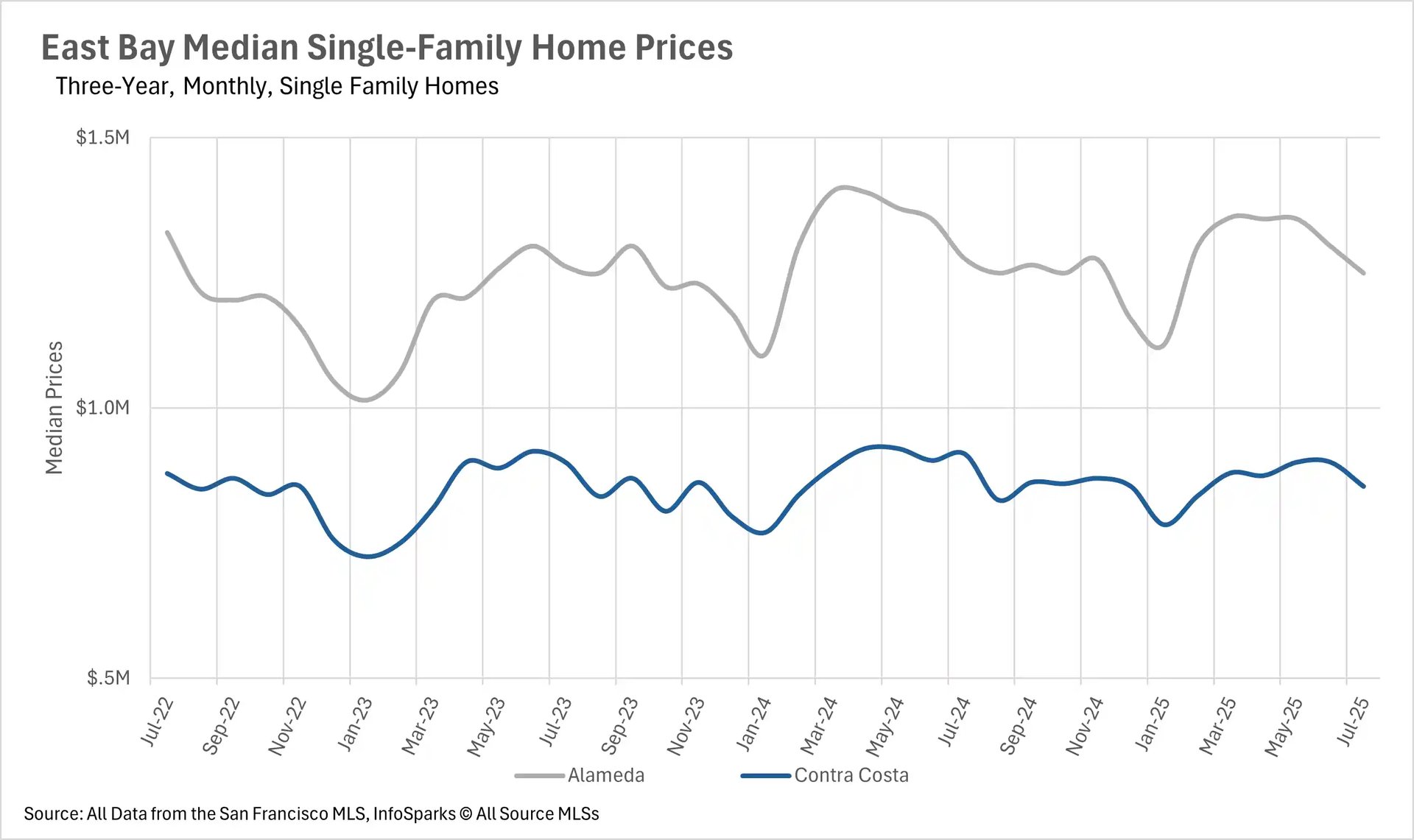
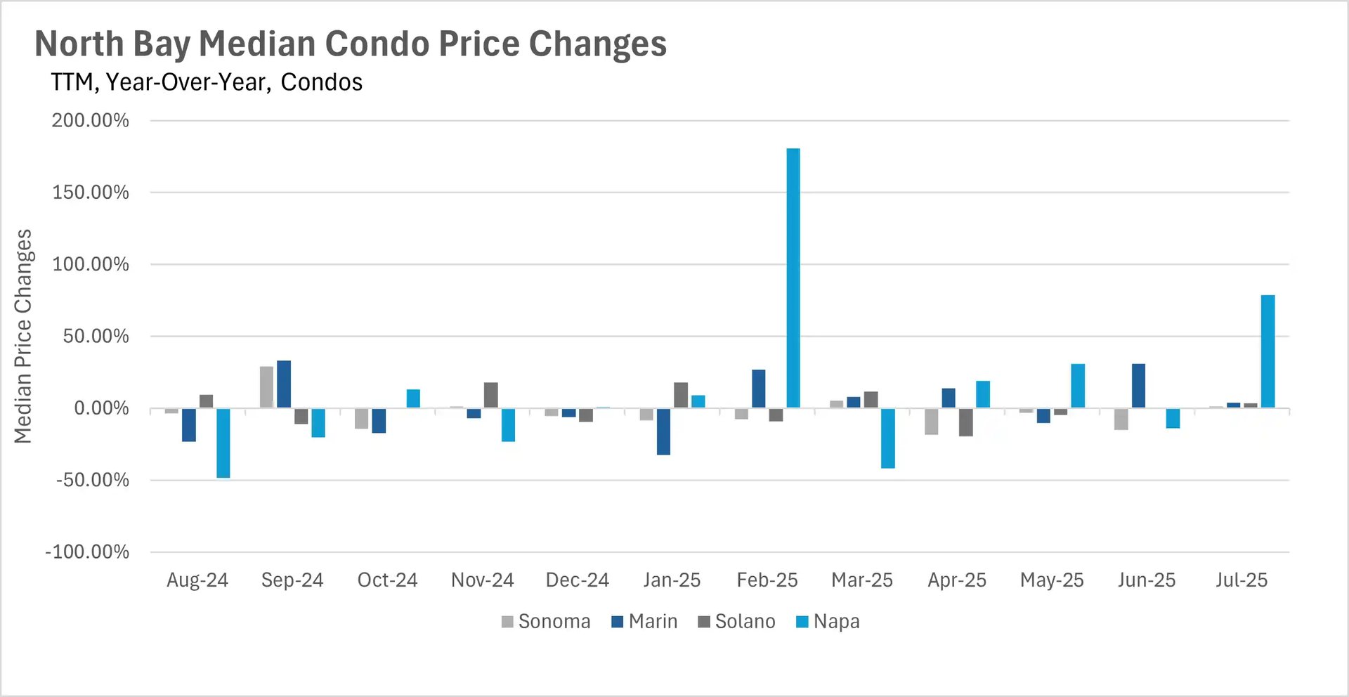
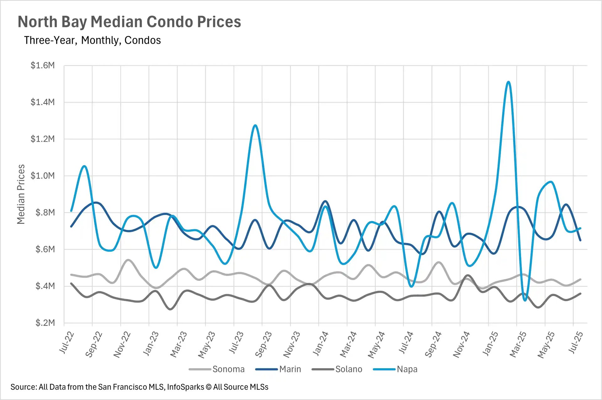
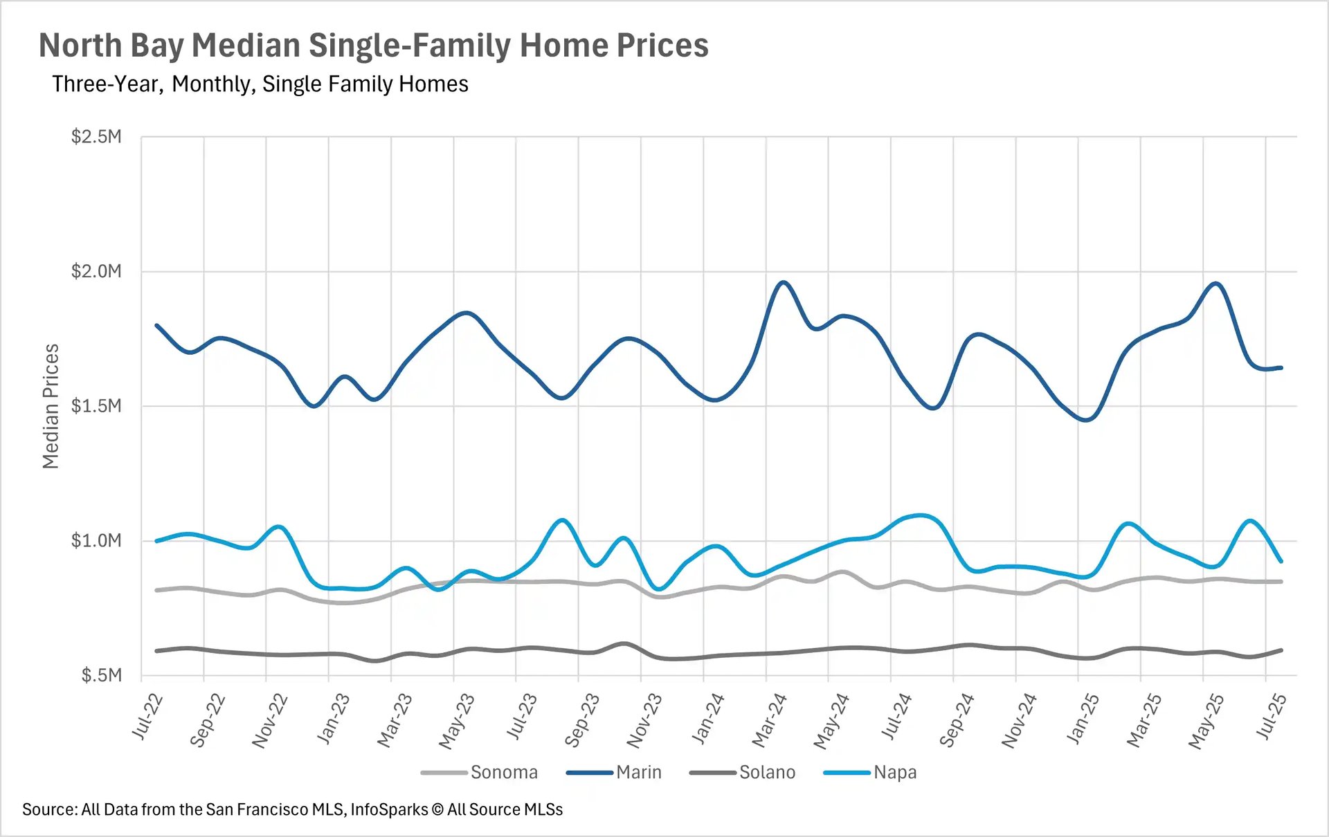
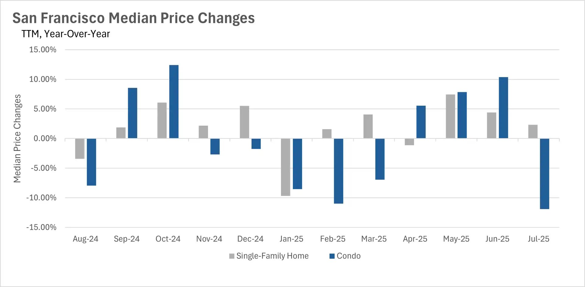
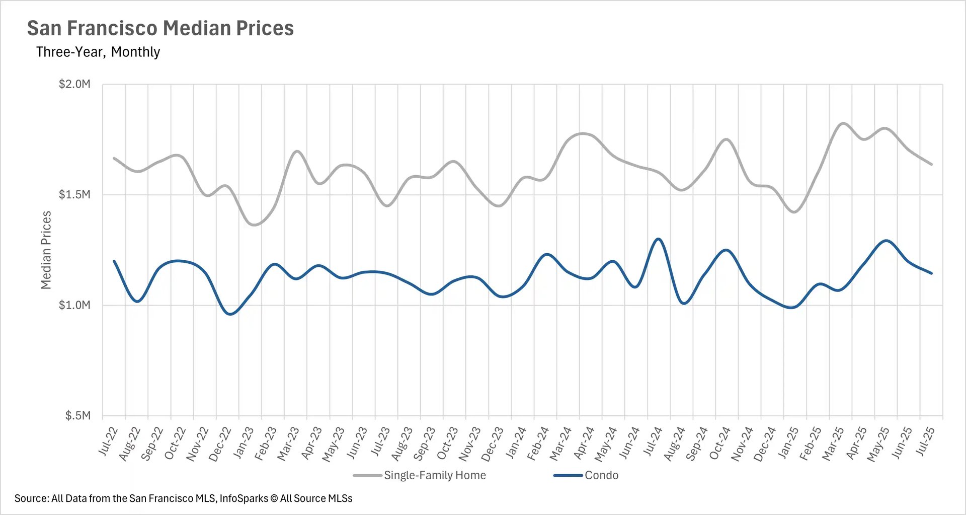
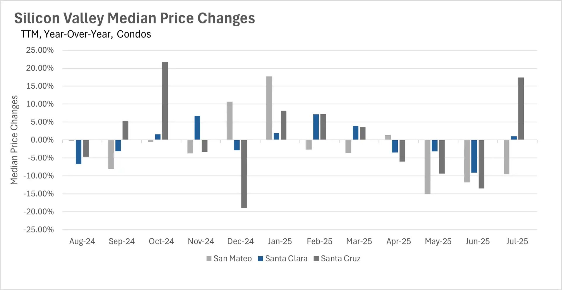
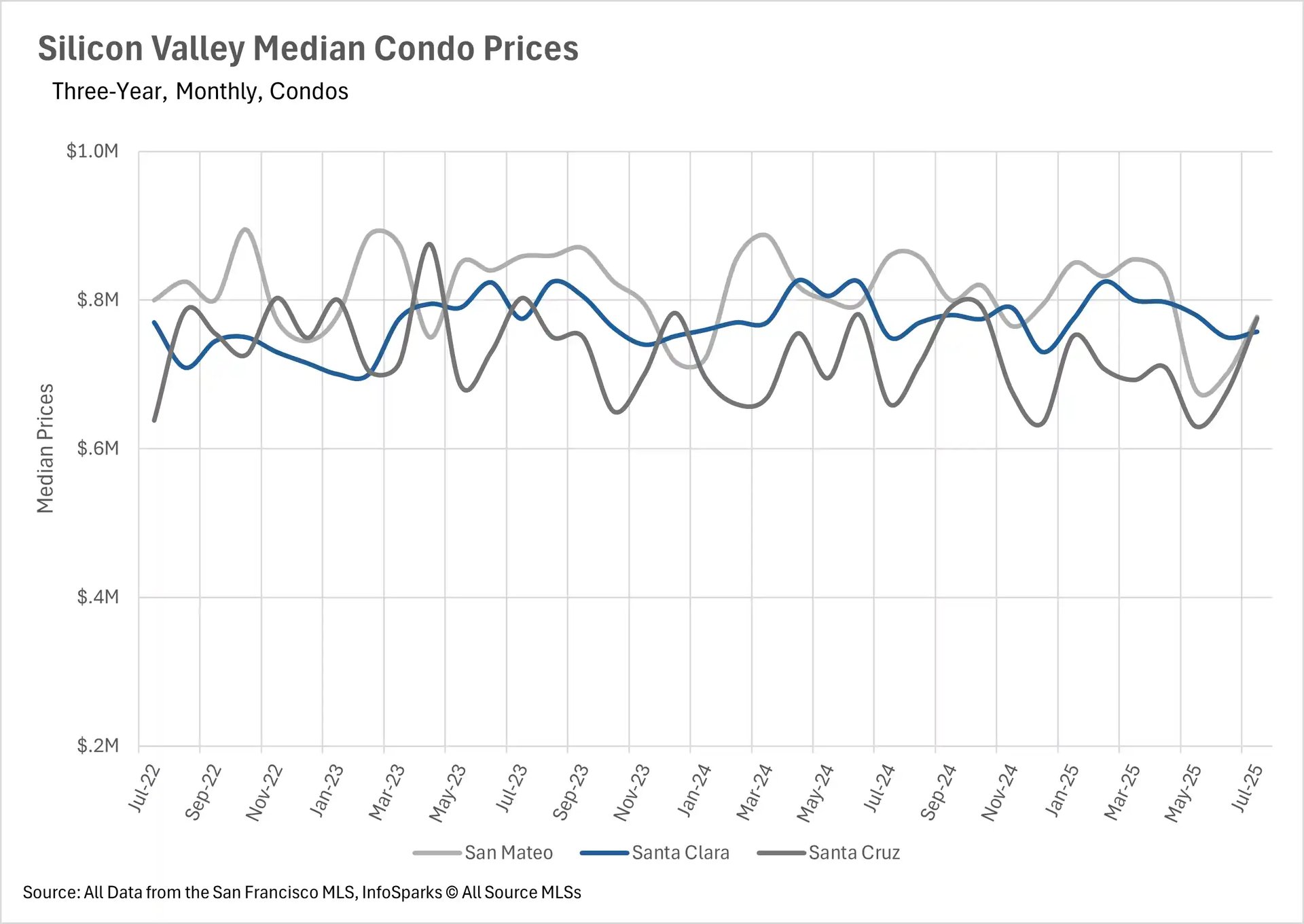
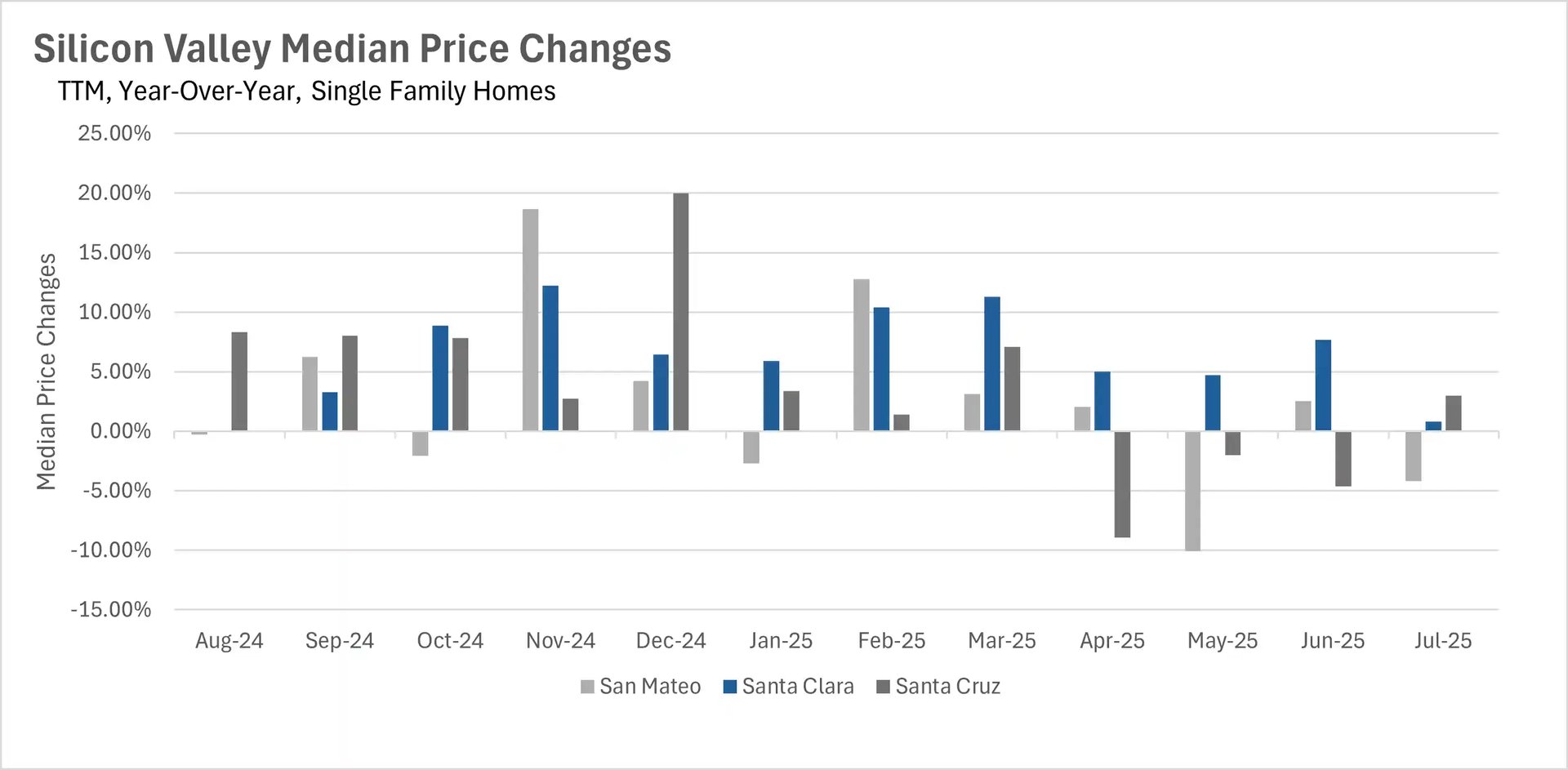
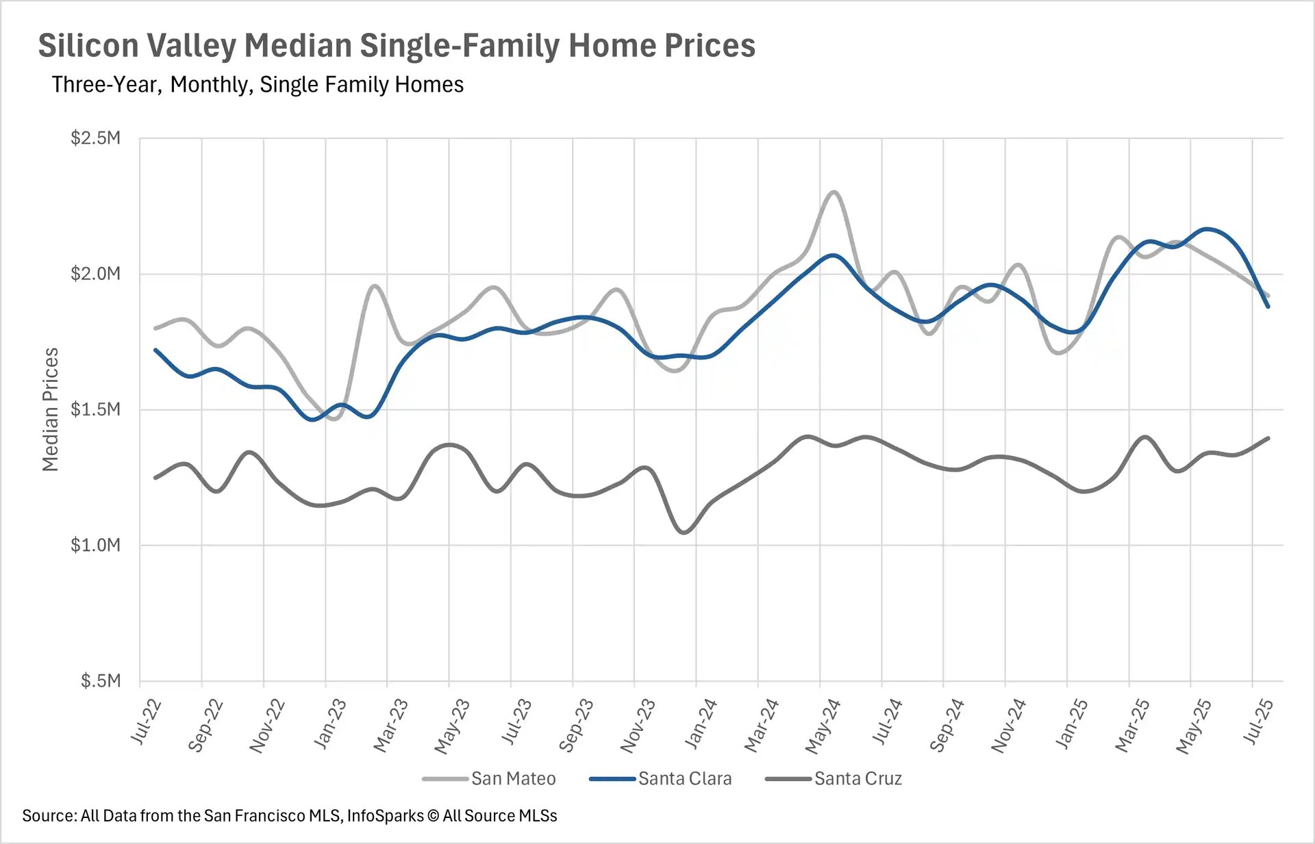
The Bay Area's real estate market is displaying stark regional differences in price performance. Silicon Valley continues to demonstrate remarkable resilience, with Santa Clara County single-family homes maintaining their impressive growth streak for over 12 months without a single year-over-year decline. In contrast, the East Bay has experienced six consecutive months of median sale price decreases, with single-family homes down 2.08% and 6.56% year-over-year in Alameda and Contra Costa Counties respectively. San Francisco and the North Bay fall somewhere in between, with San Francisco single-family homes up 2.34% year-over-year and relatively stable conditions across most North Bay counties, though Napa County stands out with a notable 14.94% decline in single-family home prices.

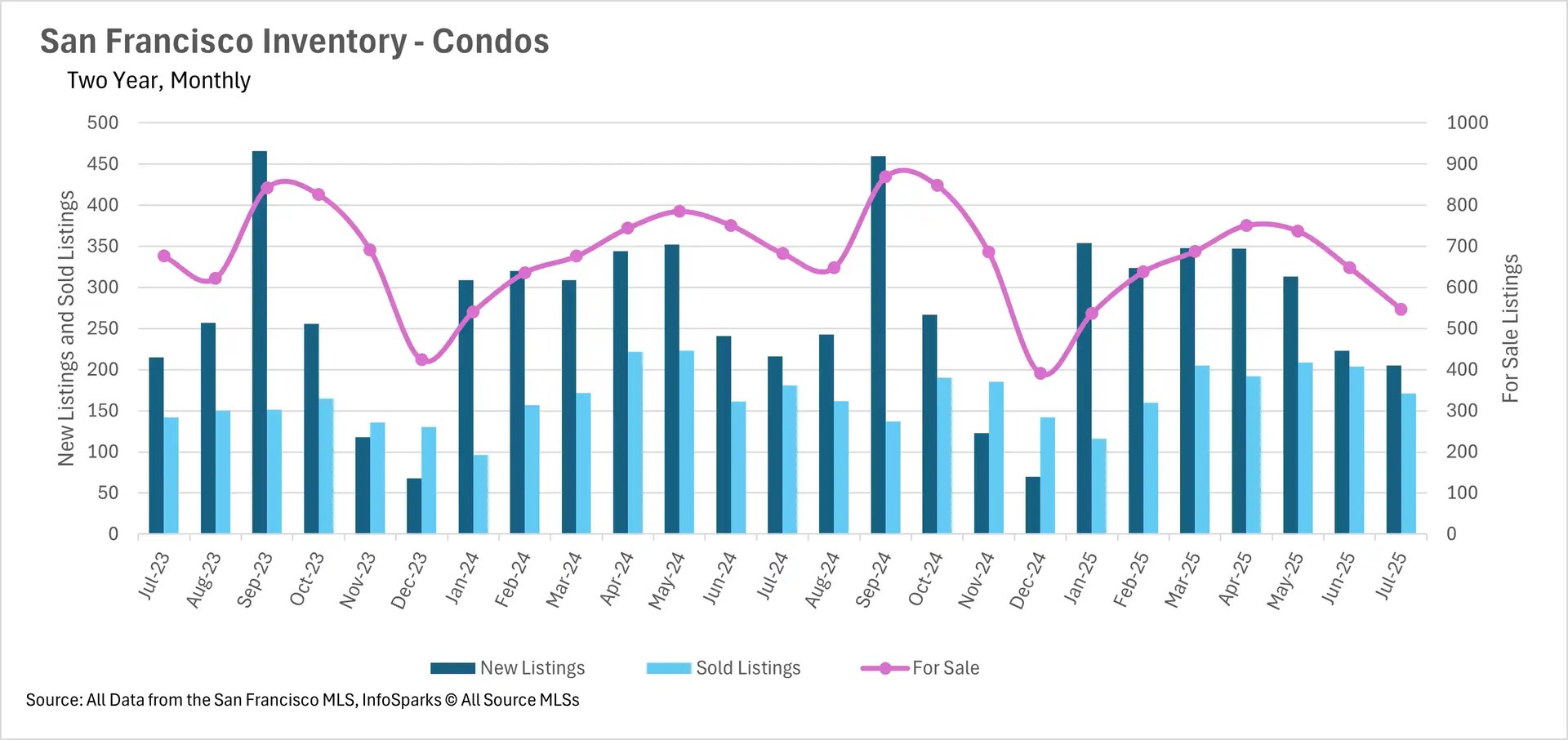
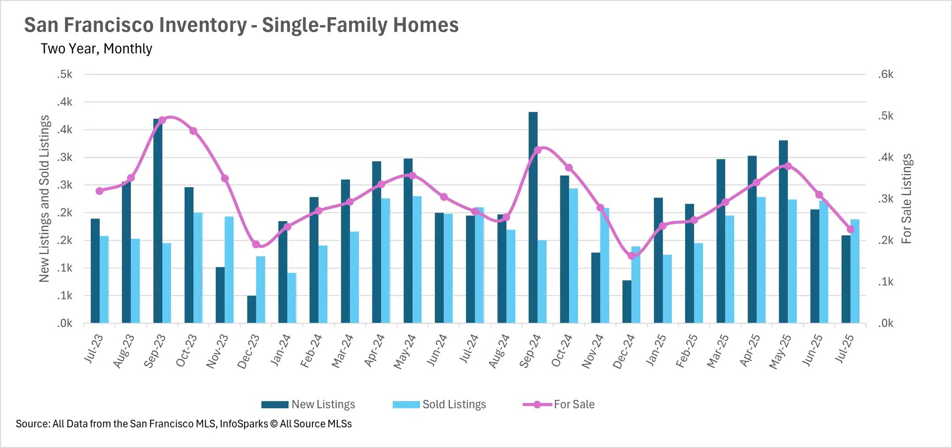
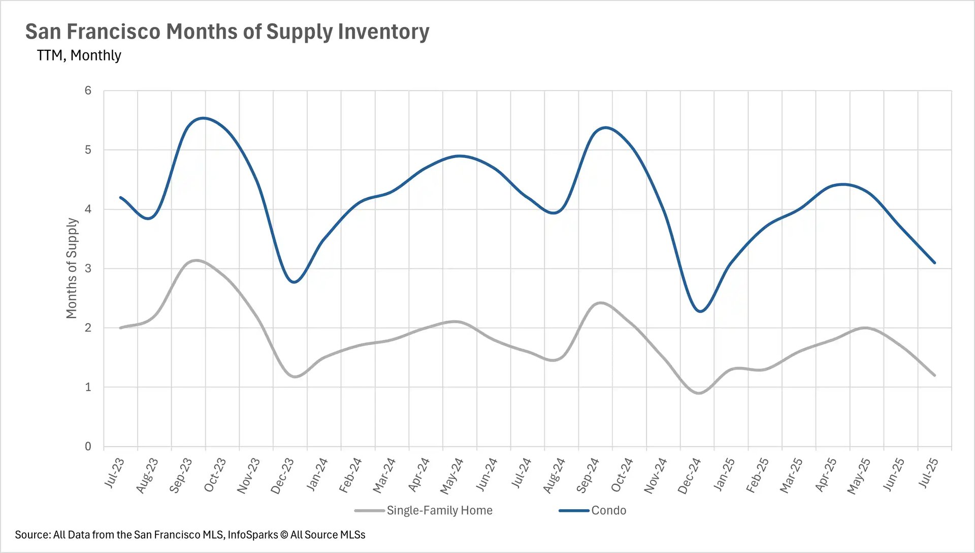
Inventory shortages persist in San Francisco while most regions see supply increases

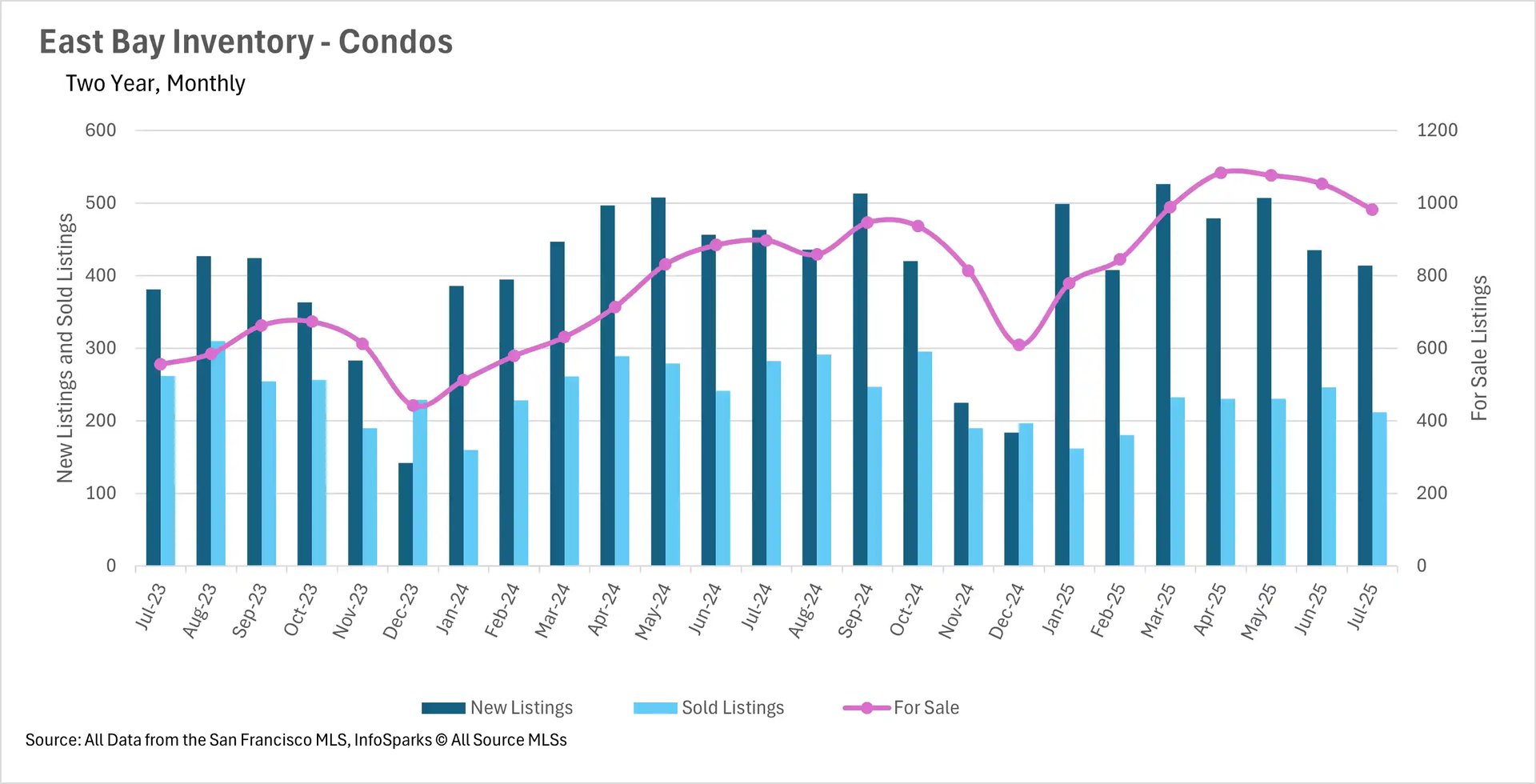
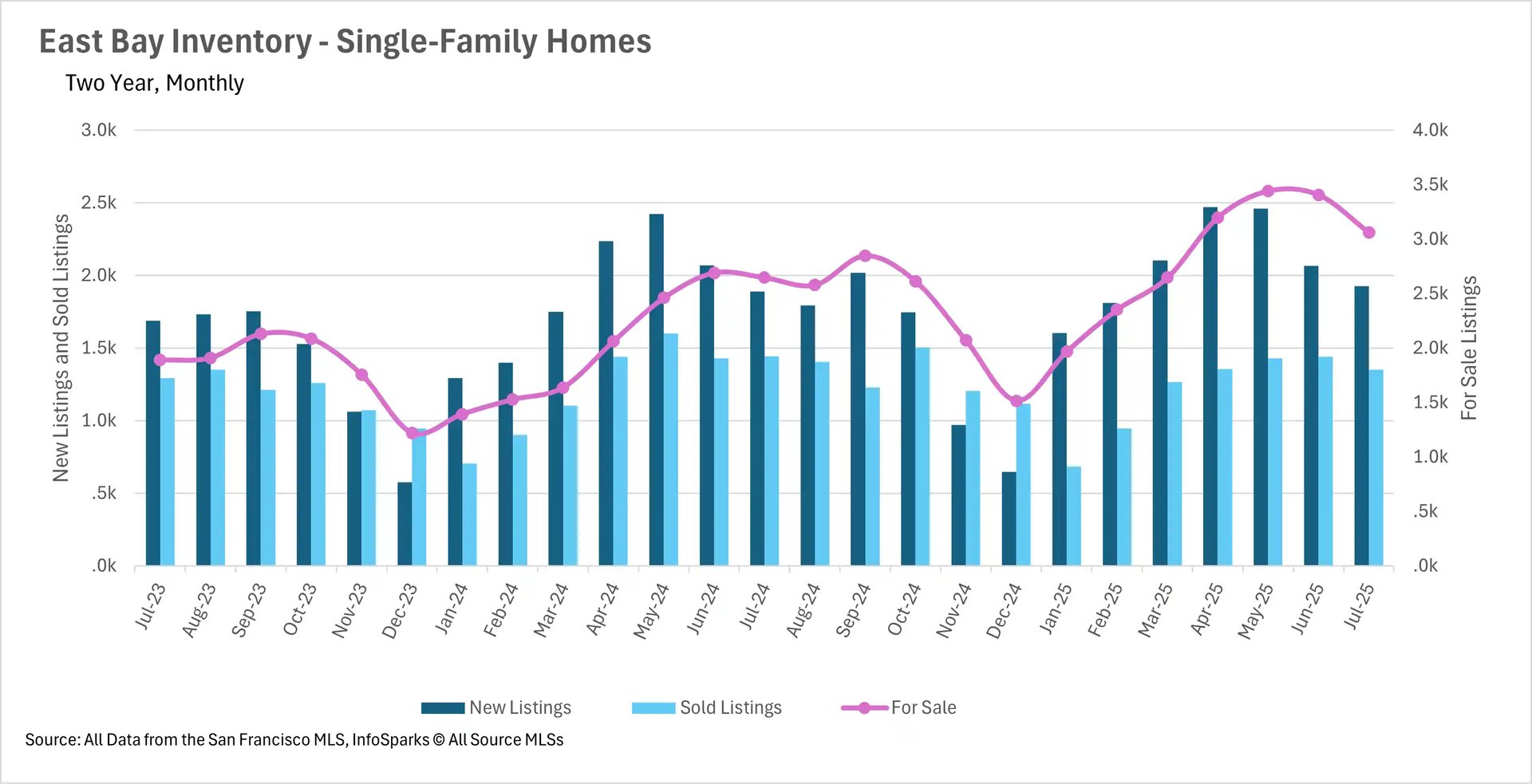
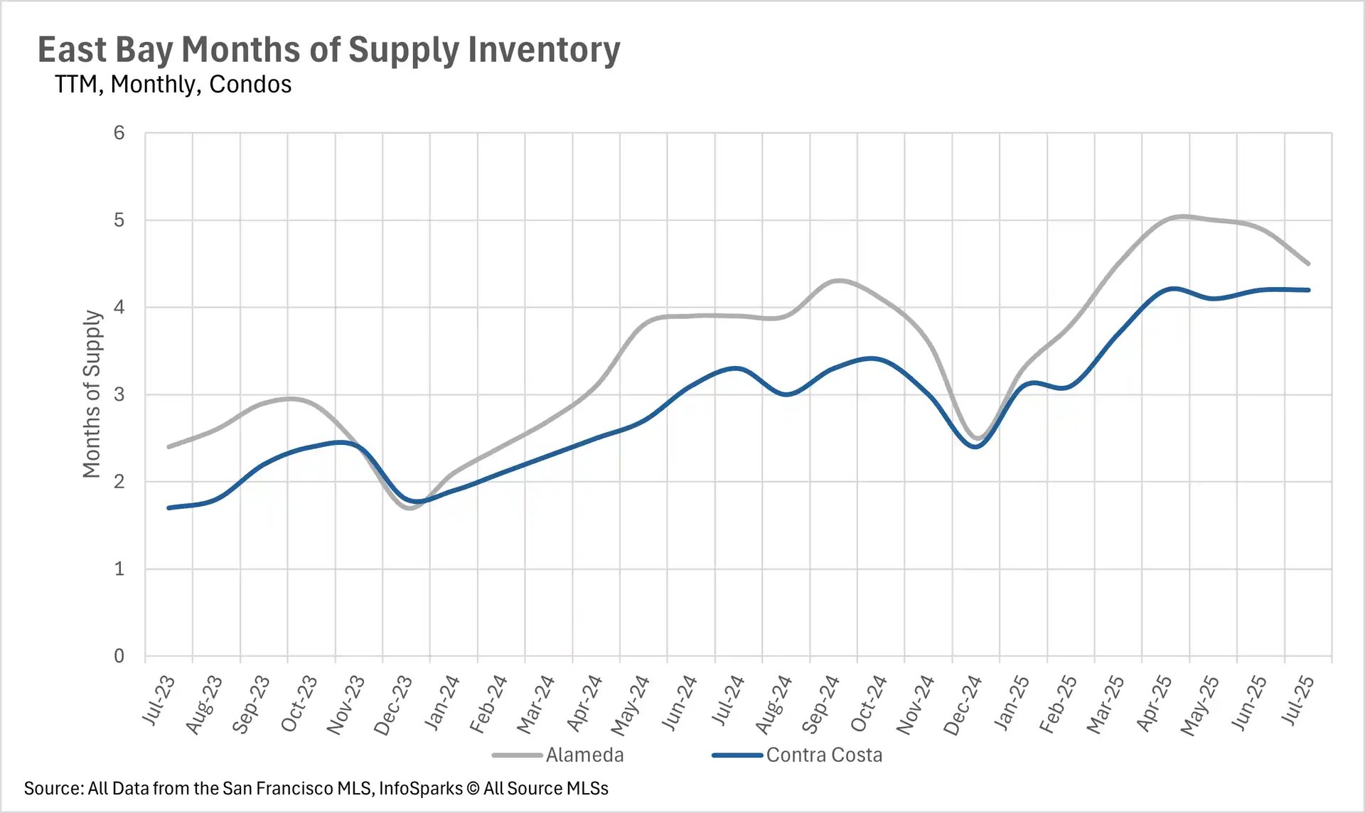
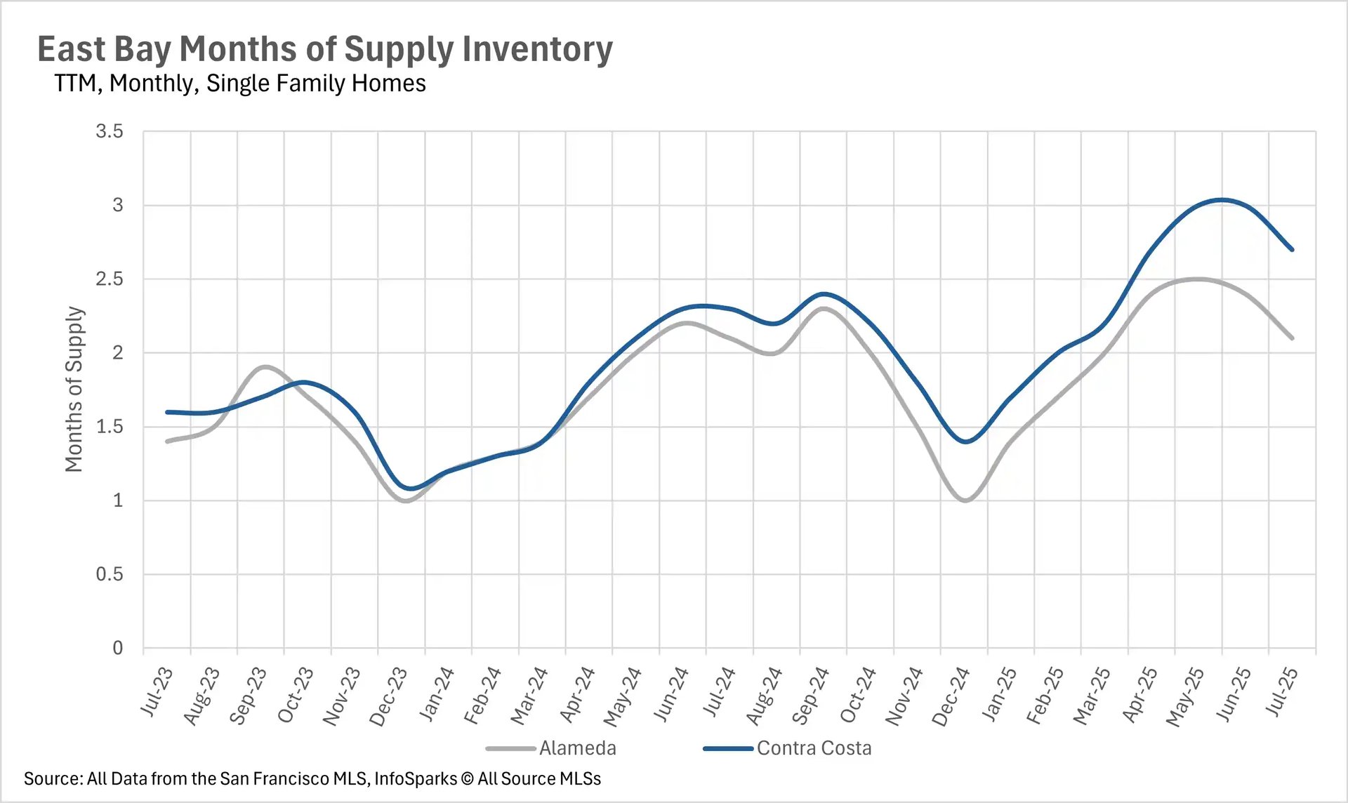
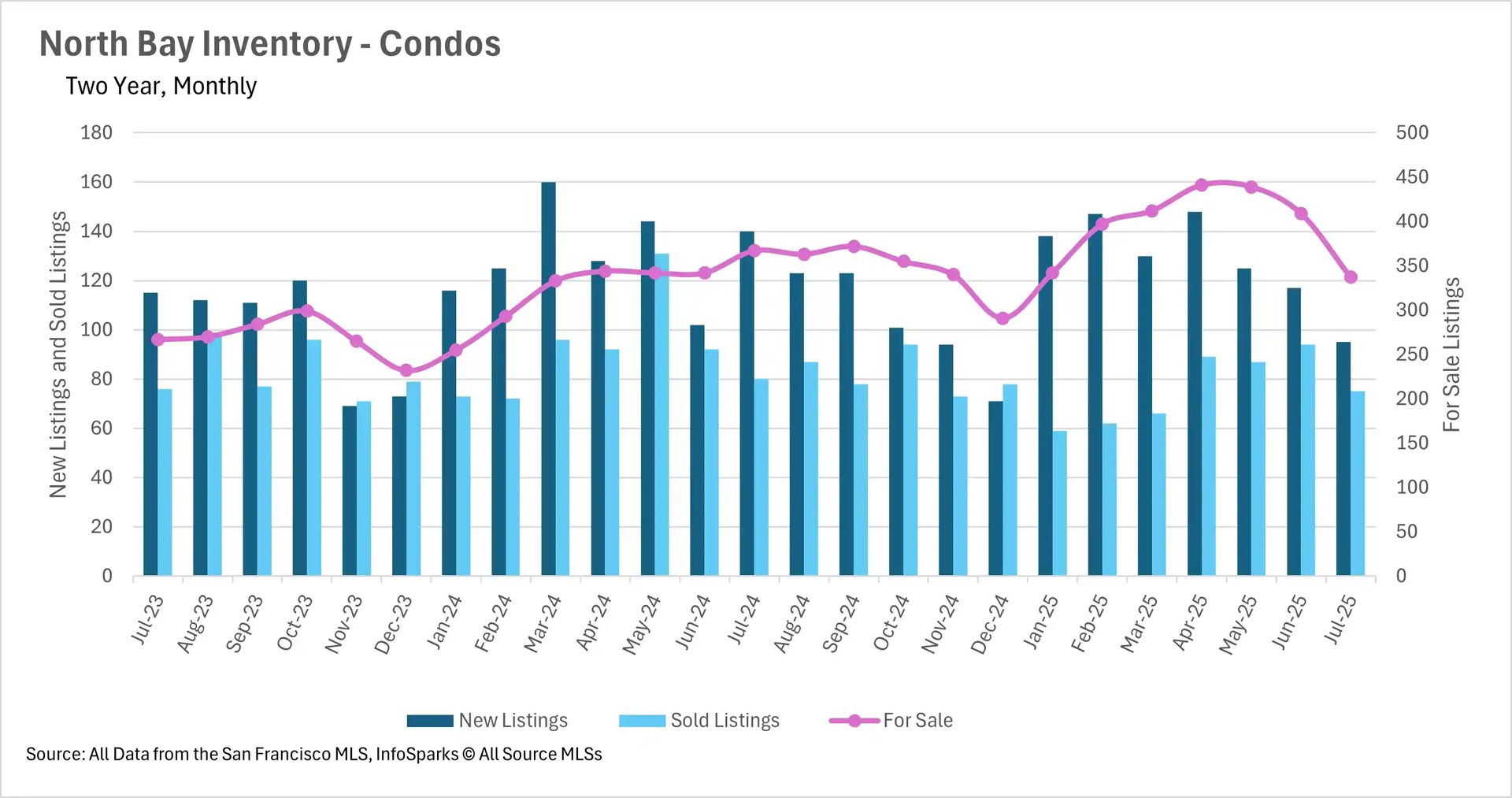
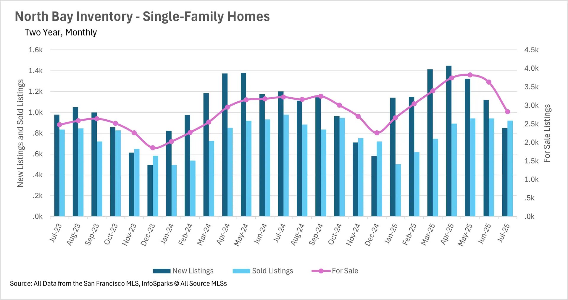
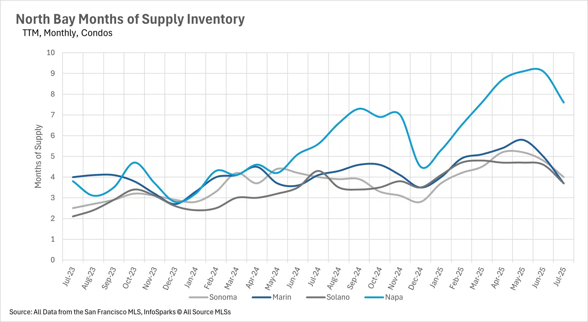
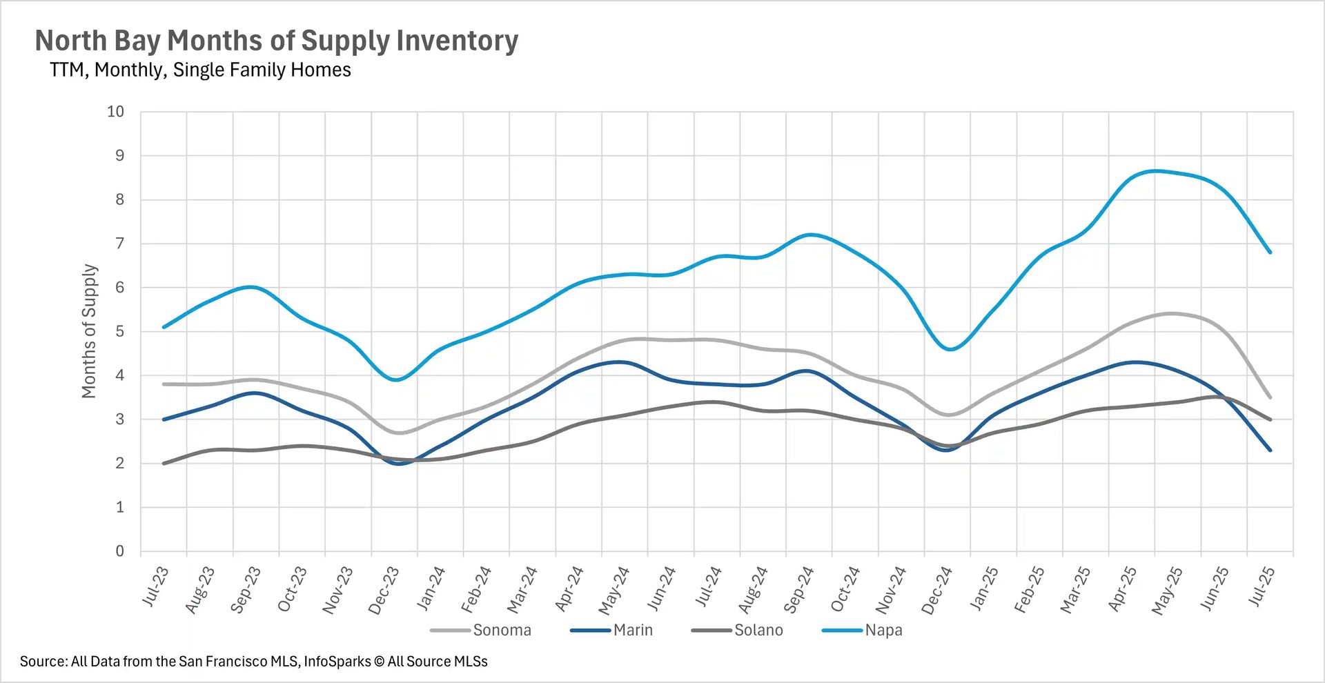
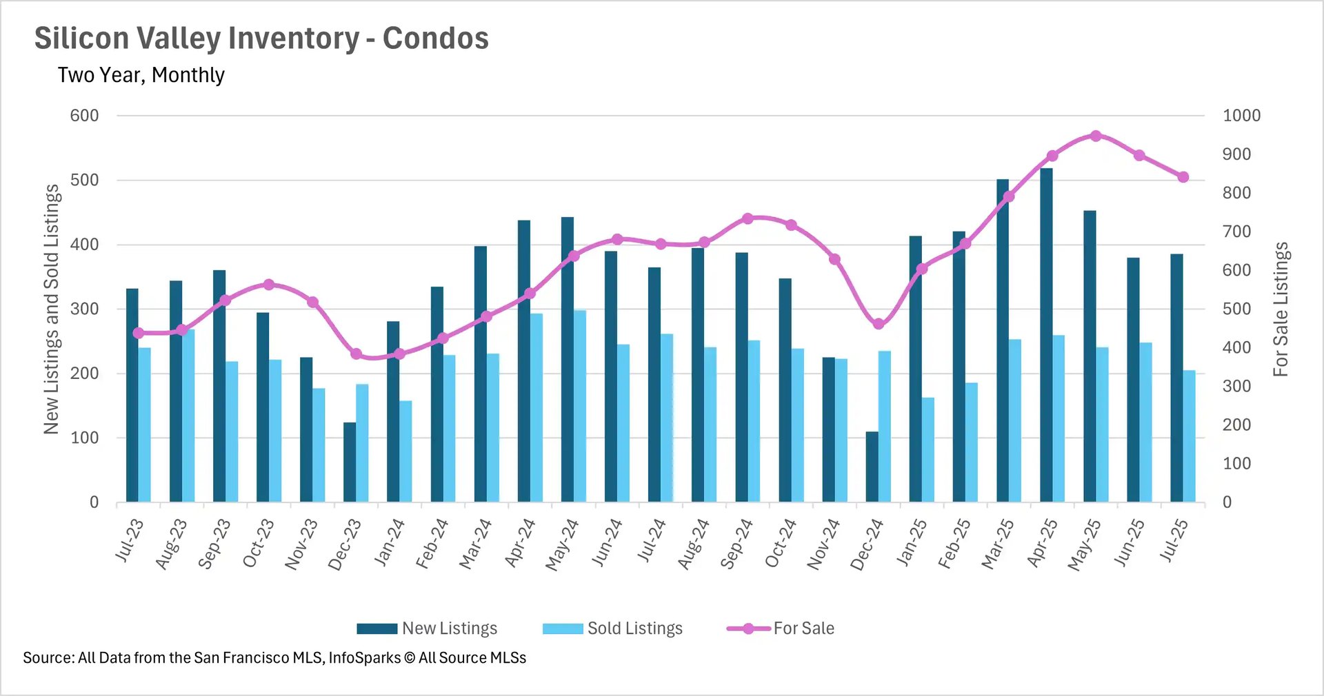
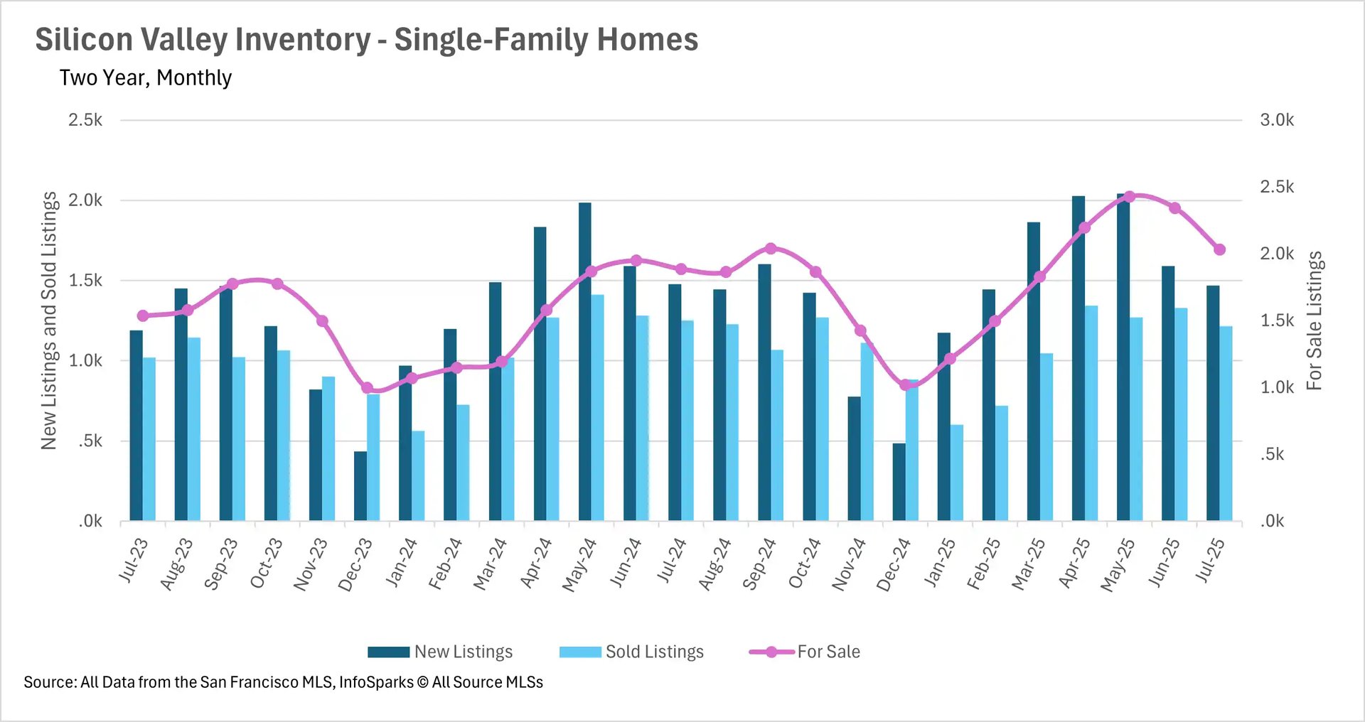
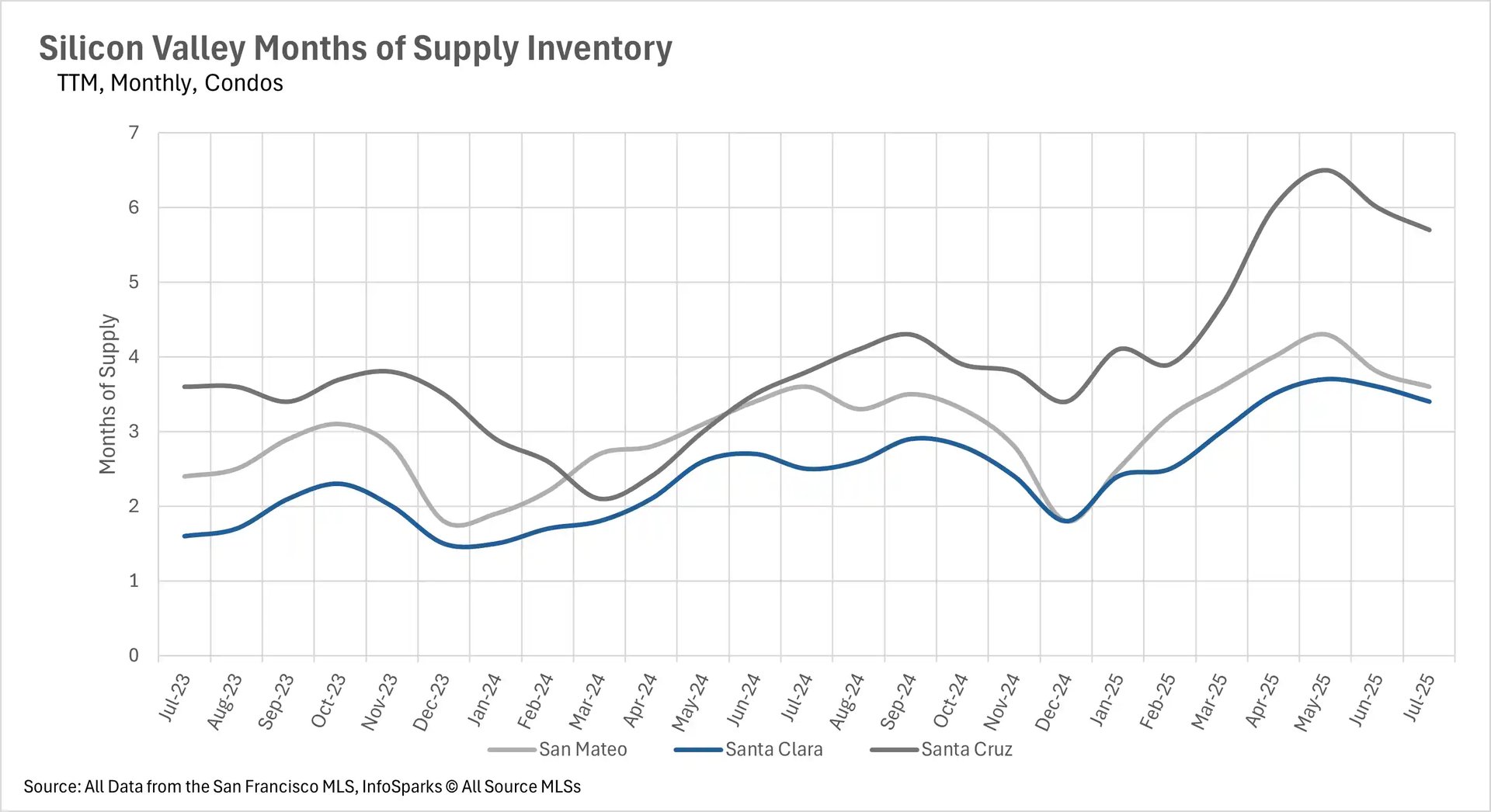
San Francisco's inventory crisis continues to deepen, with 15.93% less single-family inventory and 19.91% fewer condos available compared to last year. This stands in sharp contrast to Silicon Valley, where inventories have grown 7.63% for single-family homes and 25.86% for condos year-over-year. The East Bay is experiencing similar inventory growth with a 15.68% increase in active single-family listings, while the North Bay has seen dramatic month-over-month inventory drops of 21.98% for single-family homes, largely attributed to record-low levels of new listings in July.

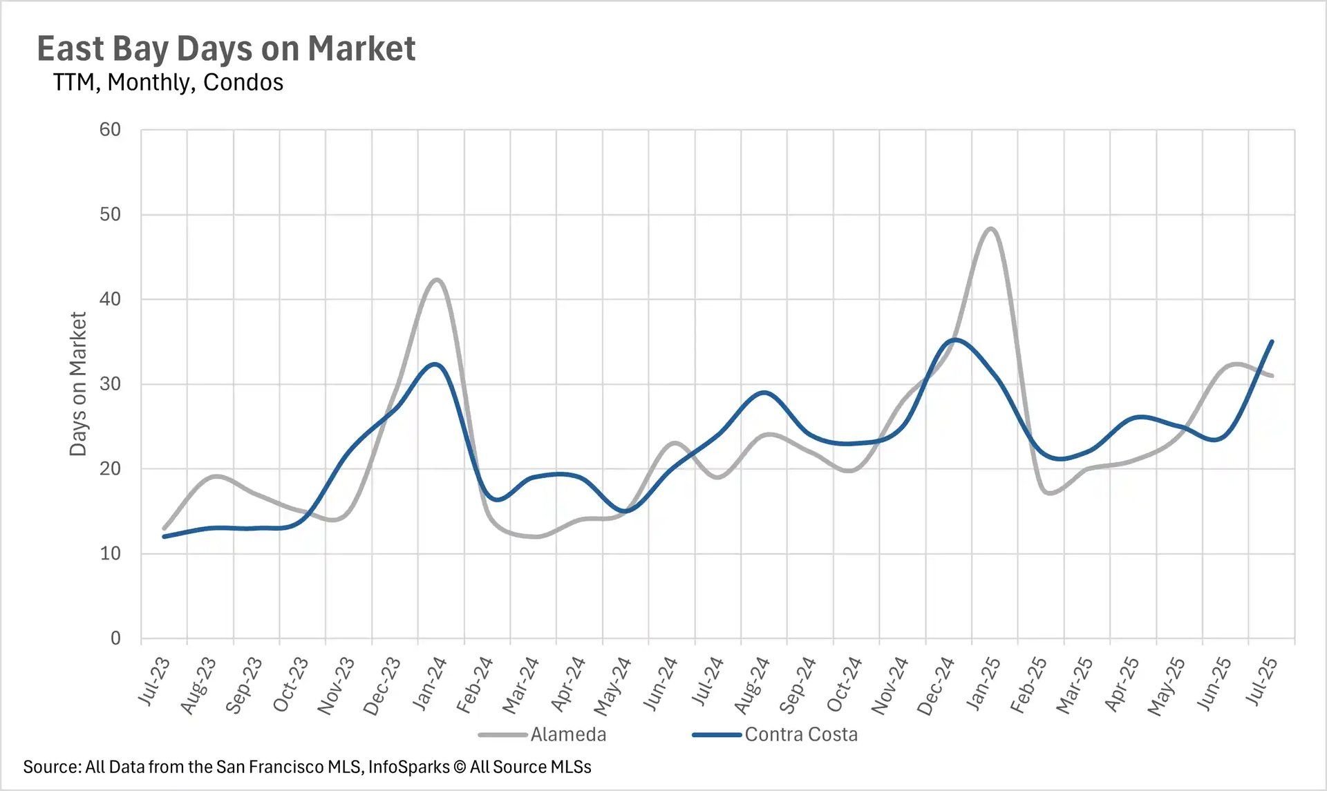
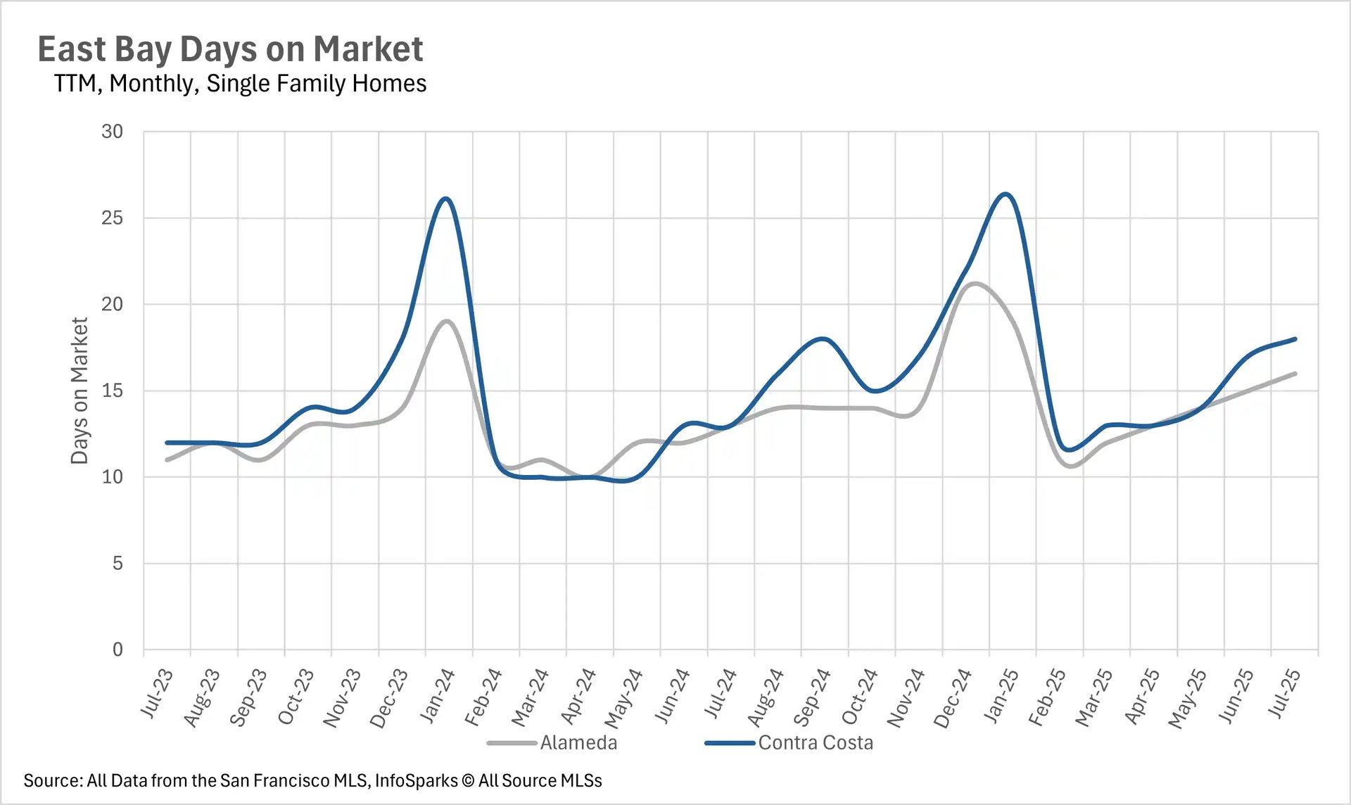
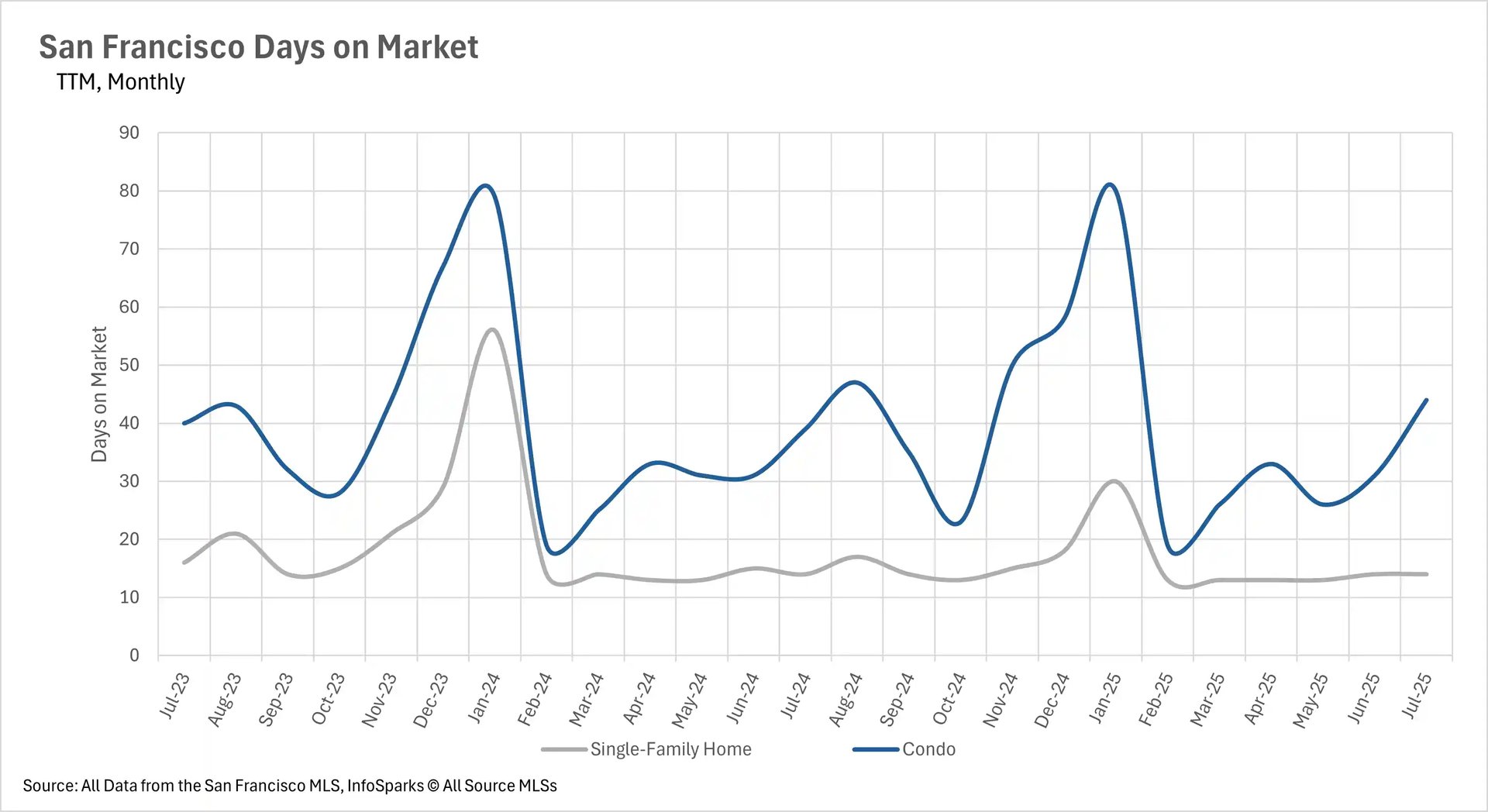
Extended time on market becomes the new normal across regions

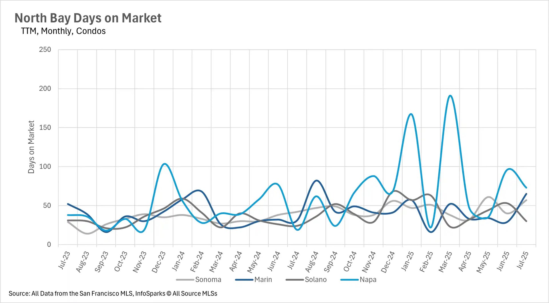
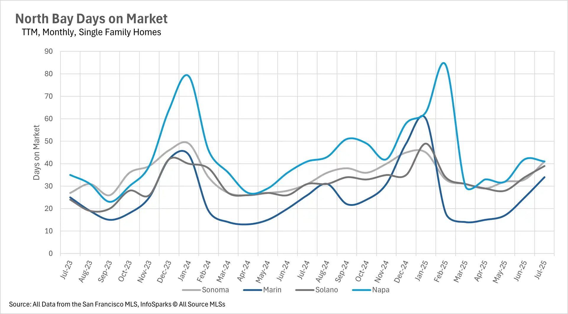
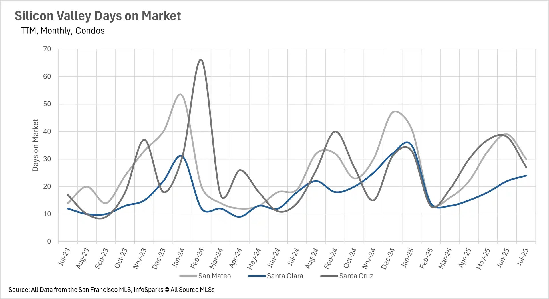
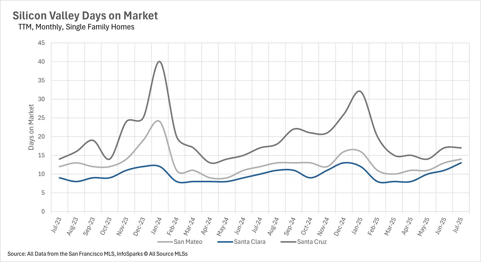
Despite varying inventory conditions, one consistent trend emerges across the Bay Area: homes are taking longer to sell. The East Bay has seen particularly dramatic increases, with single-family homes now spending 16-18 days on market compared to 13 days last year, while condos are taking 31-35 days versus 19-24 days in 2024. Silicon Valley homes are still selling quickly at under 2.5 weeks, but even this represents an increase from last year. The North Bay is experiencing 20-30% longer listing periods in most markets, with some areas like Marin and Napa County condos seeing dramatic increases of 109.68% and 284.21% respectively.

Market dynamics shift toward more balanced conditions

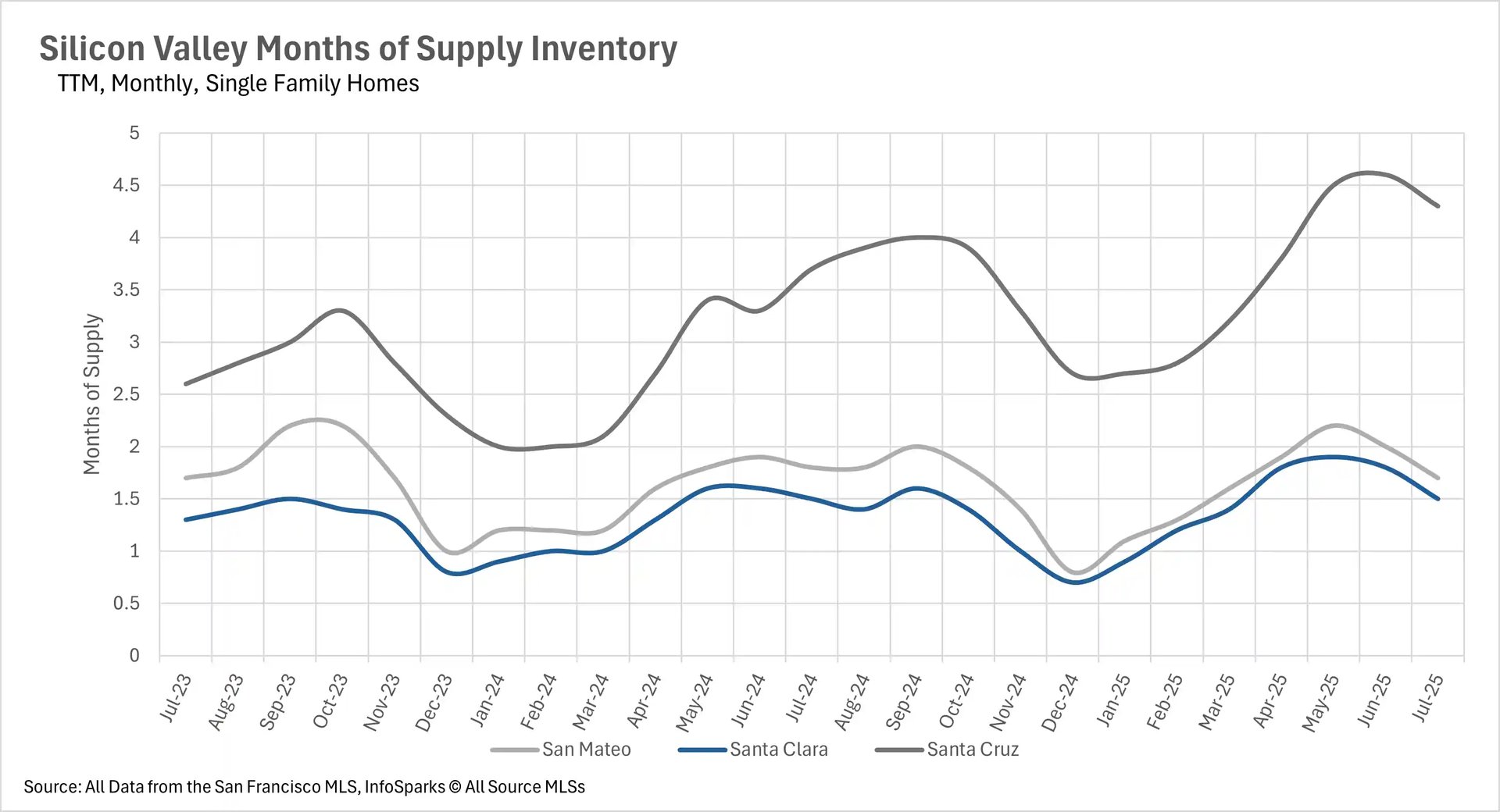
The changing inventory and pricing dynamics are reshaping market competitiveness across the Bay Area. San Mateo and Santa Clara Counties remain fiercely competitive sellers' markets with just 1.7 and 1.5 months of supply respectively. However, other areas are trending toward more balanced conditions, with Marin County's single-family market flipping to a sellers' market at 2.3 months of supply, while San Francisco's condo market is approaching balance at 3.1 months. The East Bay maintains sellers' market conditions for single-family homes despite falling prices, while condo markets across most regions have shifted to buyer-friendly conditions with 3.4 to 5.7 months of supply available.

Local Lowdown Data

A line graph titled "East Bay Days on Market, TTM, Monthly, Condos" showing the number of days condos have been on the market in Alameda (gray line) and Contra Costa (blue line) counties from July 2023 to July 2025. The data shows a general trend of increasing days on the market for both counties from early 2024 to mid-2024, followed by a decrease and then another increase into mid-2025.

A line graph titled "East Bay Days on Market, TTM, Monthly, Single Family Homes" showing the number of days single-family homes have been on the market in Alameda (gray line) and Contra Costa (blue line) counties from July 2023 to July 2025. Both counties show a similar trend with peaks in early 2024 and late 2024, and a low point in early 2025.

A bar and line graph titled "East Bay Inventory - Condos, Two Year, Monthly" showing New Listings (dark blue bars), Sold Listings (light blue bars), and For Sale inventory (pink line) for condos from July 2023 to July 2025. The graph indicates a general increase in all three metrics from late 2023 to mid-2024, with inventory peaking in mid-2025.

A bar and line graph titled "East Bay Inventory - Single-Family Homes, Two Year, Monthly" showing New Listings (dark blue bars), Sold Listings (light blue bars), and For Sale inventory (pink line) for single-family homes from July 2023 to July 2025. The graph shows a general increase in new and sold listings from late 2023 to mid-2024 and then a decline. The "For Sale" inventory line shows a clear seasonal pattern, peaking in the spring/summer of both 2024 and 2025.

A bar chart titled "East Bay Median Condo Price Changes, TTM, Year-Over-Year, Condos" showing the year-over-year percentage change in median condo prices for Alameda (gray bars) and Contra Costa (blue bars) from August 2024 to July 2025. The data indicates significant negative price changes in Alameda from January 2025 onward, while Contra Costa shows more mixed but generally negative changes in the same period.

A line graph titled "East Bay Median Condo Prices, Three-Year, Monthly, Condos" showing the median condo prices in Alameda (gray line) and Contra Costa (blue line) counties from July 2022 to July 2025. The graph shows that prices in Contra Costa County are consistently lower than in Alameda County. Both lines fluctuate, with Alameda prices generally trending downward and Contra Costa prices remaining relatively stable.

A bar chart titled "East Bay Median Single-Family Home Price Changes, TTM, Year-Over-Year, Single Family Homes" showing the year-over-year percentage change in median single-family home prices for Alameda (gray bars) and Contra Costa (blue bars) from August 2024 to July 2025. The data shows a decline in prices for both counties in the most recent months, with Contra Costa showing more significant negative changes in April and July 2025.

A line graph titled "East Bay Months of Supply Inventory, TTM, Monthly, Condos" showing the months of supply for condos in Alameda (gray line) and Contra Costa (blue line) counties from July 2023 to July 2025. The graph shows an increasing trend in months of supply for both counties, indicating a shift towards a buyer's market.

A line graph titled "East Bay Months of Supply Inventory, TTM, Monthly, Single Family Homes" showing the months of supply for single-family homes in Alameda (gray line) and Contra Costa (blue line) counties from July 2023 to July 2025. The graph indicates a tightening supply in early 2024, followed by a significant increase in supply from March 2024 to June 2025 for both counties.

A line graph titled "East Bay Median Single-Family Home Prices, Three-Year, Monthly, Single Family Homes" showing the median single-family home prices in Alameda (gray line) and Contra Costa (blue line) counties from July 2022 to July 2025. The graph shows that prices in Alameda County are consistently higher than in Contra Costa County. Both lines show significant fluctuations but a generally stable, or slightly declining, trend over the last year.

A line chart titled 'North Bay Days on Market TTM, Monthly, Condos' showing the days on market for condos in four North Bay counties from July 2023 to July 2025. The data is for Sonoma, Marin, Solano, and Napa counties, with Napa showing the most volatility and a peak of around 190 days on market in March 2025.

A line chart titled 'North Bay Days on Market TTM, Monthly, Single Family Homes' showing the days on market for single-family homes in four North Bay counties from July 2023 to July 2025. Napa has the highest peak around 85 days in February 2024 and again around 85 days in February 2025, while the other counties generally hover between 20 and 50 days.

A bar and line chart titled 'North Bay Inventory - Condos' from July 2023 to July 2025. The bars show the number of new and sold listings, while a pink line shows the number of for-sale listings. For-sale listings peaked around 425 in May 2025 and new listings generally outnumber sold listings, with a few exceptions.

A bar and line chart titled 'North Bay Inventory - Single-Family Homes' from July 2023 to July 2025. The bars show the number of new and sold listings, while a pink line shows the number of for-sale listings. For-sale listings peaked around 4,000 in May 2025 and new listings are consistently higher than sold listings.

A bar chart titled 'North Bay Median Condo Price Changes TTM, Year-Over-Year, Condos' from August 2024 to July 2025. The chart shows the year-over-year percentage change in median condo prices for Sonoma, Marin, Solano, and Napa counties. Napa shows an extreme increase of over 175% in February 2025 and over 75% in July 2025.

A line chart titled 'North Bay Median Condo Prices Three-Year, Monthly, Condos' from July 2022 to July 2025. The chart shows the median condo prices for Sonoma, Marin, Solano, and Napa counties. The Napa line shows extreme fluctuations, with a peak of over $1.2 million in October 2023 and another peak of over $1.4 million in February 2025.

A bar chart titled 'North Bay Median Single-Family Home Price Changes TTM, Year-Over-Year, Single Family Homes' from August 2024 to July 2025. The chart shows the year-over-year percentage change in median single-family home prices for Sonoma, Marin, Solano, and Napa counties. Napa shows a dramatic increase of over 20% in February 2025 and a significant decrease of about 15% in July 2025.

A line chart titled 'North Bay Median Single-Family Home Prices Three-Year, Monthly, Single Family Homes' from July 2022 to July 2025. The chart shows the median single-family home prices for Sonoma, Marin, Solano, and Napa counties. Marin has the highest prices, peaking near $2 million in mid-2023 and again in early 2025. The other counties show prices consistently below Marin.

A line chart titled 'North Bay Months of Supply Inventory TTM, Monthly, Condos' showing months of supply for condos in four North Bay counties from July 2023 to July 2025. The chart shows that months of supply for Napa is consistently higher than the other counties, with a peak of over 9 months in May and June 2025.

A line chart titled 'North Bay Months of Supply Inventory TTM, Monthly, Single Family Homes' showing months of supply for single-family homes in four North Bay counties from July 2023 to July 2025. Napa consistently has the highest months of supply, peaking at around 8.5 months in May and June 2025.

A line graph titled "San Francisco Average % of Original Price" showing data for single-family homes and condos over a three-year period, from July 2022 to July 2025. The y-axis shows the percent of the original price from 90% to 120%. The single-family home line fluctuates between 100% and 115%. The condo line remains mostly between 95% and 100%, with dips below 95% in late 2023 and early 2024.

A line graph titled "San Francisco Days on Market" showing TTM (Trailing Twelve Months) monthly data for single-family homes and condos. The y-axis shows days on market from 0 to 90. The condo line shows a significant peak around 80 days in early 2024 and another peak around the same time in 2025. The single-family home line remains much lower, mostly below 30 days, with a peak around 50 days in early 2024.

A bar and line graph titled "San Francisco Inventory - Condos" showing two years of monthly data. The bar chart represents new listings (dark blue) and sold listings (light blue) with a y-axis from 0 to 500. The pink line represents "For Sale" listings, with a y-axis from 0 to 1000. The number of for-sale condos peaks around 800 in late 2023 and late 2024.

A bar and line graph titled "San Francisco Inventory - Single-Family Homes" showing two years of monthly data. The bar chart represents new listings (dark blue) and sold listings (light blue) with a y-axis from 0 to 5,000. The pink line represents "For Sale" listings, with a y-axis from 0 to 6,000. The for-sale listings peaked above 4,000 in late 2023 and again in late 2024.

A bar graph titled "San Francisco Median Price Changes," showing TTM (Trailing Twelve Months) year-over-year data for single-family homes and condos. The y-axis shows median price changes from -15.00% to 15.00%. The single-family home (light gray) and condo (dark blue) bars show both positive and negative changes, with a significant negative change for condos in July 2025.

A line graph titled "San Francisco Median Prices" showing three years of monthly data for single-family homes and condos. The y-axis shows median prices from $0.5M to $2.0M. The single-family home line (light gray) is consistently higher than the condo line (dark blue), with single-family home prices peaking above $1.75M and condo prices peaking above $1.25M.

A line graph titled "San Francisco Months of Supply Inventory," showing TTM (Trailing Twelve Months) monthly data for single-family homes and condos. The y-axis shows months of supply from 0 to 6. The condo line (dark blue) is consistently higher than the single-family home line (light gray), with the condo supply peaking at over 5 months in late 2023 and late 2024, and the single-family home supply peaking at just over 3 months in late 2023.

A line graph titled "Silicon Valley Days on Market" for Condos. The x-axis shows months from July 2023 to July 2025. The y-axis shows Days on Market from 0 to 70. There are three lines representing San Mateo (gray), Santa Clara (blue), and Santa Cruz (dark gray). All three lines show a general upward trend in the first half of 2024, followed by a decline and then another increase. In July 2025, Santa Cruz has the highest days on market, followed by San Mateo and then Santa Clara.

A line graph titled "Silicon Valley Days on Market" for Single Family Homes. The x-axis shows months from July 2023 to July 2025. The y-axis shows Days on Market from 0 to 45. There are three lines representing San Mateo (gray), Santa Clara (blue), and Santa Cruz (dark gray). Santa Cruz consistently has the highest days on market, with a peak around January 2024. Santa Clara and San Mateo have similar, lower values, with a slight upward trend in July 2025.

A bar and line chart titled "Silicon Valley Inventory - Condos." The x-axis shows months from July 2023 to July 2025. The left y-axis shows New Listings and Sold Listings from 0 to 600, while the right y-axis shows For Sale Listings from 0 to 1000. Blue bars represent New Listings, light blue bars represent Sold Listings, and a pink line represents For Sale Listings. The "For Sale" line shows a significant increase from January 2024 to May 2025. New listings and sold listings show seasonal fluctuations.

A bar and line chart titled "Silicon Valley Inventory - Single-Family Homes." The x-axis shows months from July 2023 to July 2025. The left y-axis shows New Listings and Sold Listings from 0 to 2.5K, and the right y-axis shows For Sale Listings from 0 to 3.0K. Dark blue bars represent New Listings, light blue bars represent Sold Listings, and a pink line represents For Sale Listings. The "For Sale" line shows an increase from January 2024 to May 2025. New and sold listings show a seasonal pattern with peaks in the spring and summer.

A bar chart titled "Silicon Valley Median Price Changes" for Condos. The x-axis shows months from August 2024 to July 2025. The y-axis shows Median Price Changes from -25.00% to 25.00%. The chart compares year-over-year median price changes for San Mateo (gray), Santa Clara (blue), and Santa Cruz (dark gray). The bars show significant volatility, with Santa Cruz experiencing large drops in December 2024 and June 2025, and a large increase in July 2025. San Mateo and Santa Clara show more modest changes.

A line graph titled "Silicon Valley Median Condo Prices." The x-axis shows months from July 2022 to July 2025. The y-axis shows Median Prices from $200k to $1.0M. There are three lines representing San Mateo (gray), Santa Clara (blue), and Santa Cruz (dark gray). All three lines show prices fluctuating, generally staying within the $600k to $900k range over the three-year period.

A bar chart titled "Silicon Valley Median Price Changes" for Single Family Homes. The x-axis shows months from August 2024 to July 2025. The y-axis shows Median Price Changes from -15.00% to 25.00%. The chart compares year-over-year median price changes for San Mateo (gray), Santa Clara (blue), and Santa Cruz (dark gray). Santa Mateo shows a significant price increase in November and December 2024, while Santa Cruz experiences a large drop in April and May 2025. Santa Clara generally shows positive price changes.

A line graph titled "Silicon Valley Median Single-Family Home Prices." The x-axis shows months from July 2022 to July 2025. The y-axis shows Median Prices from $500k to $2.5M. There are three lines representing San Mateo (gray), Santa Clara (blue), and Santa Cruz (dark gray). Santa Clara and San Mateo prices are consistently higher than Santa Cruz prices, with all three lines showing a general upward trend since early 2023, followed by a slight decline in the first half of 2025.

A line graph titled "Silicon Valley Months of Supply Inventory" for Condos. The x-axis shows months from July 2023 to July 2025. The y-axis shows Months of Supply from 0 to 7. There are three lines representing San Mateo (gray), Santa Clara (blue), and Santa Cruz (dark gray). Santa Cruz and San Mateo show a steady increase in supply from late 2024 to July 2025, while Santa Clara's supply remains relatively stable, peaking in July 2025.

A line graph titled "Silicon Valley Months of Supply Inventory" for Single Family Homes. The x-axis shows months from July 2023 to July 2025. The y-axis shows Months of Supply from 0 to 5. There are three lines representing San Mateo (gray), Santa Clara (blue), and Santa Cruz (dark gray). Santa Cruz's supply is consistently the highest, showing a significant increase from late 2024 to May 2025. Santa Clara and San Mateo have similar, lower supply levels, with San Mateo's supply increasing more sharply than Santa Clara's in 2025.

Let’s Talk

You’ve got questions and we can’t wait to answer them.

Follow Us on Instagram