When it comes to designing open concept luxury homes, the choice of interior colors is crucial in shaping the overall ambiance and ensuring a seamless flow between spaces. Unlike traditional room-by-room layouts, open concept designs merge living, dining, and kitchen areas into a unified space, which makes color selection both a strategic and creative endeavor. Here’s an in-depth look at the interior colors used in open concept luxury homes and how to achieve elegant decor that enhances the sophistication of your living environment.
The Role of luxury home interior paint colors
Open concept layouts are designed to create a sense of fluidity and connection across different areas of the home. This design approach promotes a more expansive and cohesive feel, but it also requires careful consideration of color schemes. The right interior colors can enhance the openness, provide continuity, and contribute to the overall elegance of the home.
1. The Timeless Appeal of Neutrals
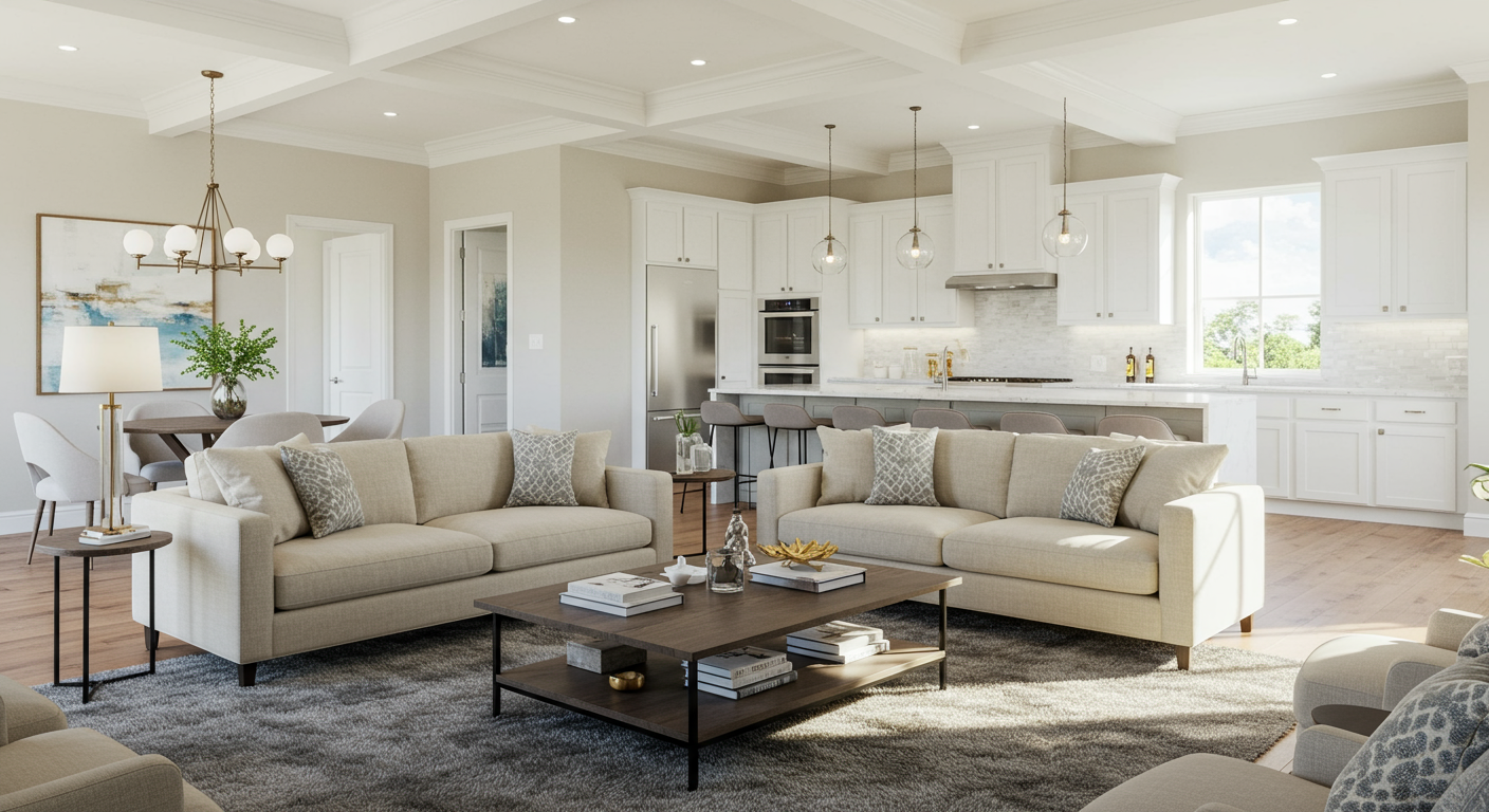
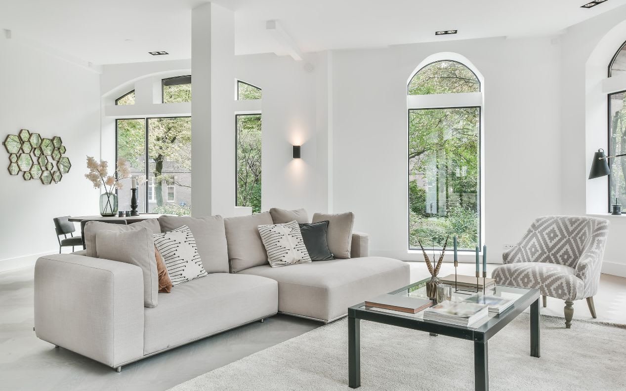
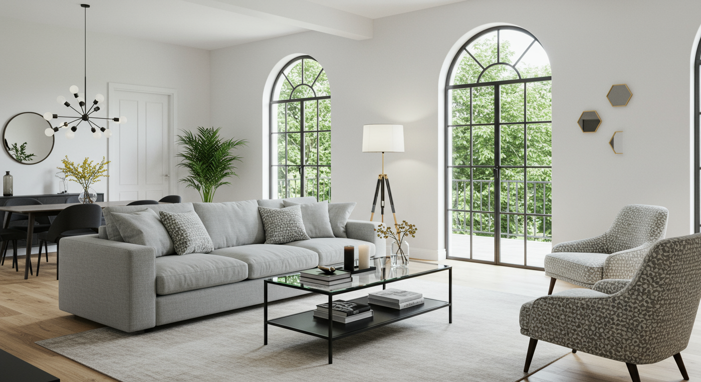
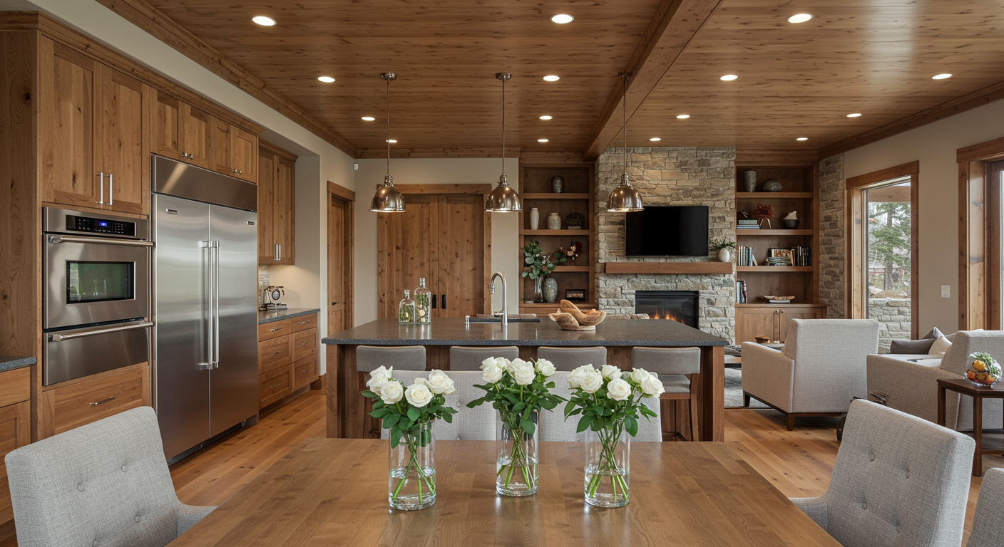
Neutral colors form the foundation of luxury home interior colors, offering versatility and a sophisticated backdrop. Shades such as soft grays, warm beiges, and creamy whites are particularly effective in open concept spaces because they create a seamless transition between different areas and reflect light beautifully, making the space feel larger and more airy.
To maximize the impact of neutral colors, consider layering different tones and textures. For example, a soft gray sofa paired with a beige area rug and ivory walls can create a harmonious and inviting atmosphere. Complement these neutrals with metallic accents, such as a brass lamp or a chrome coffee table, to add a touch of glamour and elevate the overall decor.
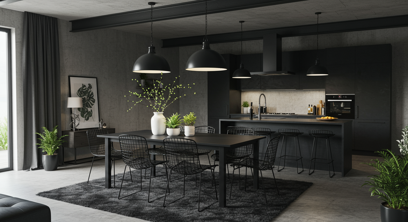
2. Introducing Bold Accent Colors
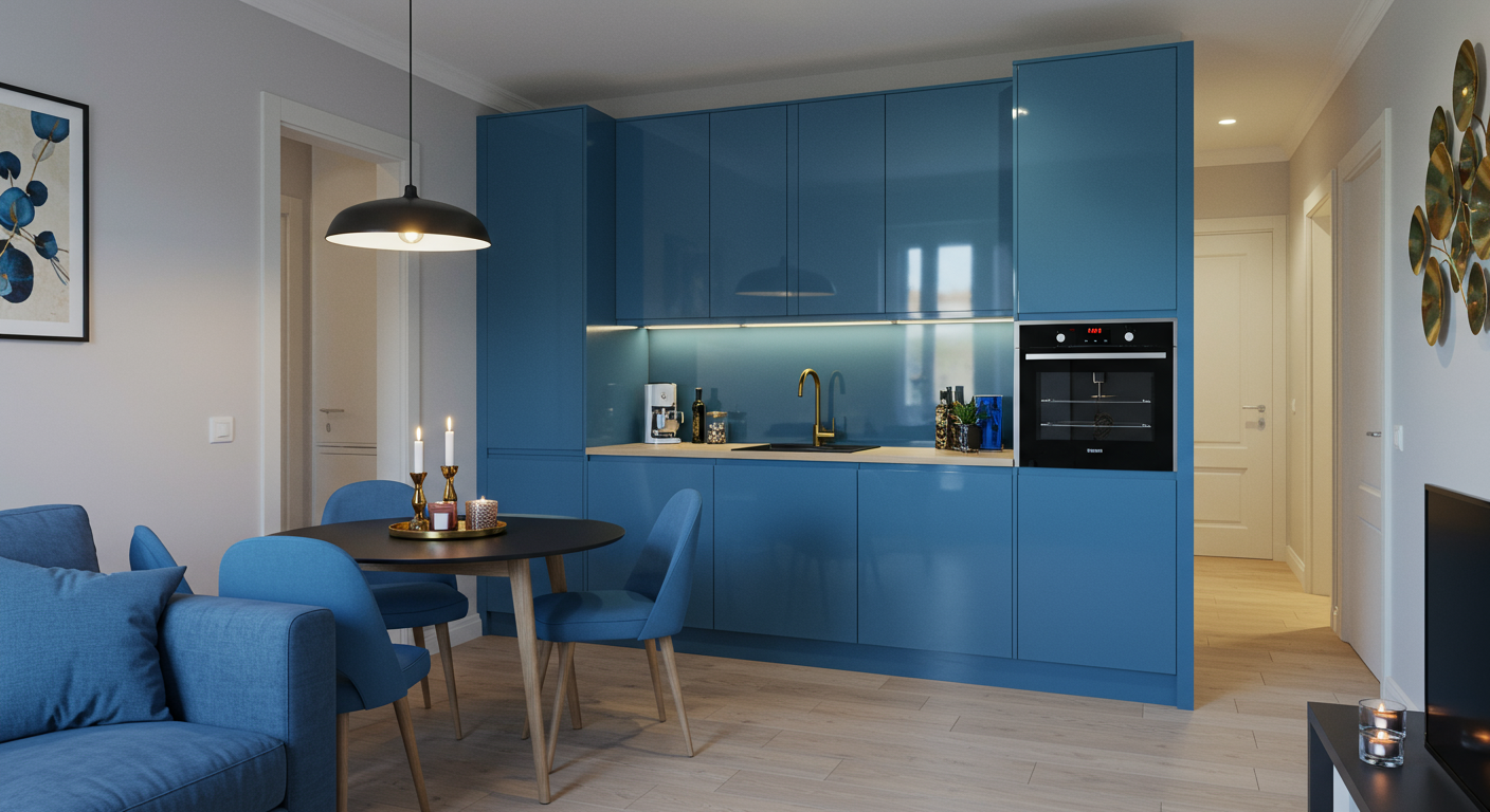
While neutrals provide a refined base, bold accent colors can infuse personality and vibrancy into open concept luxury homes. Deep hues like navy blue, emerald green, and charcoal black can be used strategically to create focal points and add depth. The key is to balance these strong colors with lighter tones to maintain an open and airy feel.
Incorporating bold colors can be as simple as using them in feature walls, statement furniture pieces, or decorative elements. For example, a rich navy blue accent wall in the dining area can draw attention and serve as a striking backdrop for elegant dining settings. To ensure cohesion, pair the accent wall with neutral furniture and decor in adjacent areas.
3. The Subtle Elegance of Soft Pastels
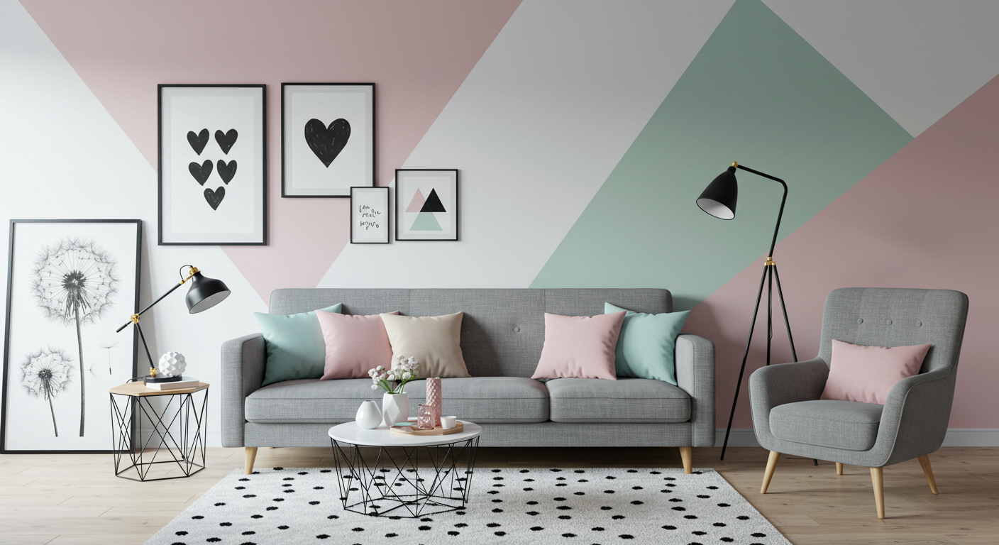
Soft pastels offer a gentle and serene alternative to bold colors. Shades like blush pink, mint green, and lavender introduce a soothing and sophisticated touch to open concept spaces. Pastels are particularly effective in creating a calming environment and can be used in various elements, including throw pillows, artwork, and curtains.
Pastels work well when paired with neutral tones, providing a subtle contrast that highlights specific areas without overwhelming the space. For example, a pastel blue throw on a gray sofa can introduce a hint of color while maintaining a cohesive and elegant look. This approach adds visual interest and softness, enhancing the overall decor.
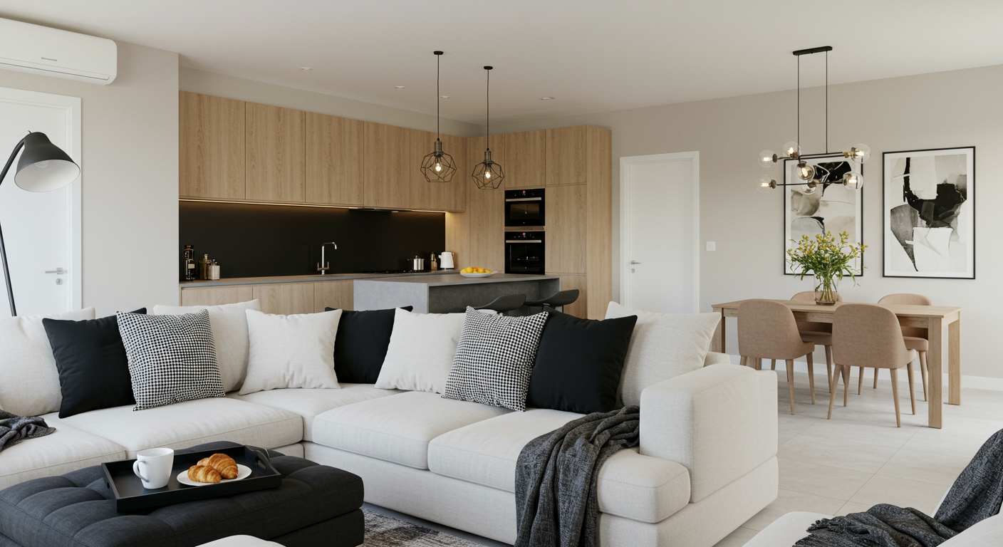
4. The Elegance of Monochromatic Schemes
A monochromatic color scheme involves using varying shades of a single color throughout the space. This approach creates a cohesive and sophisticated look, emphasizing the textures and materials in the home. Monochromatic schemes are particularly effective in modern and minimalist designs, where simplicity and elegance are paramount.
For instance, a range of gray shades can be layered to add depth and dimension, from light gray walls to dark gray upholstery and a medium gray rug. This approach ensures that the color palette remains cohesive while allowing the textures and materials to become the focal point. Monochromatic schemes can be complemented with accents in similar tones to enhance the visual appeal.
5. Balancing Warm and Cool Tones
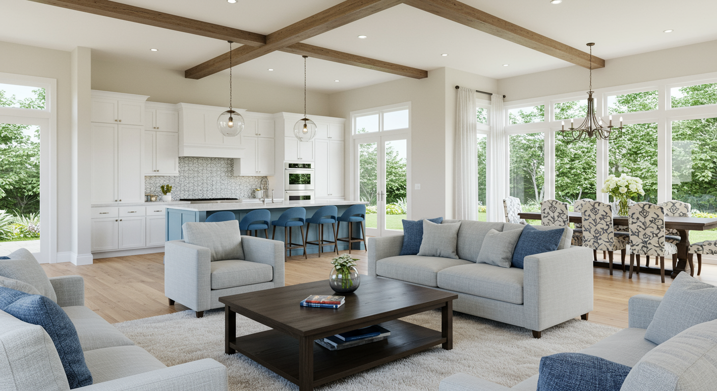
Balancing warm and cool tones is essential in open concept spaces to create a dynamic yet harmonious environment. Warm tones, such as taupe, terracotta, and gold, add richness and coziness, while cool tones like teal, charcoal, and silver offer a refreshing and crisp contrast.
To achieve balance, use warm tones in areas where comfort and warmth are desired, such as the living room and dining area. In contrast, cool tones can be introduced in spaces like the kitchen or home office for a modern and clean aesthetic. The interplay between warm and cool tones helps to maintain visual interest and cohesion throughout the open concept layout.
6. Drawing Inspiration from Nature
Nature-inspired colors can enhance the elegance and tranquility of open concept luxury homes. Earthy hues like sage green, sandy beige, and ocean blue evoke a sense of calm and connection to the natural world. These colors can be incorporated through wall paint, upholstery, or decorative accents to create a soothing and cohesive look.
Natural colors work beautifully with materials such as wood, stone, and greenery. For instance, a sage green accent wall can complement wooden furniture and indoor plants, creating a harmonious blend of color and texture. This approach not only enhances the visual appeal but also fosters a calming and inviting atmosphere.
7. The Power of Patterns and Textures
In addition to color, patterns and textures play a significant role in adding sophistication and depth to luxury interiors. Textured wall coverings, patterned rugs, and upholstered furniture can introduce visual interest and enhance the overall decor of open concept spaces.
When incorporating patterns, ensure they complement the existing color scheme. For example, a geometric patterned rug in neutral tones can add texture and visual interest without clashing with the overall palette. Similarly, textured wallpaper in a soft hue can create an elegant backdrop, enhancing the space while maintaining a cohesive look.
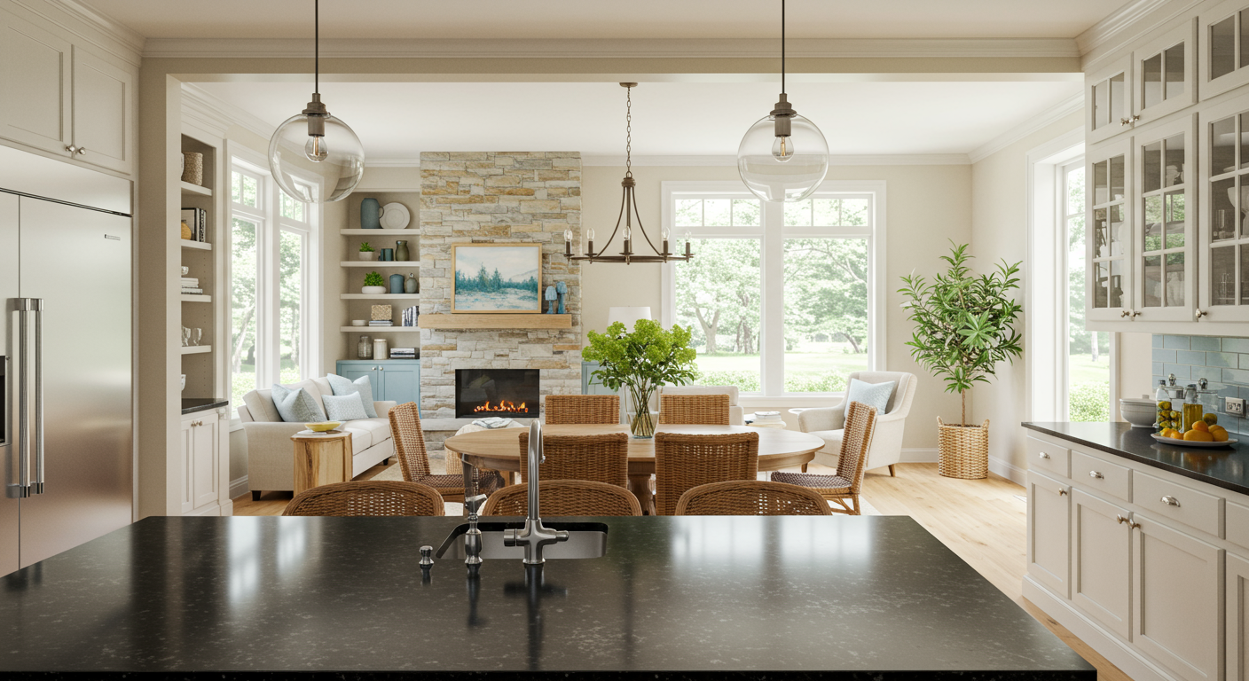
8. Coordinating with Architectural Elements
In open concept luxury homes, it’s important to coordinate the color scheme with architectural elements and features. Consider how colors interact with existing elements such as flooring, cabinetry, and fixtures. For instance, if your home features dark hardwood floors, you might choose lighter wall colors to create contrast and balance.
Architectural features like high ceilings and large windows also influence color choices. Light colors can help enhance the sense of space in areas with high ceilings, while darker shades can add warmth and intimacy to large rooms. By coordinating colors with architectural elements, you can create a harmonious and well-designed living environment.
9. Creating Zones Within Open Spaces
One of the challenges of open concept layouts is defining distinct zones within the space while maintaining a cohesive look. Use color to delineate different areas subtly. For example, you can introduce a different accent color or pattern in the dining area to distinguish it from the living room, while ensuring that the overall color scheme remains harmonious.
Area rugs, curtains, and furniture can also help define different zones within an open concept space. By incorporating complementary colors and patterns, you can create functional and aesthetically pleasing areas that flow seamlessly into each other.
Conclusion
Choosing the right interior colors for open concept luxury homes is both an art and a science. By embracing neutral elegance, balancing bold and soft hues, and drawing inspiration from nature, you can achieve a sophisticated and cohesive design. The key is to enhance the openness of the space while reflecting your personal style and achieving that refined, elegant decor.
Whether you’re renovating your current home or embarking on a new design project, thoughtful color choices will transform your open concept space into a luxurious and inviting haven. Enjoy sprucing up your space!