Berkeley California Golden Gate

Bay Area Real Estate Market Report - June 2025

The Local Lowdown

Quick Take:

  • Bay Area real estate markets show stark contrasts in May, with San Francisco surging while Silicon Valley's growth streak breaks and North Bay prices decline.
  • Inventory dynamics vary dramatically across regions, East Bay and Silicon Valley see massive increases while San Francisco and North Bay experience sharp declines.
  • The region's housing markets are increasingly polarized, with single-family homes generally favoring sellers while condo markets present significant opportunities for buyers.
  • Despite varying market conditions, homes are selling relatively quickly throughout most of the Bay Area, though condos are taking considerably longer in some areas.

Note: You can find the charts/graphs for the Local Lowdown at the end of this section.

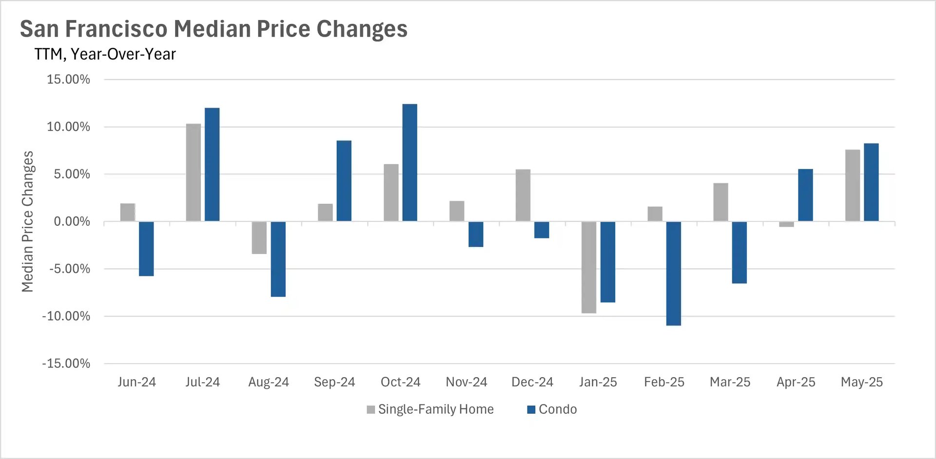
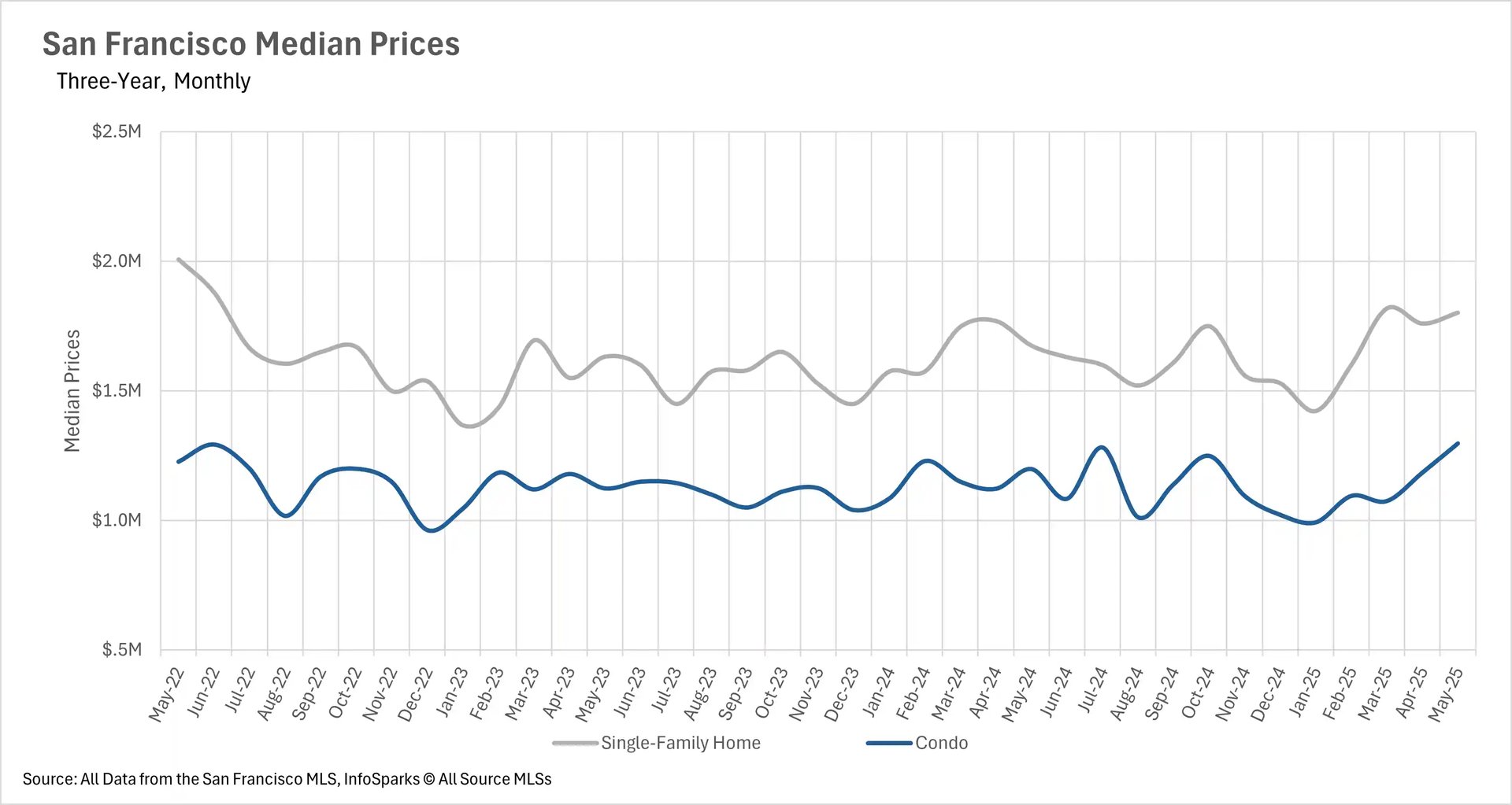
San Francisco leads price growth while other regions cool

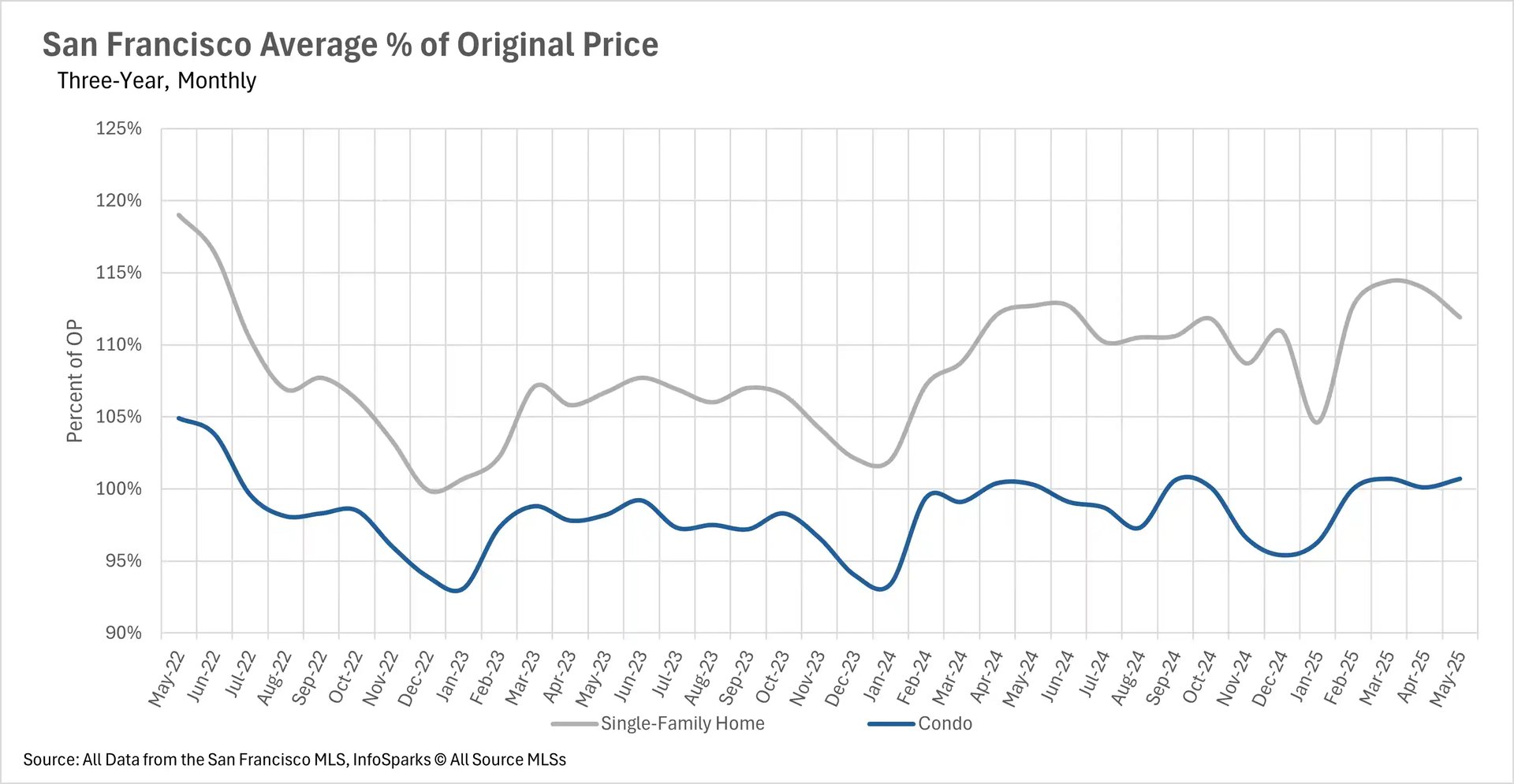
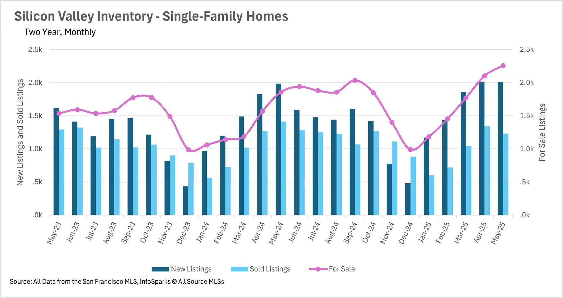
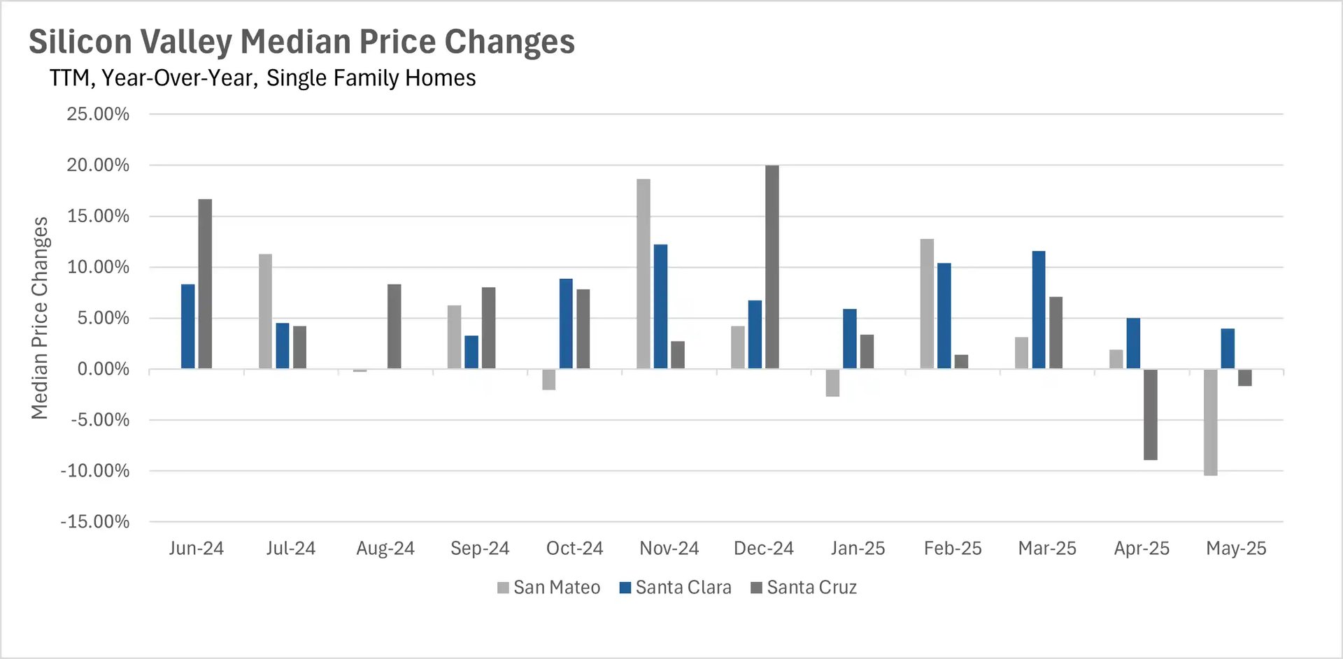
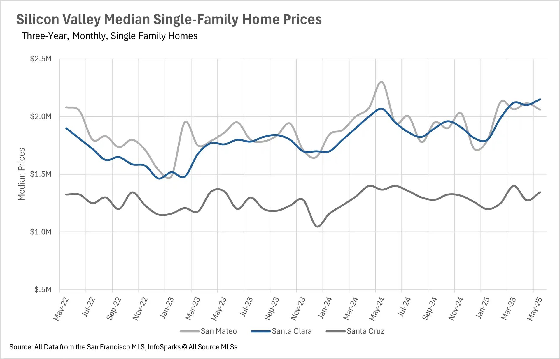
May showcased the Bay Area's increasingly divergent price trends. San Francisco demonstrated remarkable resilience with median single-family home prices surging 7.58% to $1,802,000 and condos jumping 8.26% to $1,298,000, reaching some of the highest levels seen in over two years. This contrasts sharply with Silicon Valley, where the nearly two-year growth streak finally broke. Santa Cruz and San Mateo Counties saw single-family home prices decline by 1.65% and 10.46% respectively, while Santa Clara County managed a modest 3.99% increase.

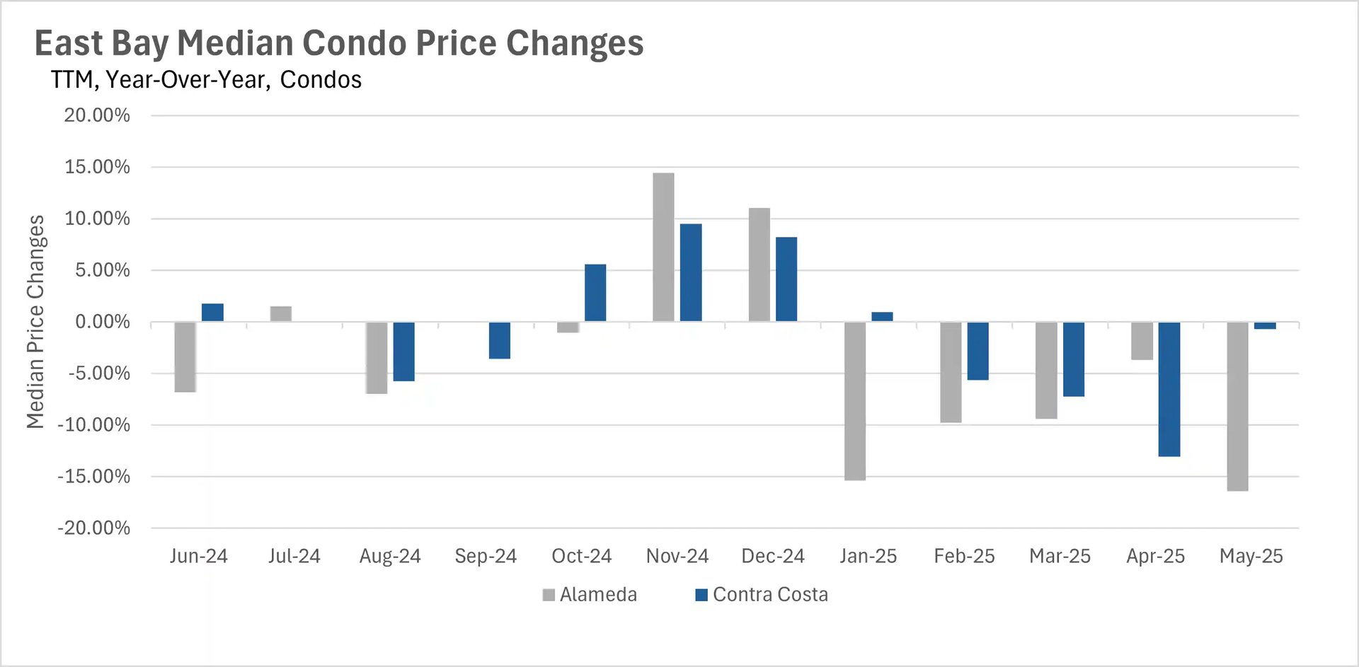
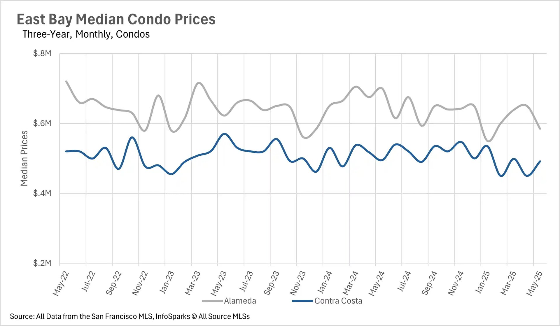
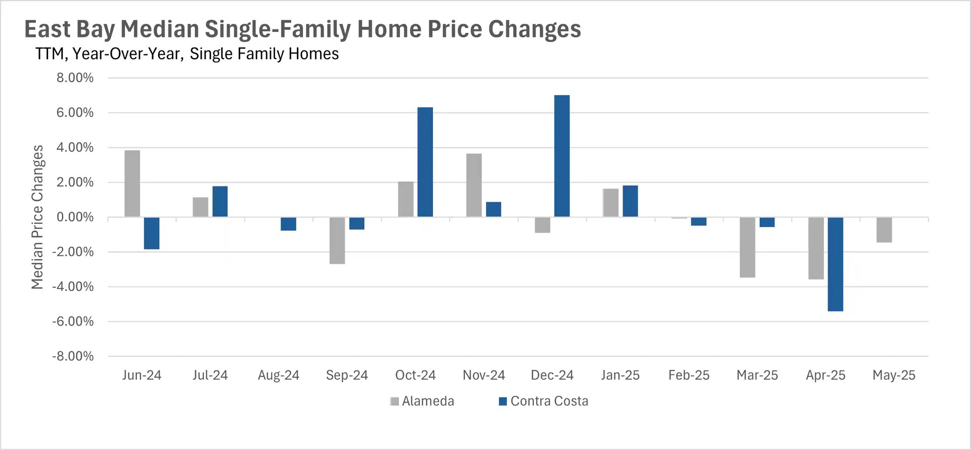
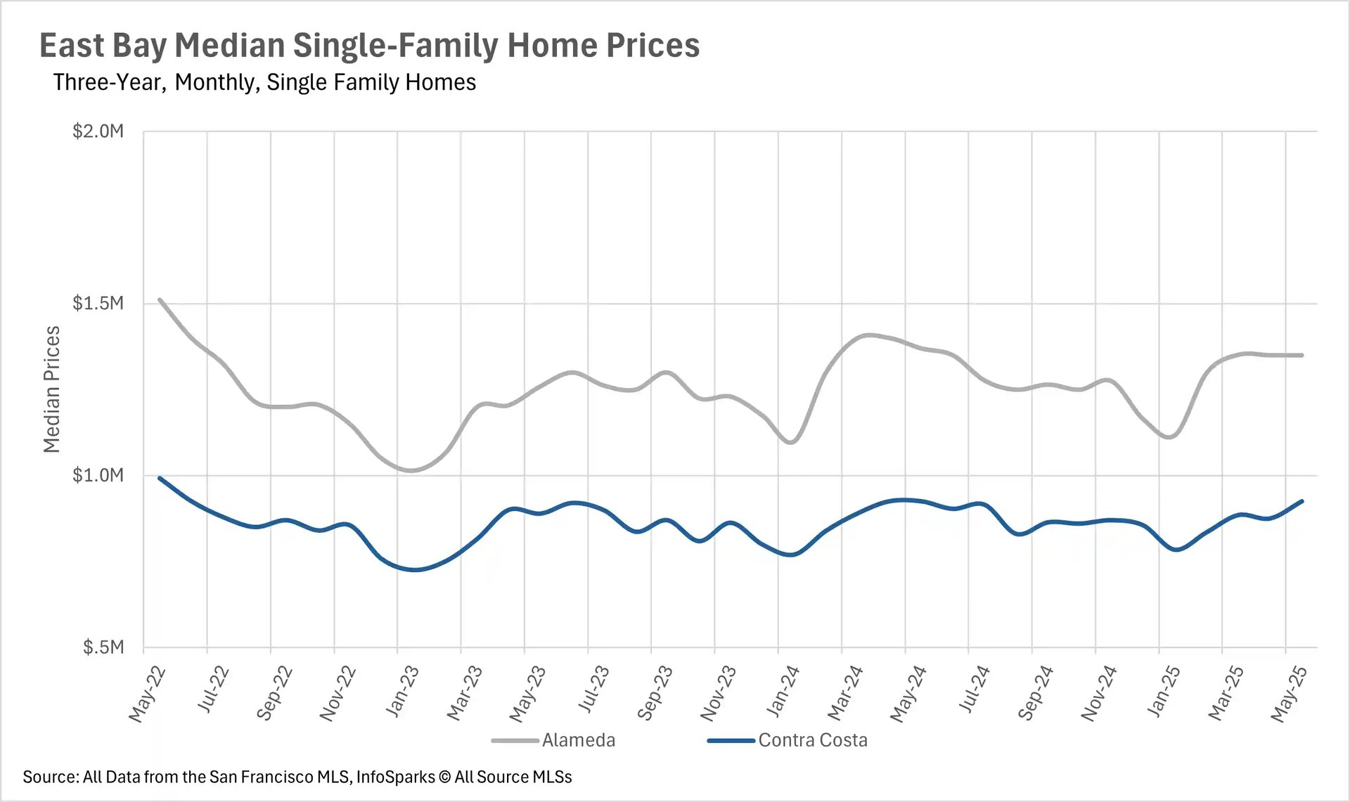
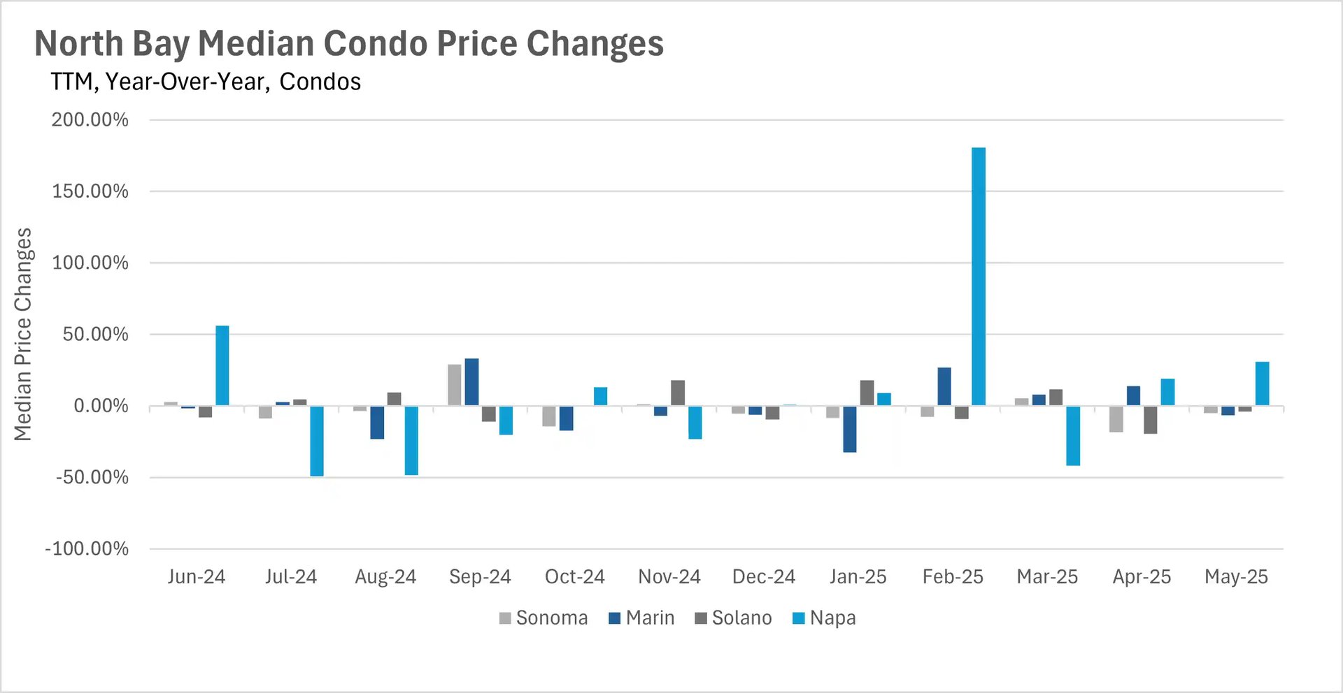
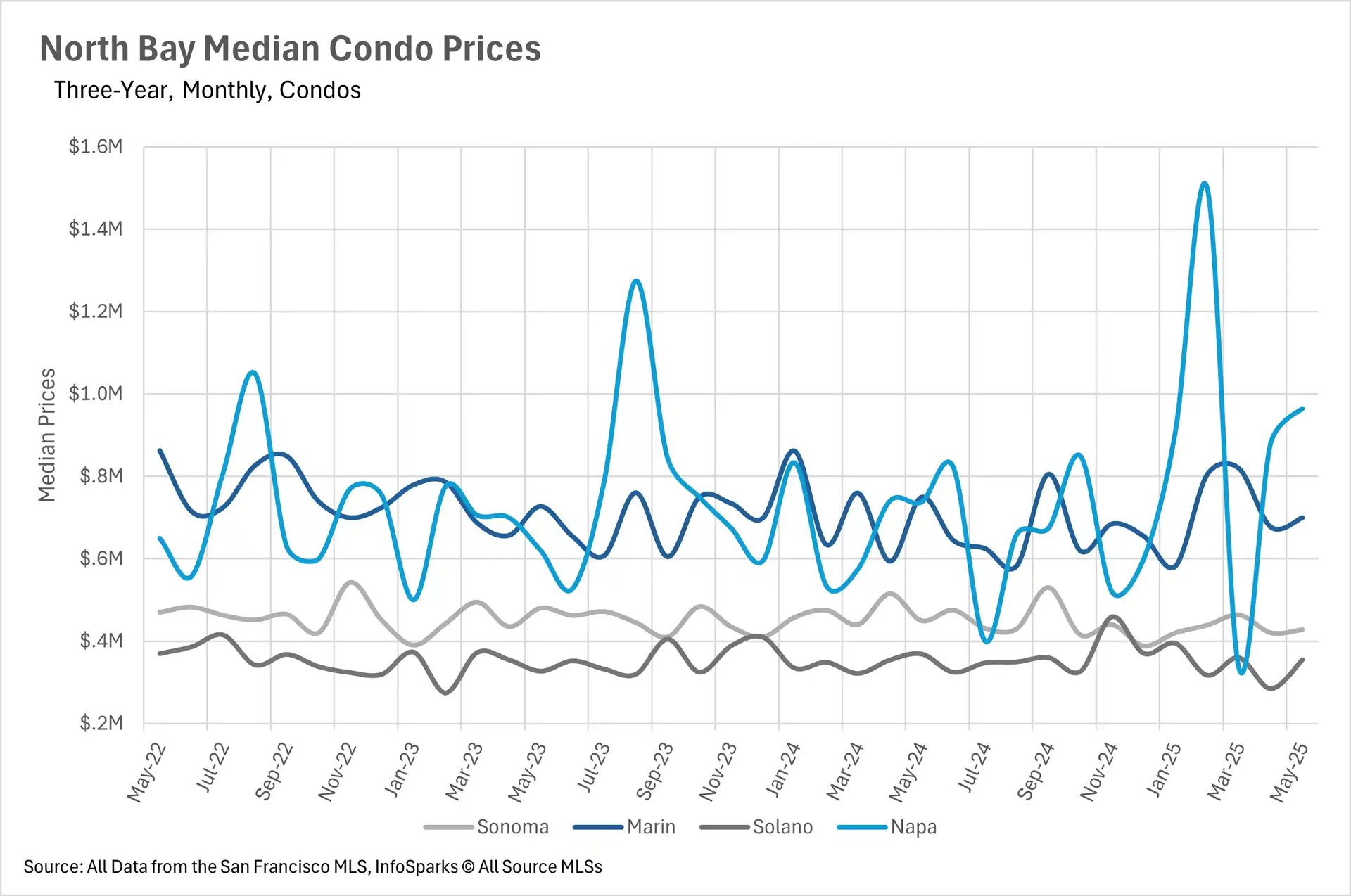
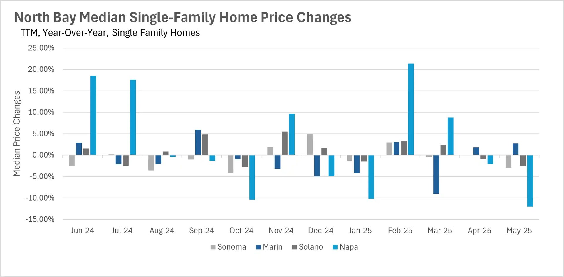
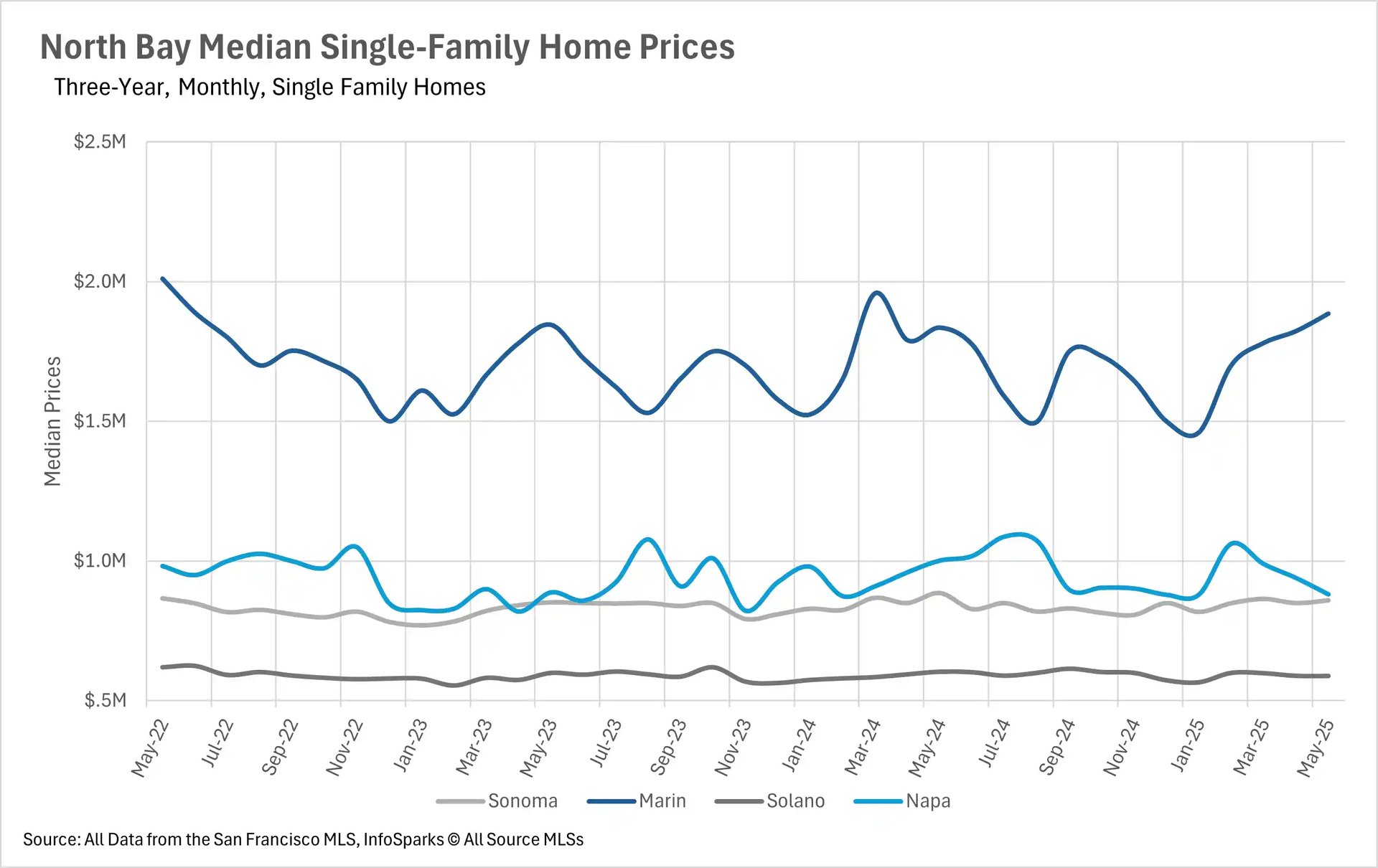
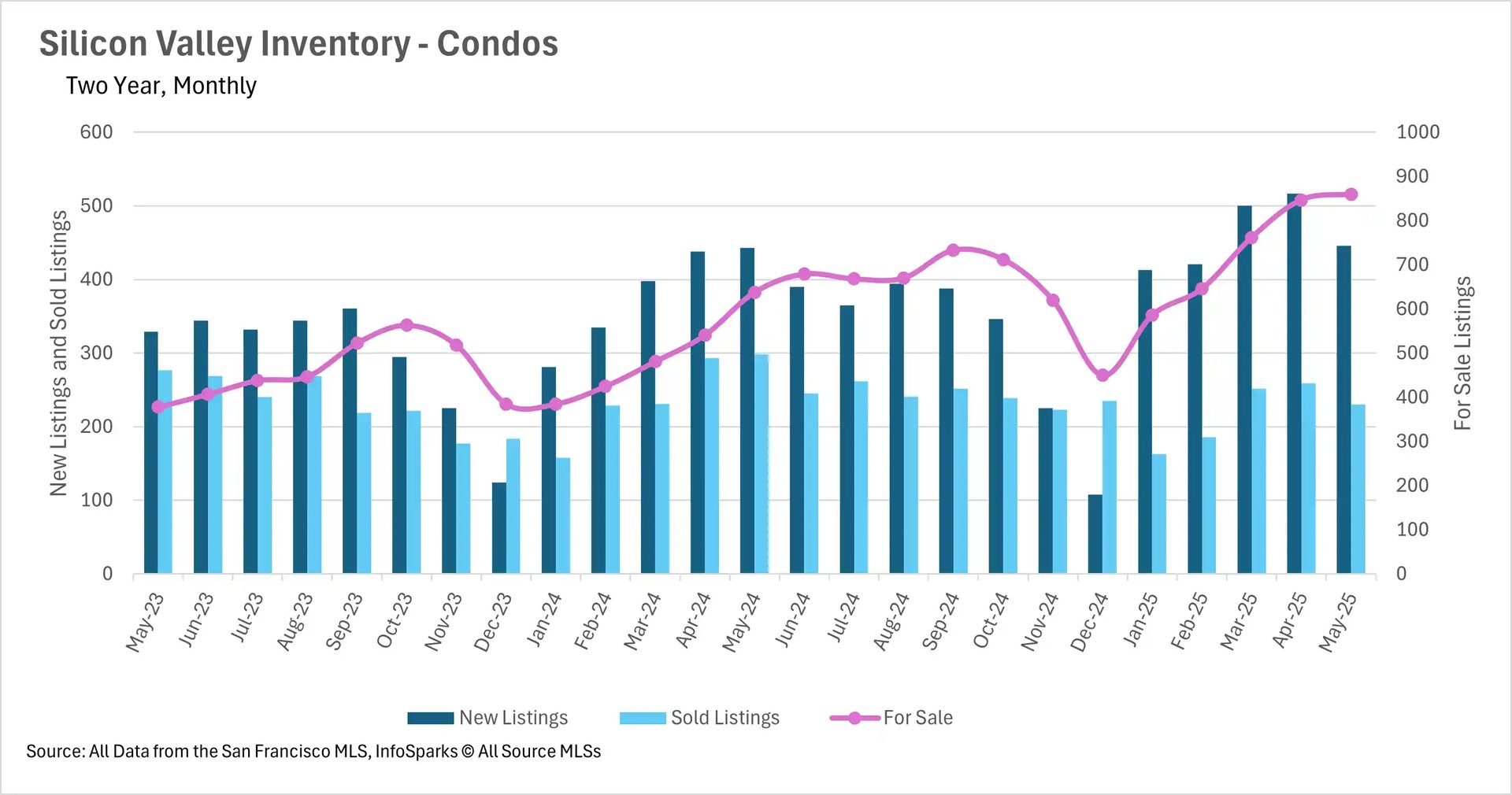
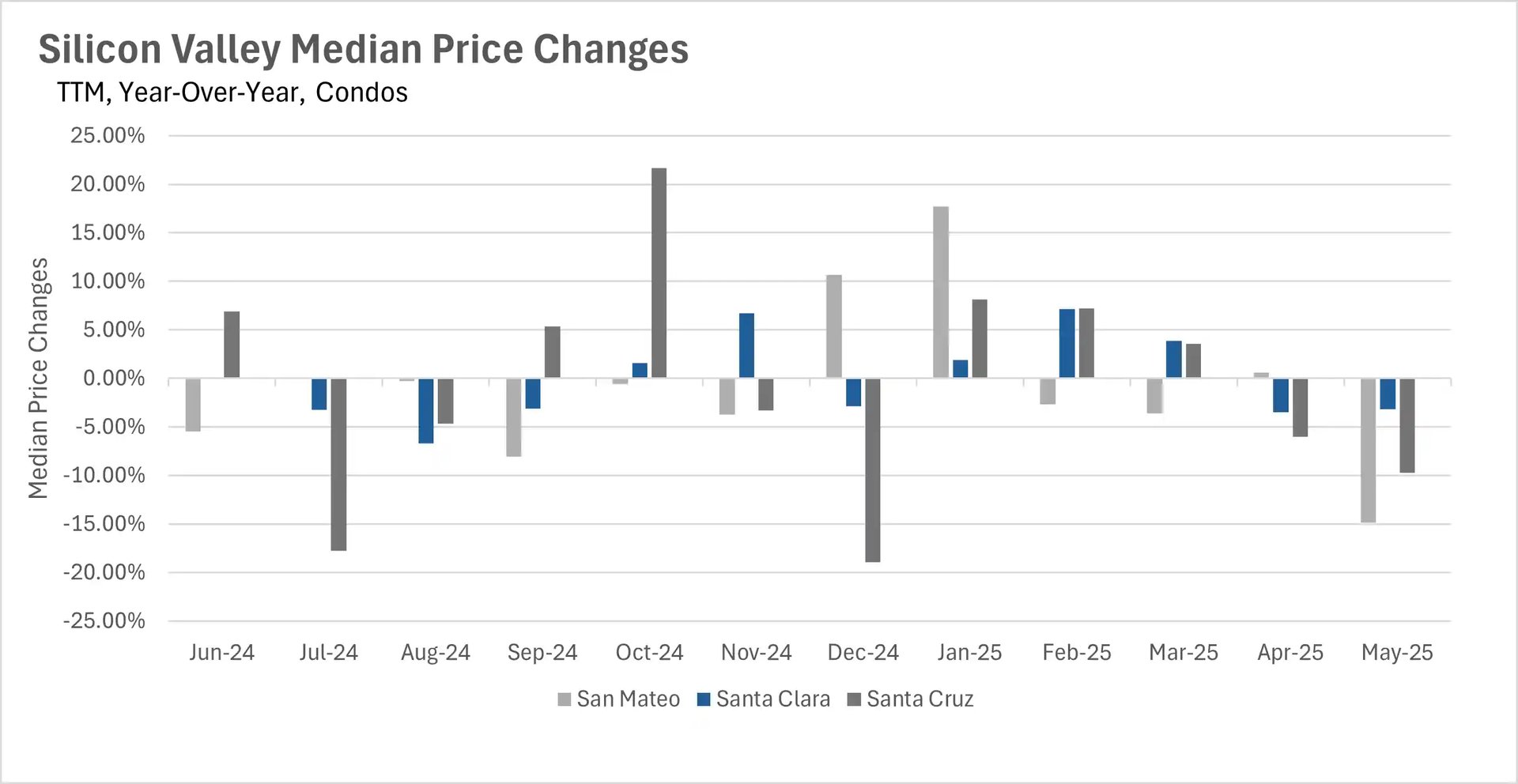
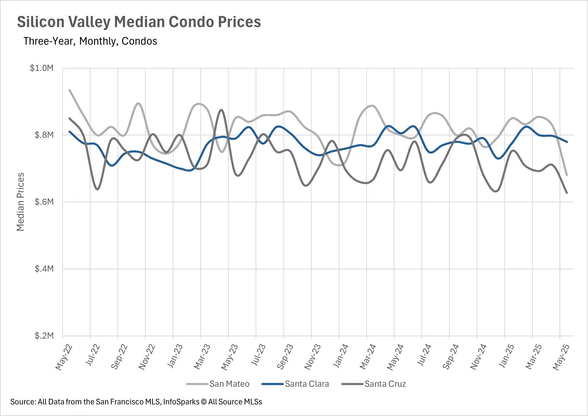
The condo market in Silicon Valley experienced even steeper declines, dropping 14.88% in San Mateo, 3.19% in Santa Clara, and 9.71% in Santa Cruz. Meanwhile, the North Bay showed widespread price weakness, with Napa County experiencing a dramatic 12.03% decline, while Solano and Sonoma Counties saw more modest decreases of 2.93% and 2.52%. Only Marin County bucked the trend with a 2.72% increase. The East Bay proved most resilient with minimal price movement, just 0.01% down in Contra Costa County and 1.46% down in Alameda County for single-family homes, though condos faced significant pressure with Alameda down 16.43%.

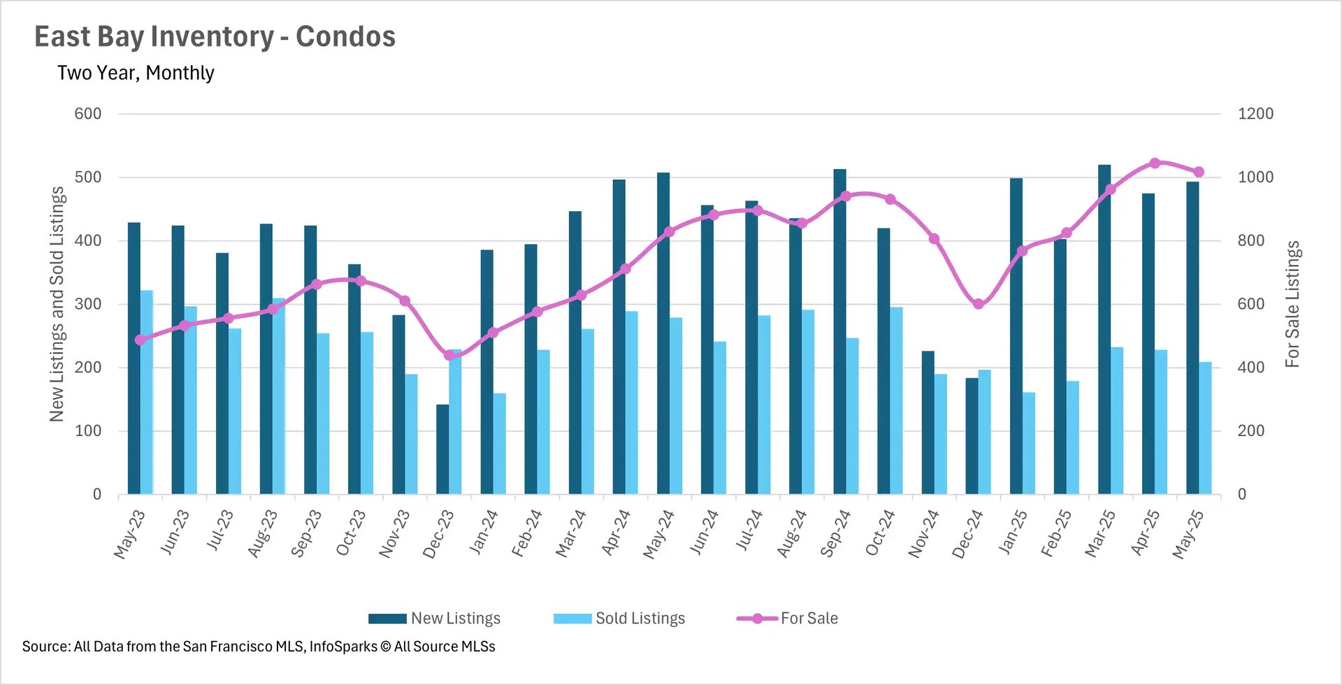
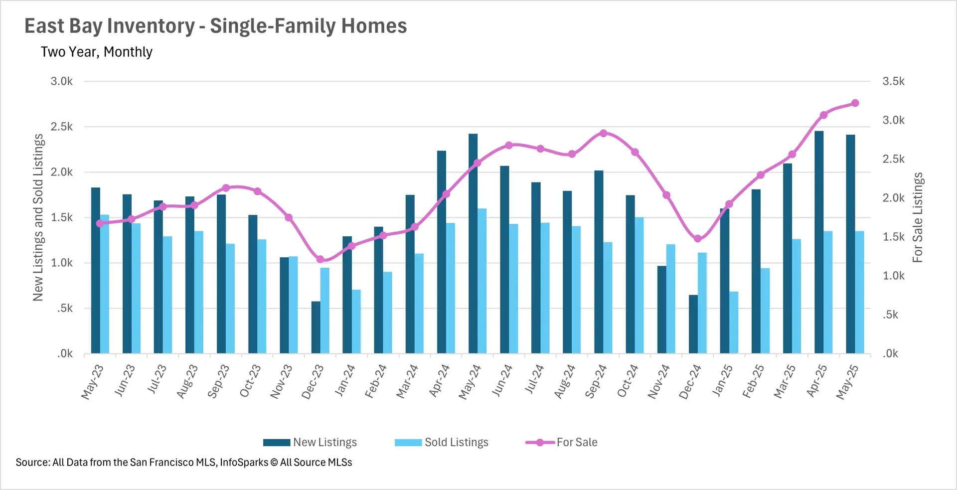
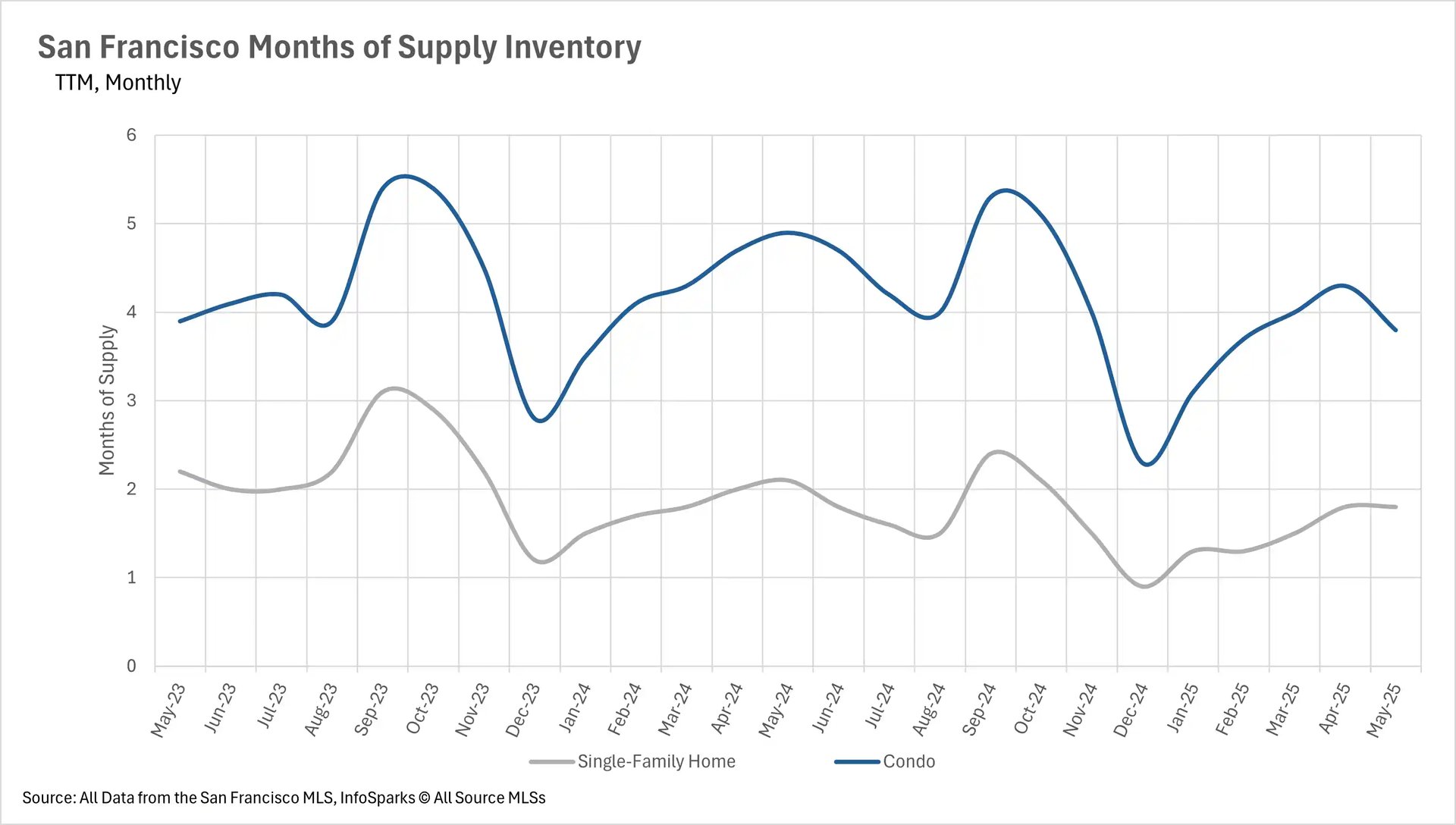
Inventory trends create a tale of two markets

May revealed stark inventory contrasts across the Bay Area. The East Bay and Silicon Valley experienced massive inventory buildups, with East Bay single-family home inventories reaching new two-year highs, increasing 31.42% year-over-year, while condo inventories grew 22.80%. Silicon Valley similarly set new records with single-family inventories jumping 21.65% and condo inventories surging 34.80%. Both regions attributed this to fewer sales rather than more listings, East Bay saw 15.57% fewer single-family home sales and 25.09% fewer condo sales, while Silicon Valley experienced 13.01% fewer single-family sales and 22.82% fewer condo sales.

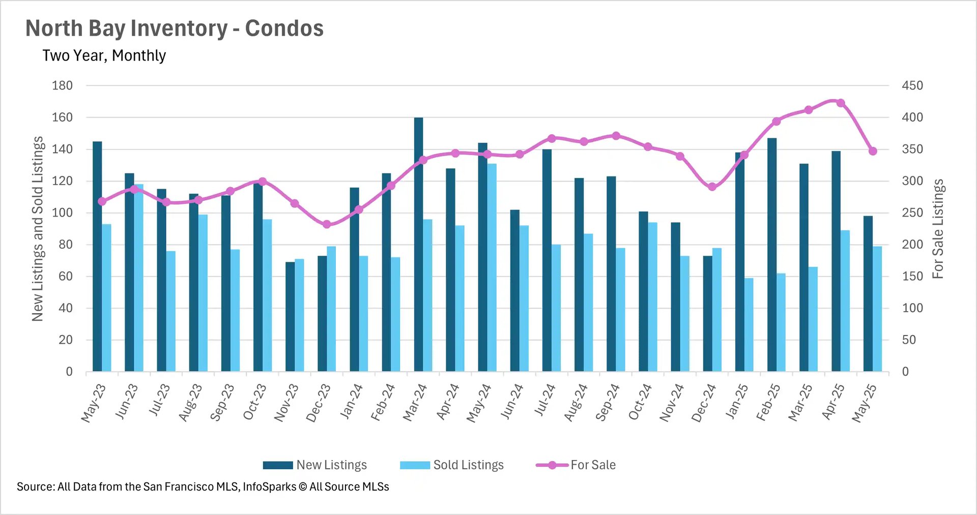
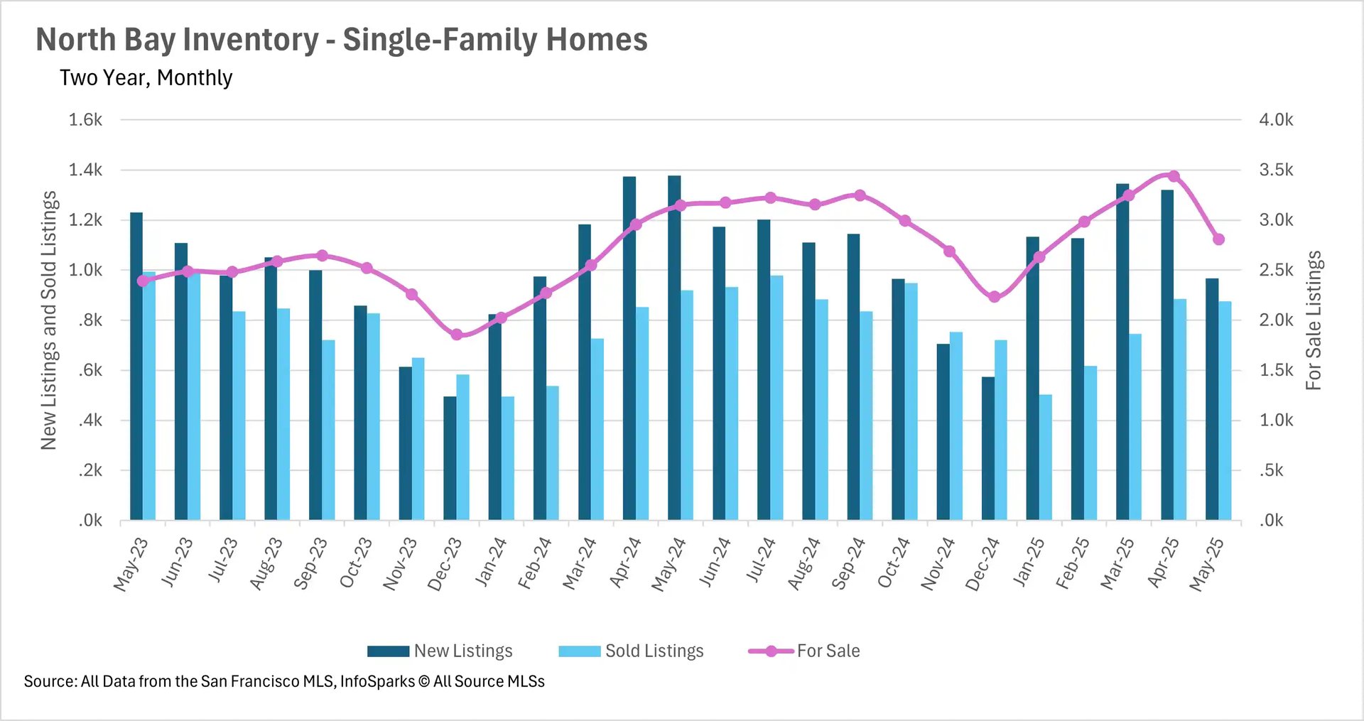
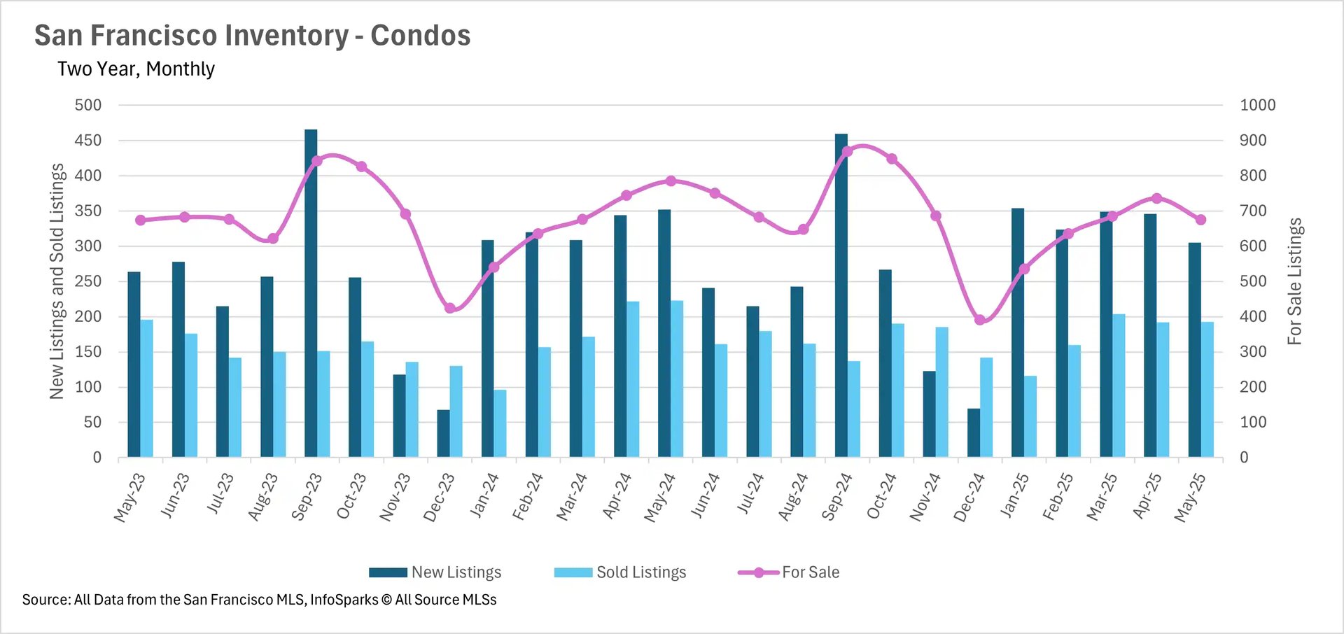
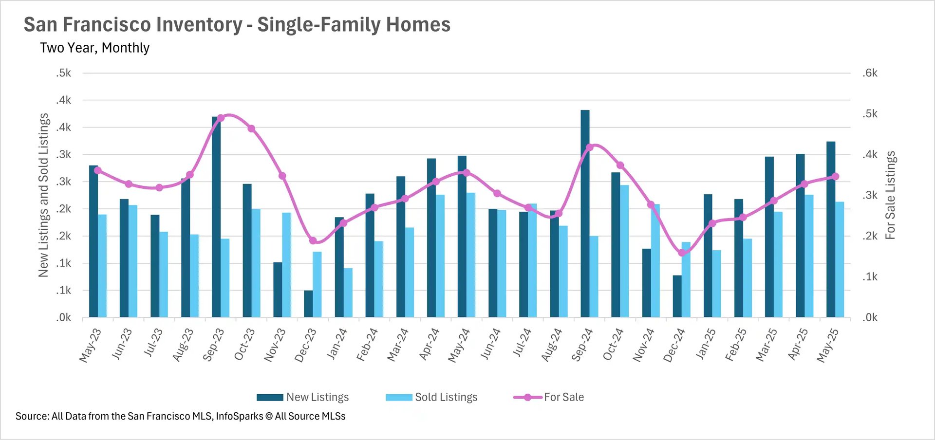
In dramatic contrast, San Francisco continued its multi-year inventory decline with single-family homes down 2.54% and condos falling 14.01% year-over-year. The North Bay also saw sharp inventory declines, with single-family home listings dropping 10.74% and new listings decreasing roughly 30% across both single-family homes and condos. This created a bifurcated Bay Area market where inventory abundance in some regions coincided with severe shortages in others.

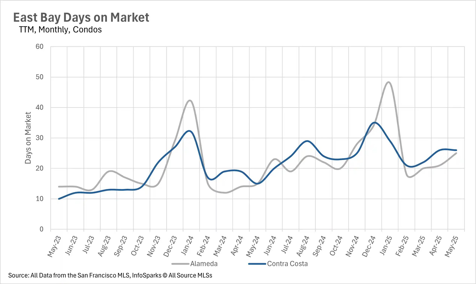
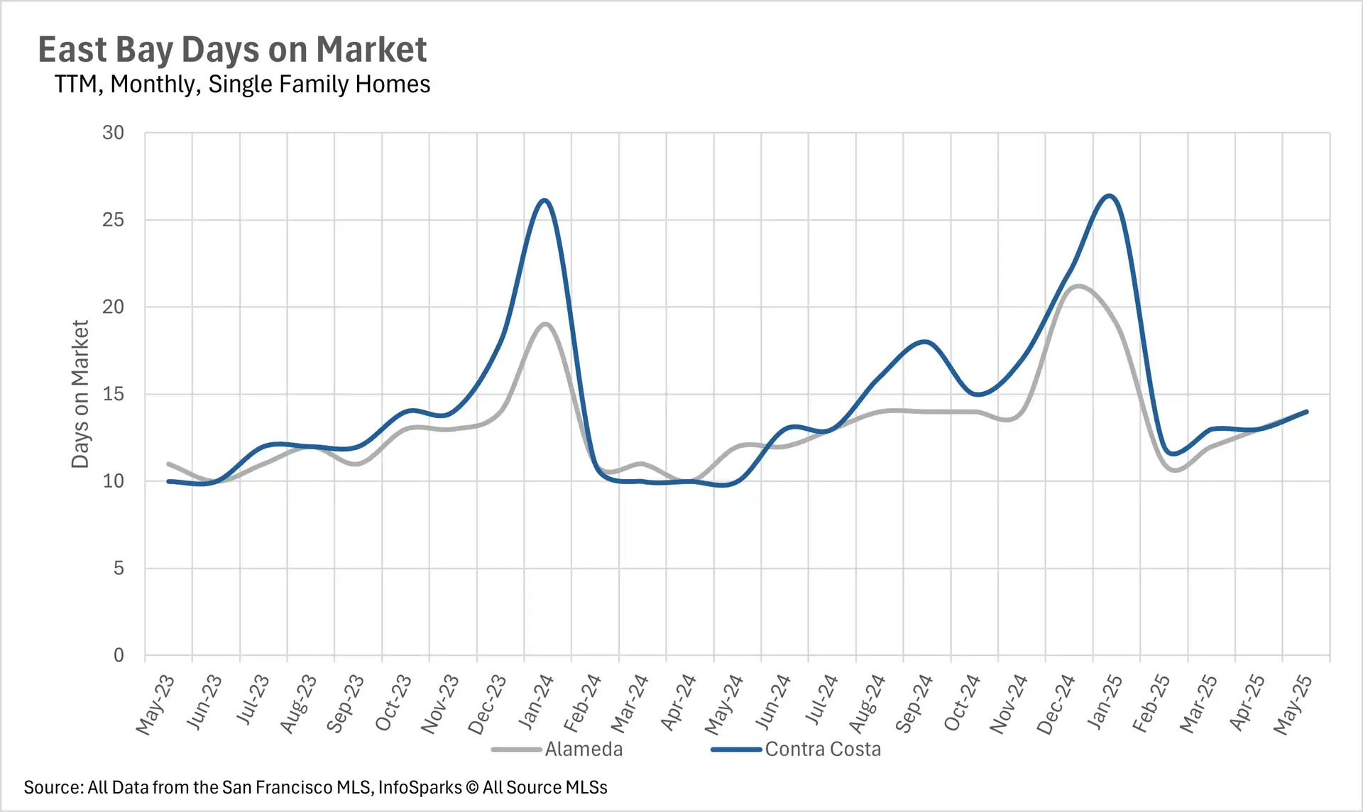
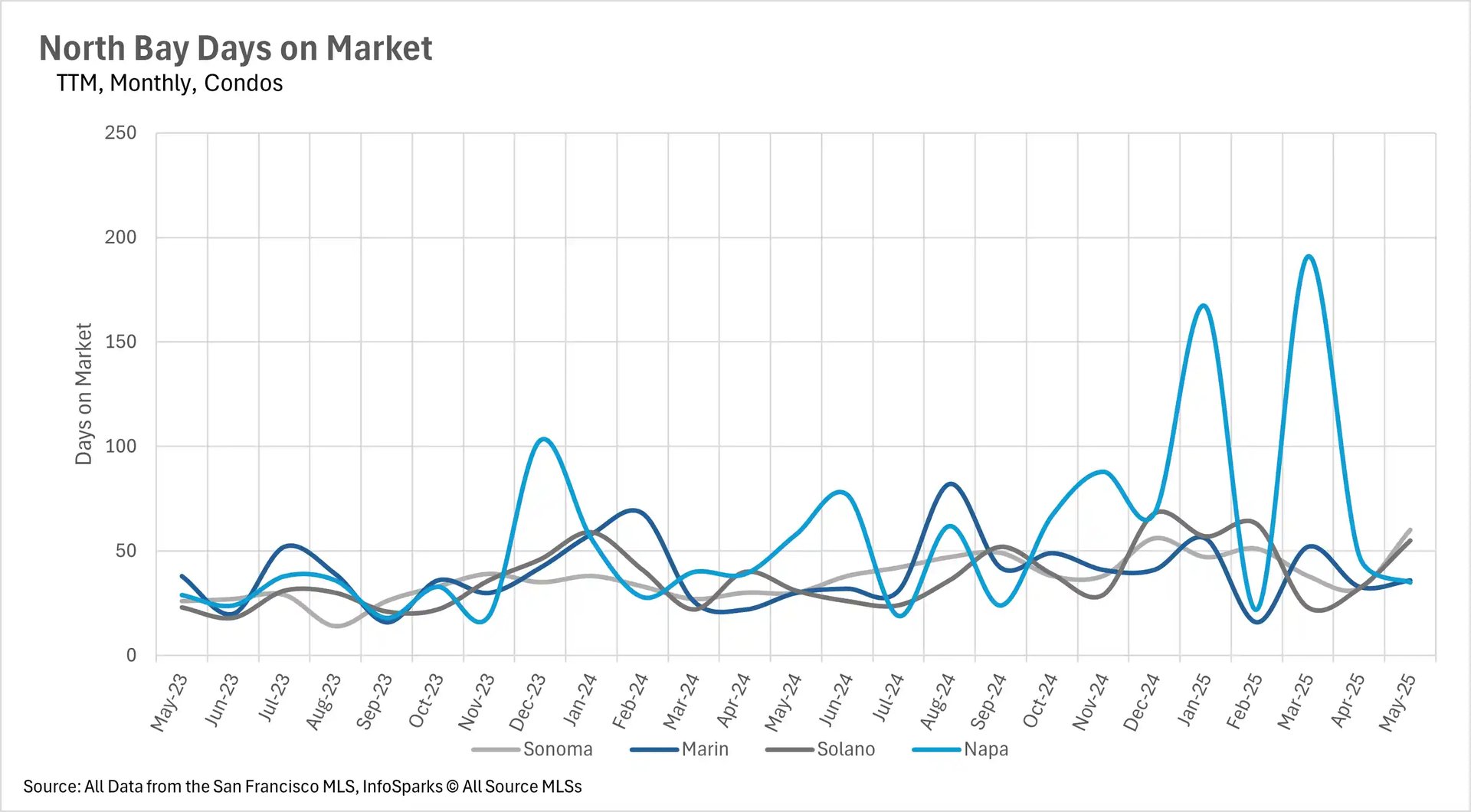
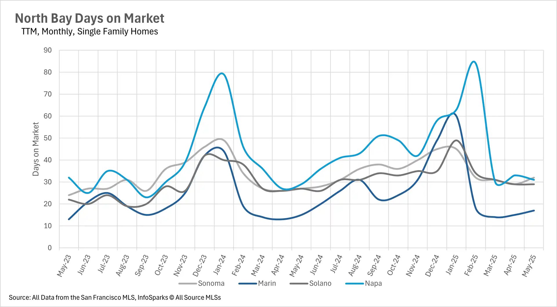
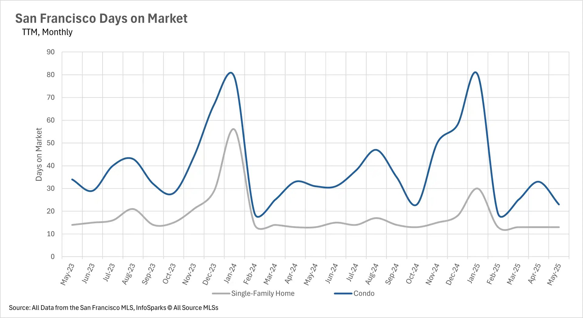
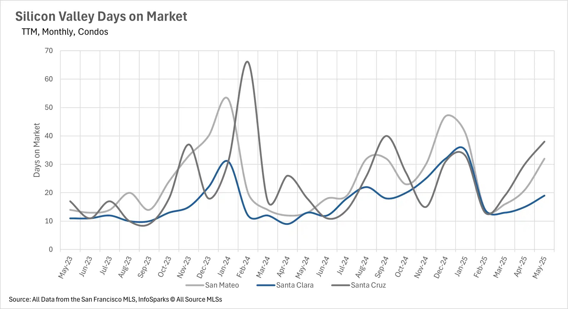
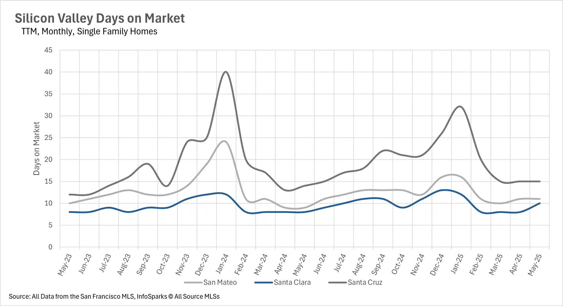
Days on market reveal regional buyer behavior patterns

The time properties spend on market varies dramatically across the Bay Area, revealing distinct buyer behavior patterns. San Francisco maintains the fastest-moving market, with single-family homes selling in just 13 days (unchanged from last year) and condos moving in 23 days (a significant improvement from 31 days last May). The East Bay also shows quick movement despite inventory increases, with single-family homes averaging just 14 days on market, though this represents a 40% increase from last year.

Silicon Valley single-family homes remain within their long-term averages for market time, but condos are experiencing significant delays, spending 46.15% more days on market in Santa Clara, 111.11% more in Santa Cruz, and 146.15% more in San Mateo Counties compared to last year. The North Bay shows the most consistent pattern of longer market times, with single-family homes spending 5 more days on market in Sonoma County and 2 more days in Marin, Solano, and Napa Counties year-over-year. These patterns suggest that while single-family homes continue to move relatively quickly throughout most of the Bay Area, the condo market is experiencing a fundamental shift toward longer selling periods, particularly in Silicon Valley.

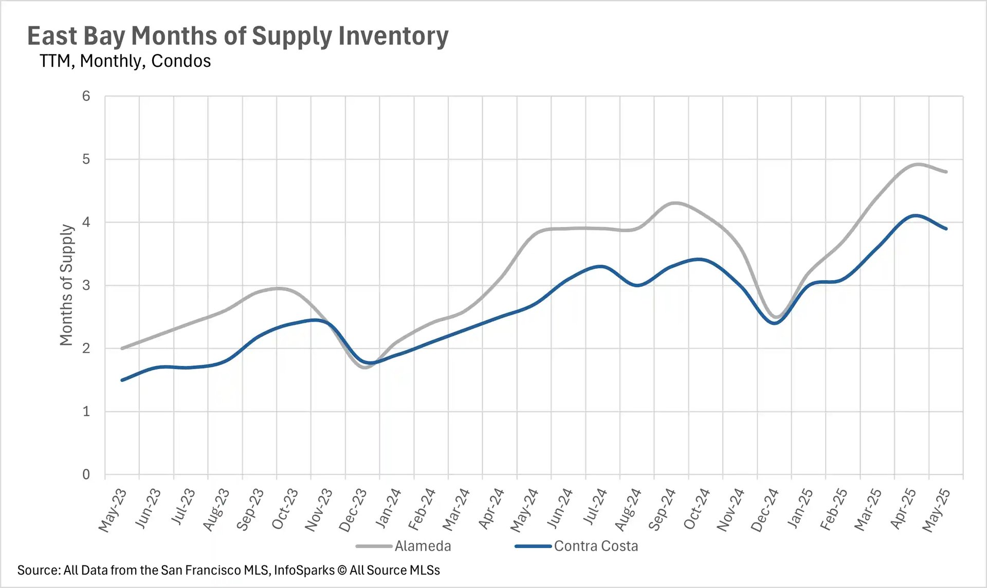
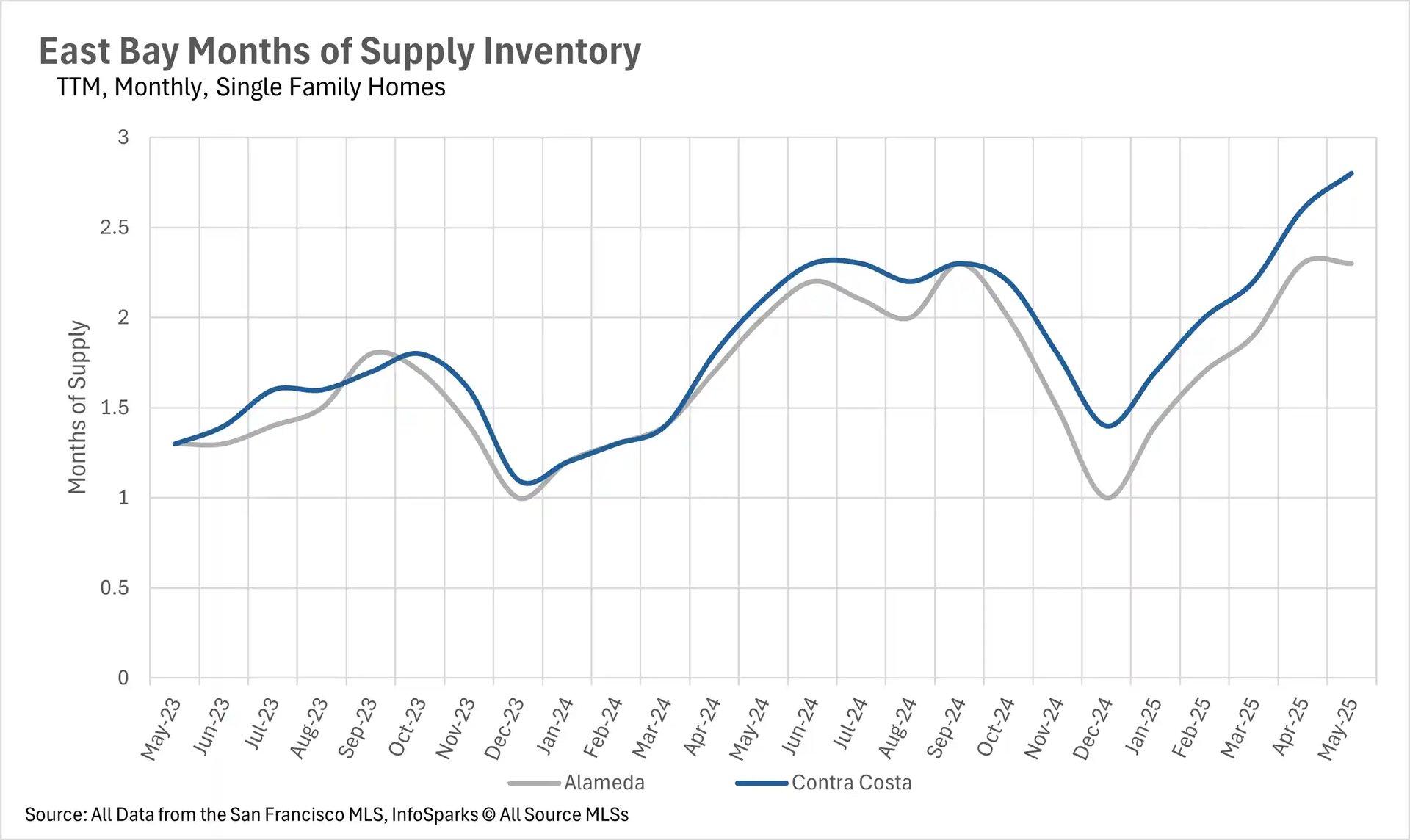
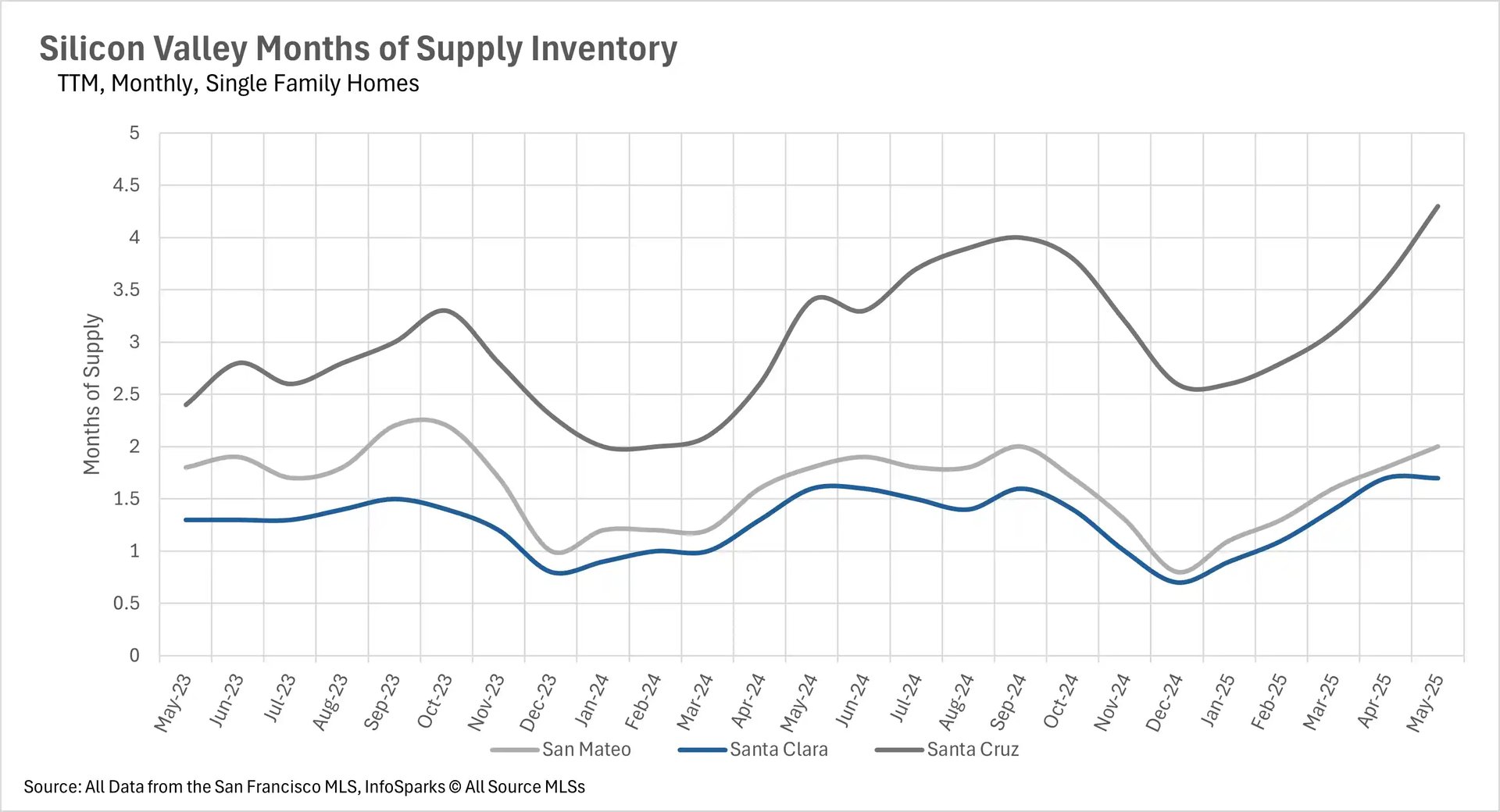
Market dynamics increasingly favor property type over location

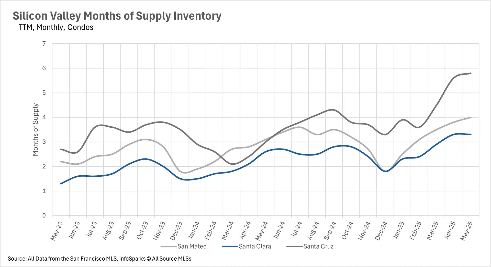
The months of supply inventory (MSI) metric reveals a consistent pattern across the Bay Area that transcends regional boundaries: single-family homes generally remain in seller's market territory while condos increasingly favor buyers. San Francisco exemplifies this split with single-family homes at just 1.8 months of supply (down 14.29% year-over-year) while condos sit at 3.8 months (down 22.45% but still favoring buyers). Silicon Valley has largely become a buyer's market, with all three counties showing buyer-favorable condo markets (4 months in San Mateo, 3.3 in Santa Clara, and 5.8 in Santa Cruz). However, Santa Cruz County's single-family market has shifted to favor buyers with 4.3 months of supply, while San Mateo (2 months) and Santa Clara (1.7 months) remain seller's markets.

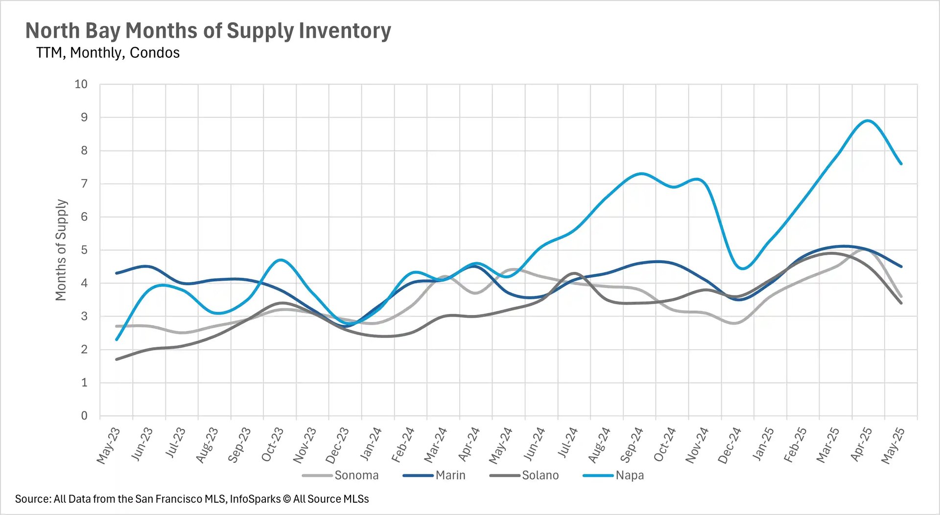
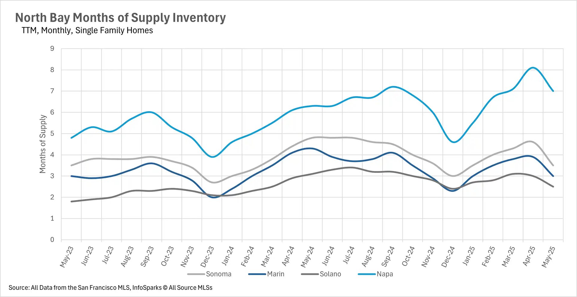
The East Bay continues its divided pattern with single-family homes at 2.3 months in Alameda and 2.8 months in Contra Costa (seller's markets), while condos favor buyers with 4.8 and 3.9 months respectively. The North Bay shows the most variation, with only Solano County (2.5 months) remaining a seller's market, Marin balanced at exactly 3 months, and Sonoma (3.5 months) and Napa (7 months) firmly in buyer's territory. This pattern suggests that across the Bay Area, single-family homes retain their premium status and seller advantage, while the condo market presents increasingly attractive opportunities for buyers willing to navigate longer search and closing timelines.

Local Lowdown Data

A line graph titled 'East Bay Days on Market TTM, Monthly, Condos' showing the average days on market for condos in Alameda and Contra Costa from May 2023 to May 2025. The y-axis represents days on market (0 to 60), and the x-axis shows months. Alameda data is in gray, and Contra Costa data is in blue, with both lines fluctuating over time. Source: San Francisco MLS, InfoSparks © AllSource MLSs.

A line graph titled 'East Bay Days on Market TTM, Monthly, Single Family Homes' showing the average days on market for single-family homes in Alameda and Contra Costa from May 2023 to May 2025. The y-axis represents days on market (0 to 30), and the x-axis shows months. Alameda data is in gray, and Contra Costa data is in blue, with both lines varying over time. Source: San Francisco MLS, InfoSparks © AllSource MLSs.

A combination bar and line graph titled 'East Bay Inventory - Condos Two Year, Monthly' displaying new listings, sold listings, and for-sale inventory for condos from May 2023 to May 2025. The y-axis on the left shows new and sold listings (0 to 600), and the y-axis on the right shows for-sale listings (0 to 1200). New listings are in dark blue bars, sold listings in light blue bars, and for-sale inventory in a pink line. Source: San Francisco MLS, InfoSparks © AllSource MLSs.

A combination bar and line graph titled 'East Bay Inventory - Single-Family Homes Two Year, Monthly' displaying new listings, sold listings, and for-sale inventory for single-family homes from May 2023 to May 2025. The y-axis on the left shows new and sold listings (0 to 3k), and the y-axis on the right shows for-sale listings (0 to 3.5k). New listings are in dark blue bars, sold listings in light blue bars, and for-sale inventory in a pink line. Source: San Francisco MLS, InfoSparks © AllSource MLSs.

A bar graph titled 'East Bay Median Condo Price Changes TTM, Year-Over-Year, Condos' showing percentage changes in median condo prices for Alameda and Contra Costa from June 2024 to May 2025. The y-axis represents price changes (-20.00% to 20.00%), and the x-axis shows months. Alameda data is in gray bars, and Contra Costa data is in blue bars, with fluctuations over time. Source: San Francisco MLS, InfoSparks © AllSource MLSs.

A line graph titled 'East Bay Median Condo Prices Three-Year, Monthly, Condos' showing median condo prices in Alameda and Contra Costa from May 2022 to May 2025. The y-axis represents median prices ($2M to $8M), and the x-axis shows months. Alameda data is in gray, and Contra Costa data is in blue, with both lines showing price trends over time. Source: San Francisco MLS, InfoSparks © AllSource MLSs.

A bar graph titled 'East Bay Median Single-Family Home Price Changes TTM, Year-Over-Year, Single Family Homes' showing percentage changes in median single-family home prices for Alameda and Contra Costa from June 2024 to May 2025. The y-axis represents price changes (-8.00% to 8.00%), and the x-axis shows months. Alameda data is in gray bars, and Contra Costa data is in blue bars, with variations over time. Source: San Francisco MLS, InfoSparks © AllSource MLSs.

A line graph titled 'East Bay Median Single-Family Home Prices Three-Year, Monthly, Single Family Homes' showing median single-family home prices in Alameda and Contra Costa from May 2022 to May 2025. The y-axis represents median prices ($0.5M to $2M), and the x-axis shows months. Alameda data is in gray, and Contra Costa data is in blue, with both lines depicting price trends over time. Source: San Francisco MLS, InfoSparks © AllSource MLSs.

A line graph titled 'East Bay Months of Supply Inventory TTM, Monthly, Condos' showing the months of supply inventory for condos in Alameda and Contra Costa from May 2023 to May 2025. The y-axis represents months of supply (0 to 6), and the x-axis shows months. Alameda data is in gray, and Contra Costa data is in blue, with both lines fluctuating over time. Source: San Francisco MLS, InfoSparks © AllSource MLSs.

A line graph titled 'East Bay Months of Supply Inventory TTM, Monthly, Single Family Homes' showing the months of supply inventory for single-family homes in Alameda and Contra Costa from May 2023 to May 2025. The y-axis represents months of supply (0 to 3), and the x-axis shows months. Alameda data is in gray, and Contra Costa data is in blue, with both lines varying over time. Source: San Francisco MLS, InfoSparks © AllSource MLSs.

Graph showing North Bay condo days on market for Sonoma, Marin, Solano, and Napa counties, from May 2023 to May 2025, indicating fluctuations in how long condos stay on the market.

Graph showing North Bay single-family home days on market for Sonoma, Marin, Solano, and Napa counties, from May 2023 to May 2025, illustrating trends in the duration homes remain on the market.

Bar and line graph showing North Bay condo inventory with new listings, sold listings, and total for-sale inventory from May 2023 to May 2025, depicting supply and demand trends.

Bar and line graph showing North Bay single-family home inventory with new listings, sold listings, and total for-sale inventory from May 2023 to May 2025, illustrating real estate market supply.

Bar chart showing North Bay median condo price changes year-over-year for Sonoma, Marin, Solano, and Napa counties from June 2024 to May 2025, highlighting percentage changes in prices.

Line graph showing North Bay median condo prices for Sonoma, Marin, Solano, and Napa counties from May 2022 to May 2025, illustrating the median price trends over three years.

Bar chart showing North Bay median single-family home price changes year-over-year for Sonoma, Marin, Solano, and Napa counties from June 2024 to May 2025, depicting percentage shifts in home prices.

Line graph showing North Bay median single-family home prices for Sonoma, Marin, Solano, and Napa counties from May 2022 to May 2025, illustrating the median home price trends over three years.

Line graph showing North Bay months of supply inventory for condos in Sonoma, Marin, Solano, and Napa counties from May 2023 to May 2025, indicating how long the current inventory would last at the current sales pace.

Line graph showing North Bay months of supply inventory for single-family homes in Sonoma, Marin, Solano, and Napa counties from May 2023 to May 2025, illustrating the balance between supply and demand in the housing market.

Line chart showing San Francisco's average percentage of original listing price over three years (May 2022 to May 2025). Two lines compare single-family homes (gray) and condos (blue). Single-family homes started around 119% in May 2022, dropped to 100% by early 2023, then fluctuated between 102-114% through 2025. Condos began at 105%, fell to 93% by early 2023, and remained mostly between 95-101% with less volatility than single-family homes.

Line chart displaying days on market for San Francisco properties from May 2023 to May 2025. Single-family homes (gray line) show relatively stable performance between 10-30 days with peaks around 55 days in early 2024. Condos (blue line) exhibit much higher volatility, ranging from 18-80 days, with notable spikes reaching 80 days in early 2024 and late 2024/early 2025.

Combined bar and line chart showing San Francisco condo inventory over two years. Dark blue bars represent new listings, light blue bars show sold listings, and a pink line tracks total for-sale inventory. New listings peaked around 460 units in September 2023 and September 2024. For-sale inventory (pink line) fluctuated between 400-900 units, with peaks in fall 2023 and 2024.

Combined bar and line chart displaying San Francisco single-family home inventory over two years. Dark blue bars show new listings, light blue bars represent sold listings, and a pink line indicates total for-sale inventory. New listings generally ranged from 100-400 units monthly. For-sale inventory peaked around 500 units in fall 2023, dropped to about 200 units in late 2024, then recovered to around 350 units by May 2025.

Bar chart showing year-over-year median price changes for San Francisco real estate from June 2024 to May 2025. Gray bars represent single-family homes, blue bars show condos. Both property types experienced significant volatility, with changes ranging from -12% to +12%. Notable peaks occurred in July and October 2024, while significant declines appeared in August 2024 and February 2025.

Line chart tracking San Francisco median prices over three years (May 2022 to May 2025). Single-family homes (gray line) started around $2.0M, declined to $1.3M by early 2023, then gradually recovered to about $1.8M by 2025. Condos (blue line) began at $1.25M, dropped to $1.0M in mid-2022, and remained relatively stable between $1.0-1.3M throughout the period with less dramatic swings than single-family homes.

Line chart showing months of supply inventory for San Francisco real estate from May 2023 to May 2025. Single-family homes (gray line) maintained relatively low inventory levels, typically between 1-3 months of supply with a peak around 3 months in mid-2023. Condos (blue line) showed higher and more volatile inventory levels, ranging from 2.5-5.5 months, with notable peaks in fall 2023 and fall 2024 reaching over 5 months of supply.

Line chart showing Silicon Valley condo days on market from May 2023 to May 2025 for San Mateo, Santa Clara, and Santa Cruz counties. Santa Cruz shows highest volatility with peaks around 65 days in February 2024 and 47 days in December 2024. Santa Clara remains most stable, generally between 10-35 days. All counties show seasonal patterns with higher days on market in winter months.

Line chart displaying Silicon Valley single-family home days on market from May 2023 to May 2025. Santa Cruz shows highest values, peaking at 40 days in January 2024 and 32 days in February 2025. Santa Clara maintains lowest and most stable values between 7-13 days throughout the period. San Mateo shows moderate values with some seasonal variation.

Combination bar and line chart showing Silicon Valley condo inventory over two years. Dark blue bars represent new listings, light blue bars show sold listings, and pink line tracks total for-sale inventory. Inventory peaks around 850 units in May 2025, with notable increases from late 2024 onwards. New listings generally range from 100-500 units monthly.

Combination bar and line chart depicting Silicon Valley single-family home inventory. Shows new listings (dark blue bars), sold listings (light blue bars), and for-sale inventory (pink line). For-sale inventory reaches highest levels around 2,200-2,300 units in early 2025. New listings typically range from 500-2,000 units monthly with seasonal variations.

Bar chart showing year-over-year median price changes for Silicon Valley condos from June 2024 to May 2025. Santa Cruz shows most volatility with changes ranging from -20% to +22%. Santa Clara generally shows positive growth between 0-7%. San Mateo displays mixed results with both positive and negative changes throughout the period.

Line chart tracking Silicon Valley median condo prices over three years from May 2022 to May 2025. San Mateo shows highest prices around $850K-$950K with significant volatility. Santa Clara maintains more stable prices around $650K-$850K. Santa Cruz shows lowest prices around $600K-$700K with moderate fluctuations.

Bar chart displaying year-over-year median price changes for Silicon Valley single-family homes from June 2024 to May 2025. Santa Cruz shows highest volatility with peaks of 20% growth in December 2024 and negative growth in recent months. Santa Clara shows consistent positive growth mostly between 5-12%. San Mateo shows mixed results with recent negative trends.

Line chart showing Silicon Valley median single-family home prices over three years. San Mateo commands highest prices, reaching peaks around $2.2-2.3M in recent months. Santa Clara follows with prices around $1.5-2.1M, showing strong recent growth. Santa Cruz maintains lowest prices around $1.0-1.4M with gradual appreciation.

Line chart depicting months of supply inventory for Silicon Valley condos from May 2023 to May 2025. Santa Cruz shows highest supply levels, reaching nearly 6 months by May 2025. San Mateo reaches around 4 months of supply. Santa Clara maintains lowest supply levels around 3.3 months, indicating tightest market conditions.

Line chart showing months of supply for Silicon Valley single-family homes. Santa Cruz reaches highest supply levels around 4.3 months by May 2025. San Mateo shows moderate supply around 2 months. Santa Clara maintains lowest supply at approximately 1.7 months, indicating strongest seller's market conditions among the three counties.

Let’s Talk

You’ve got questions and we can’t wait to answer them.

Follow Us on Instagram